July 26, 2017
Paula Scher on her logo for Poster House
Rating: G

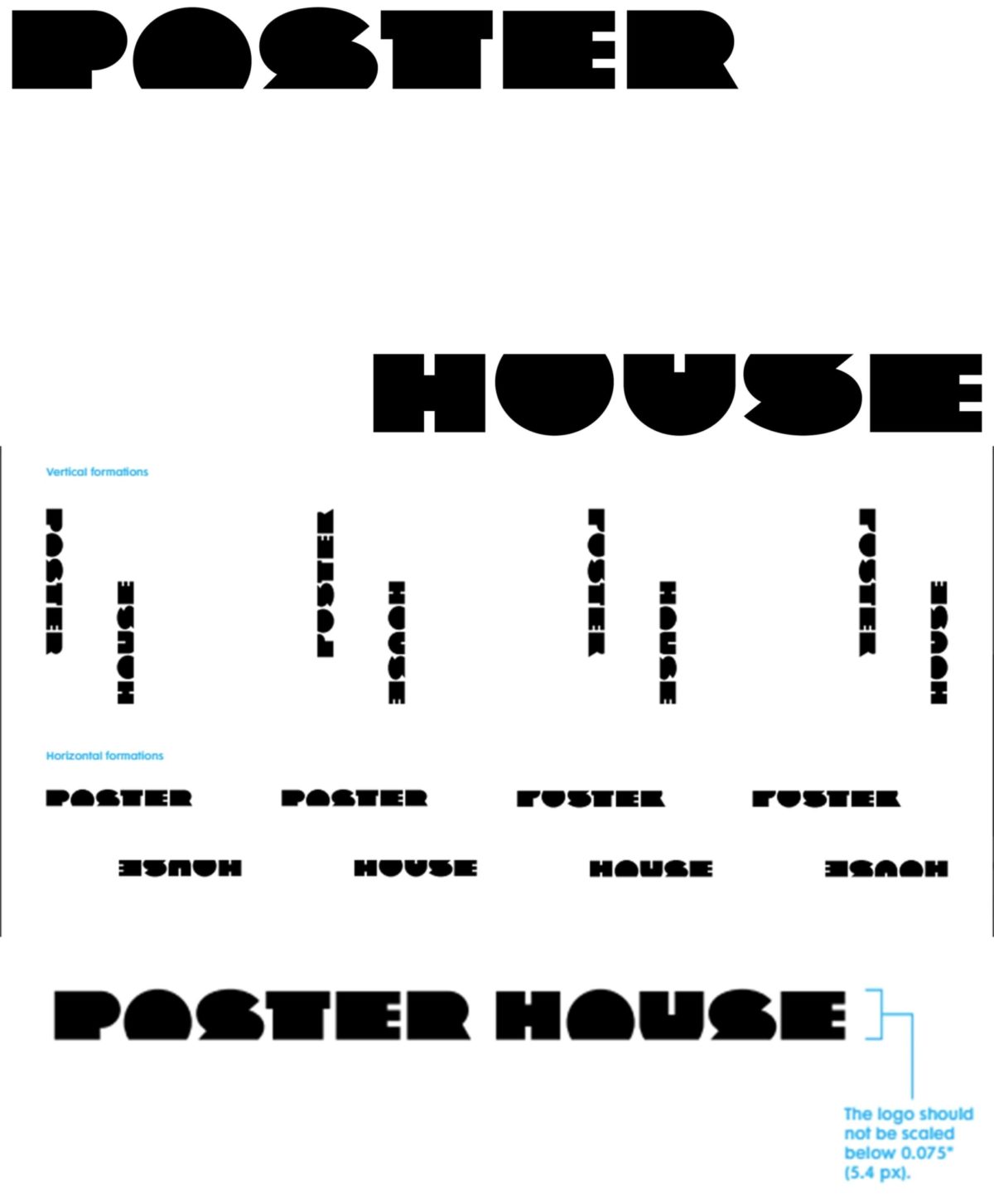
The Poster House logo was designed as moveable frame. The negative space between the typography is the imagined poster. The logo type is made from geometric shapes and is designed to have a flat base in order to contain the negative space which can be horizontal, vertical and square, sometimes long and thin or short and wide.
The logo’s purpose is to define something that is often undefinable. A poster can be anything. It can be the side of a building or can be reduced to a post card. The moving negative space in the logo design is as important as the type design. It becomes its own graphic statement about what is possible.