


On May 17, 2021, Poster House partnered with Clio Entertainment to host a panel of design luminaries in the field of key art. They had previously worked together to create a list of 50 movie posters that changed entertainment marketing—not their favorite posters, not the best posters, but posters that impacted the field in unique and lasting ways. Below are the top three contenders from each of the panelists alongside their thoughts on these remarkable posters. For the full list, head to Muse by Clio!
Head of Creative Marketing, Movies, Amazon Studios
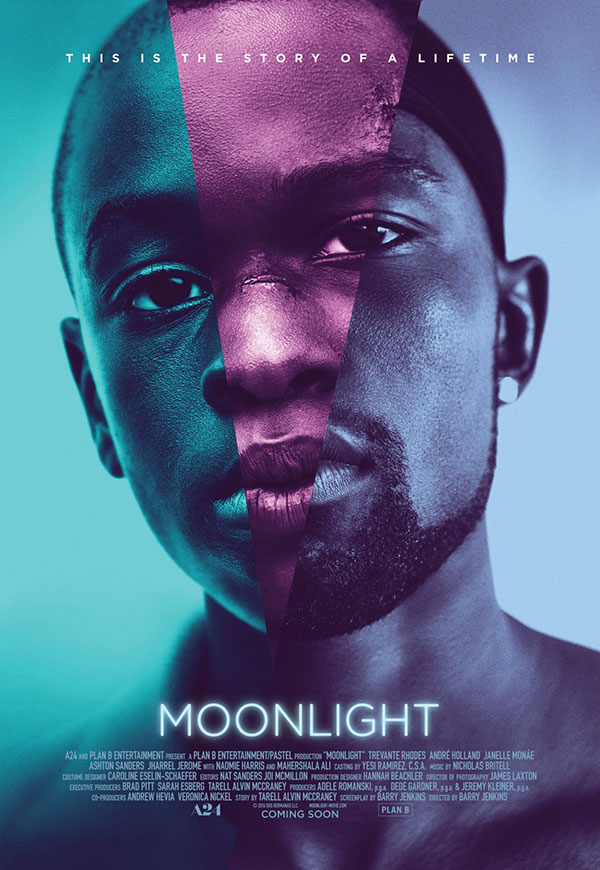
A24, 2016
InSync Plus
Creative Directors: Kishan Muthucumaru, Jeff Wadley
Designer: Steve Reeves
Simplicity wins. Moonlight was such a groundbreaking film, and as the copy line indicates, spanned crucial points in the life of the character, played by three different actors. This coming-of-age film about identity was told with visual beauty, and the key art is no less defining. It gorgeously captures the intensity in facial expression and eyes, which is nearly impossible to get so right as a composite in one static image. This was executed using unit photography, rather than a special shoot, which makes it even more impressive.
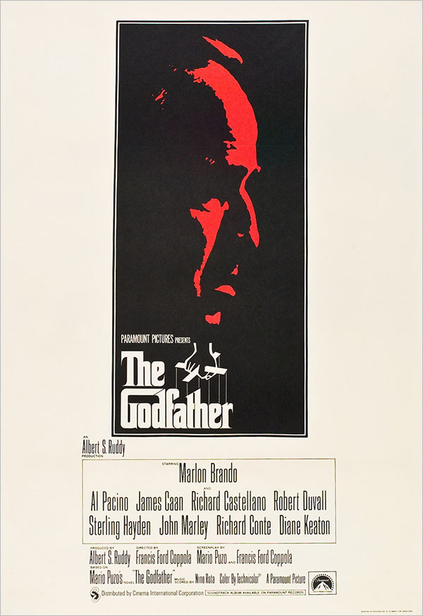
Paramount Pictures, 1972
Designer: S. Neil Fujita (title treatment)
File this under “If it’s not broken, don’t fix it.” The puppeteering logo of The Godfather was also the cover of the novel by Mario Puzo. While this was (I think) the British poster, any of the artwork with Marlon Brando’s image as the Godfather himself, especially in the foreboding red, tells us all we need to know. And that title treatment says it all.
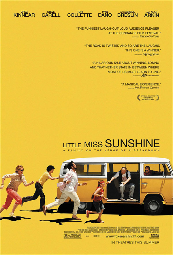
Fox Searchlight, 2006
BLT Communications
Creative director: Dawn Baillie
Art director/designer: Doug Tomich
There are so many reasons this key art is inspirational, but the way in which it captures a moment from the film in a singular image—the use of negative space and the color yellow—is certainly among them. The work was bold and memorable and perfectly captured this ensemble cast as a quirky and unforgettable family full of rich characters, humor, love and dysfunction. It’s all right there in the art … and this film’s marketing campaign owned yellow in a way that will never be forgotten.
Founding Partner and Creative Director, The Refinery
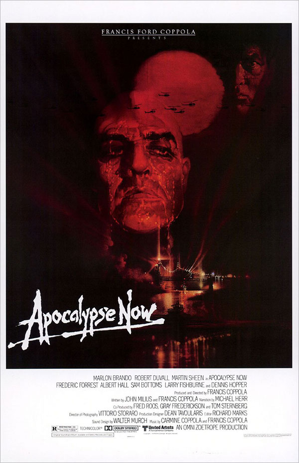
United Artists, 1979
Illustrators: Bob Peak
Tom Jung
Bob Peak is another of those powerhouse artists who moved the needle on the art form, alongside John Alvin and Drew Struzan. Apocalypse Now is likely the most impactful of Peak’s works: The fearless use of negative space balanced against portraiture blended with scope is one of the finer examples of a technique that is still ubiquitous today (Marvel Universe, anyone?).
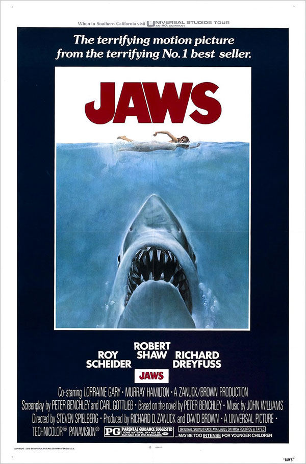
Universal Pictures, 1975
Seiniger Advertising
Illustrator: Roger Kastel
One of the most enduring and influential images ever to market a film, this illustration is both a beautiful, iconic piece of art, and a terrifying image in and of itself. Interestingly, there’s debate as to whether this piece should be included on this list: This was the artwork for the novel by Peter Benchley, stunningly illustrated by Roger Kastel. The decision to repurpose it for the film was bold, and purposeful. To this day, it ranks at the top of many lists of the best posters of all time.
Co-Founder and Creative Director, BLT Communications
Twentieth Century Fox, 1950
Designer: Erik Nitsche
Storytelling! This is a movie trailer in poster form. Beautiful, whimsical design that makes your eyes dance across the page. I love the colors, the treatment, the graphics, the style. The legendary Erik Nitsche designed this.
Twentieth Century Fox, 1970
Diener-Hauser
Designer: Arsen Roje
The glorious, humorous simplicity of this storytelling is just delightful. The clean negative space. The irreverent attitude. The surreal “mashed up” figure. The sexiness without any sex. This poster does not get the attention it deserves. It has been copied in other posters, but to have originated this … wow! And keep in mind, this is PRE-PHOTOSHOP.
Universal Pictures, 1988
Diener-Hauser
Illustrator: Joseph Caroff
This Joseph Caroff poster is a beauty. A designed concept of thorns that goes on for days perfectly illustrates the Last Temptation. Caroff’s work is often attributed to Saul Bass, as in the case of the poster for West Side Story, but he deserves his place in movie poster history. This piece is astoundingly beautiful in its smart design. It’s a classic.
EVP Creative Advertising, Warner Bros.
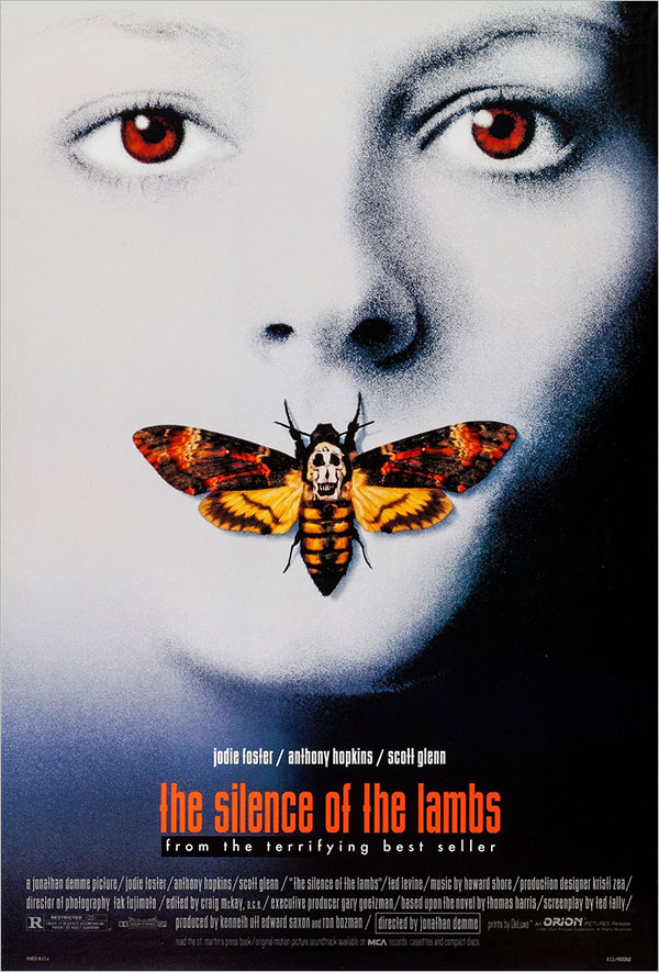
Orion Pictures, 1991
Dazu
Dawn Baillie
I’ve mentioned that while in art school studying illustration, I obsessed heavily on surrealism and several other movements. That designer Dawn Baillie was able to capture a modernist, surrealist horror iconography in a single image like this and throw in a Dalí easter egg—all while still effectively selling the genre and star with such an avante-garde style—shows mastery on several levels. It’s no wonder Dawn has gone on to affect the movie poster lexicon in the genius way she and her company have done. The poster was a game-changer, and so is Dawn.
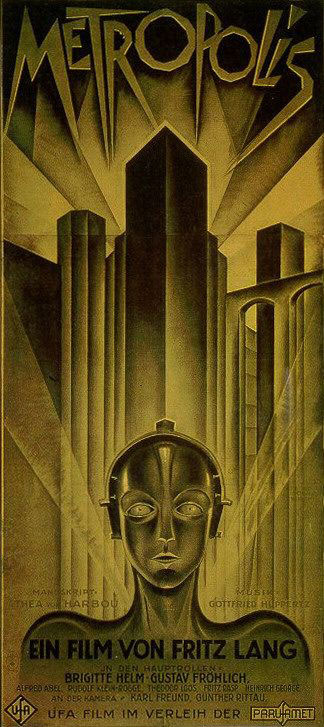
Universal Pictures, 1927
Heinz Schulz-Neudamm
This groundbreaking Fritz Lang silent film had numerous posters, but this three-sheet image by German graphic artist Heinz Schulz-Neudamm is regarded as the most striking and avant-garde of them. It is among the most expensive and sought-after posters today, but what makes it truly valuable is the design. Futurism, sci-fi, and modernism all seem to have been meant to be in the same frame. It’s both stunning and quietly discordant, in a truly brilliant way. Among the best ever in the poster lexicon.
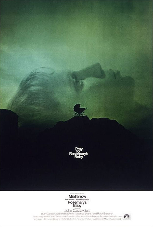
Paramount Pictures, 1968
Frankfurt Gips Balkind
Not since Battleship Potemkin has a baby carriage left such a massive mark in film. Again, genius is sometimes about boldness in its own era. Horror films were not conventionally sold this quietly and beautifully. The ephemeral Mia Farrow profile as landscape for the horror that a simple baby carriage portends is calmly and terrifyingly disturbing. Oh, and the type design restraint—with copy running directly into title, surrounded by enough eerie negative space that you can’t help but seek out the title below it—genius.
Co-Founder and Chief Creative Officer, Gravillis Inc.
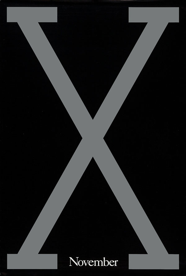
Columbia Pictures, 1992
11:24 Design Advertising
Power—that’s what this says to me. The power of X. Very brave to be that bold and that direct with such a historic Black character. Denzel Washington was already an established Oscar winner when this came out, so to pass on a more typical portrait approach of him showed the brass of the film. The power was the power of X. Try to think of another letter that could get away with that. Not sure there is one. Who needs a title when you have an icon like this? Game-changing.
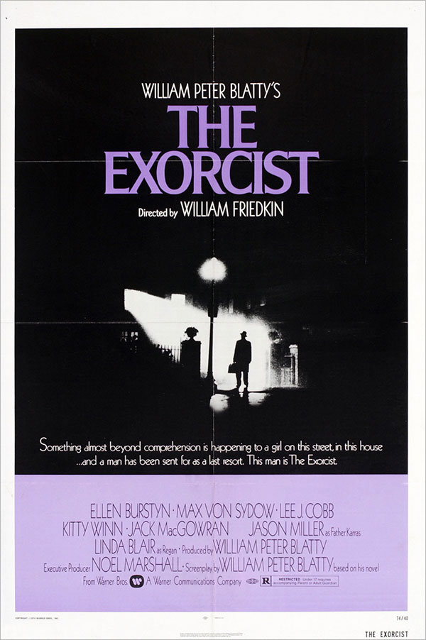
Warner Bros., 1973
Designer: Bill Gold
When I see a poster showing a scene like this, the big question I like to ask is: What is it promising? And how iconic can that promise be? This Exorcist poster walks that line beautifully. All you know is, here’s a man who’s about to go into something very dark, and you wouldn’t want to be him. Also, the use of purple feels so unexpected. It’s spooky as all hell without really showing anything horrific. It’s just a feeling and a vibe, which inspired many a marketing exec to ask: How can we show horror without showing blood?
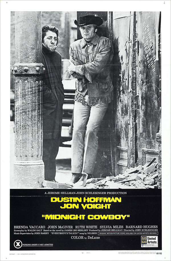
United Artists, 1969
Diener Hauser Greenthal
Steve Schapiro, Photographer
I just love a great photo that says it all. Another simple approach that speaks volumes. The energy between Hoffman and Voight is so perfect. Two hustlers trying to make it happen but on the other side of luck. So great and iconic.