


After hearing from so many guests that they wanted to see more of our permanent collection, we’ve just finished installing a timeline of poster styles near our 24th Street entrance!
Located across from our Billboard Vitrine, the timeline offers visitors a snapshot of poster development and history by highlighting major works from designers over a 100+ year period.
To help whet your appetite, here are some new works you can expect to see on permanent display at Poster House:
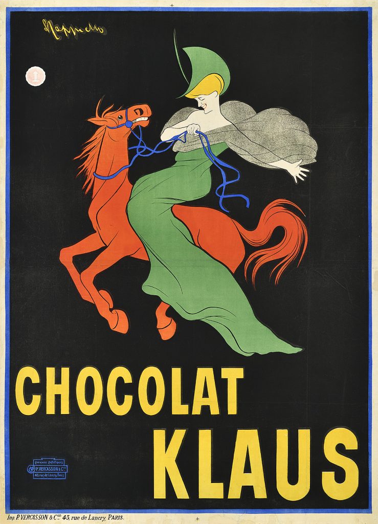
Chocolat Klaus, 1903, by Leonetto Cappiello (1875–1942)
Leonetto Cappiello is known as the “Father of Modern Advertising” thanks to his design innovations within the poster field, specifically his lively compositions full of movement and color offset by flat, saturated backgrounds. This poster for a chocolate brand is especially important as it introduced the concept of a mascot to advertising. Rather than show the product, Cappiello chose to present a distinctive image of a woman riding a red horse. This was so novel that people soon began to ask for the chocolate by describing the image rather than mentioning the brand’s name.
This poster was created during the Belle Époque (1871–1914), a golden age in France and other parts of Europe characterized by decadence, optimism, and intellectualism. This era saw the emergence of the “poster craze,” a proliferation of poster fairs, and, most importantly, the development of the idea that a poster could be more than just a text-based advertising tool. While artists show off a variety of styles, many posters from this period, printed through stone lithography, feature rich, primary colors, splashy compositions, and heavy outlines. The images are all about exuberance, flirtation, and entertainment.
You can take home your own small version of this image from permanent collection by picking up one of our bags of original house-roasted rosemary cashews at Cafe des Affiches.
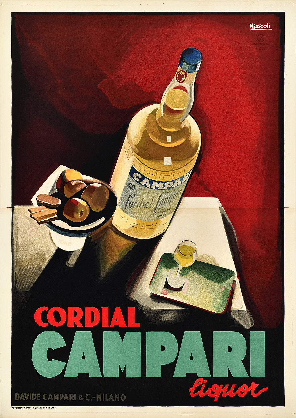
Cordial Campari, 1926, by Marcello Nizzoli (1887–1969)
Campari has an especially varied and lively history of advertising posters. This design by Nizzoli, however, is particularly distinctive for its moody interpretation of Art Deco space and perspective. The bottle and table setting are placed at extreme, almost unstable angles, as if they could fall toward the viewer at any moment. This tension combined with the moody color palette suggests a possible nod to the popularity of Cubism at the time in addition to typical Deco drama.
The Art Deco period (1920–39) focuses on luxurious expressions of mechanization and uniformity. The sinuous fluidity and lighthearted humor that preceded it is replaced by harder, more geometric lines, while colors become cooler. The resulting compositions appear formal, expensive, and masculine. Designers begin to use extreme perspective, showing objects that seem to tower over the viewer as well as figures which suggest a sense of weight and volume. Typefaces are standardized but still hand-drawn, and an affinity for airbrushing further links the style with commodification and the machine age.
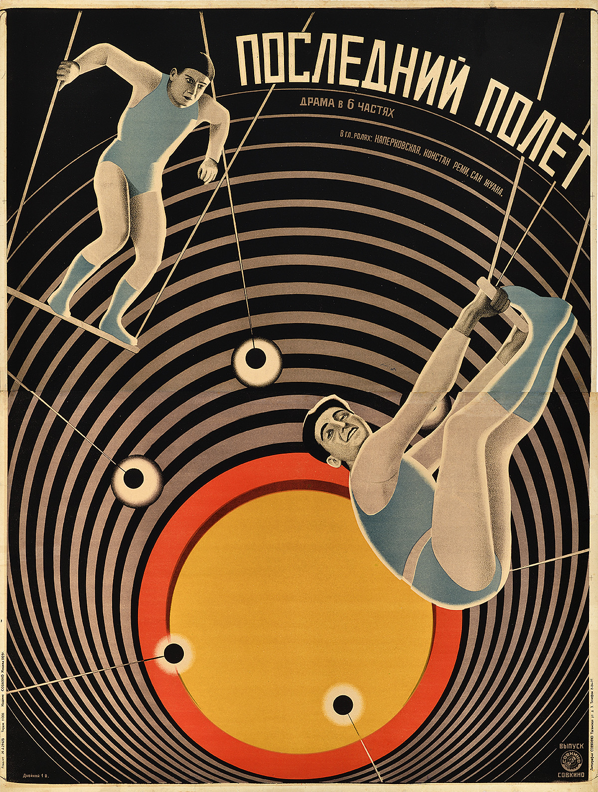
The Last Flight (Posledni polet), 1929, by Vladimir Stenberg (1899–1982) & Georgii Stenberg (1900–33)
The Stenberg Brothers are two of the most famous Constructivist poster designers. They are responsible for creating the visual language of the era, pushing posters to a new level of creativity and excitement. In Soviet Russia, artists were rarely able to see a film before designing its poster, thereby relying entirely on a plot description, film stills, or, sometimes, just a title when conceiving a design. To replicate photographic imagery, the Stenbergs frequently projected film stills onto the paper and traced the figures into the composition, creating a proto-photomontage technique. In the 1930s, Stalin would ban entertainment posters in this style in favor of Socialist Realism.
After World War I, Constructivism (1913–34) emerged within the Soviet Union as an aggressive response to the optimism and organic lines of the Belle Époque. Like Art Deco, the style reflects a modern preoccupation with technology and progress; however, political imperatives led artists to imbue their designs with a sense of necessary revolution. Composed of harsh diagonals and bold colors, these lithographic posters were intended to jar viewers out of complacency and into political action.
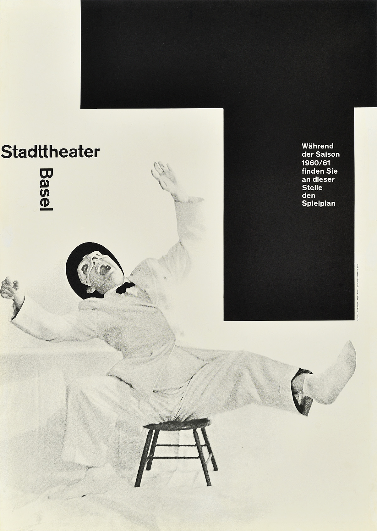
Stadttheater Basel, Saison 60–61, 1960, by Armin Hofmann (b. 1920)
Armin Hofmann was one of the masters of this style. His posters appear both effortless and precise, concerned only with direct, impactful communication. Here, he represents both the acts of listening to and watching an enjoyable performance, the “t” for “theater” entering the image as both a reminder of the institution as well as a demarcated area for posting the weekly schedule. This design won the Swiss Poster Award in 1960 for its humor, balance, and effective storytelling.
Also known as the International Typographic Style (1950–70), this period is defined by simplicity and precision. Designers pared down compositions to the most minimal information possible to effectively express an idea, shunning illustration and excessive use of color. New developments in printing technology allowed for the incorporation of photomontage (the insertion of photography into large-scale printing), and new sans-serif typefaces like Univers and Akzidenz Grotesk became the standard in all forms of graphic media. Posters were generally produced using photo-offset printing, a technique that came to dominate the postwar period as it was cheaper than stone lithography. Key elements of this style, such as the use of a grid to map out a composition, are still taught to design students today.
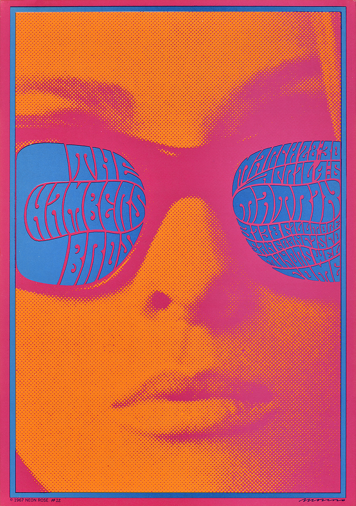
Left: The Chambers Brothers, 1967, by Victor Moscoso (b. 1936)
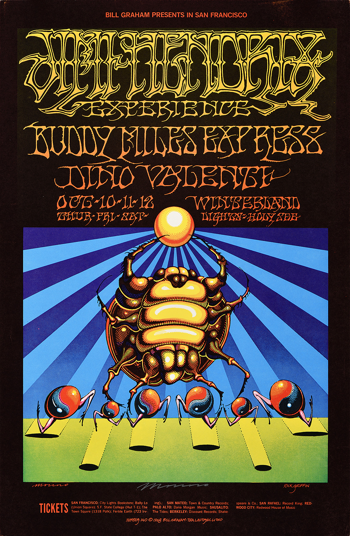
Right: Jimi Hendrix Experience, 1968, by Rick Griffin (1944–1991) & Victor Moscoso (b. 1936)
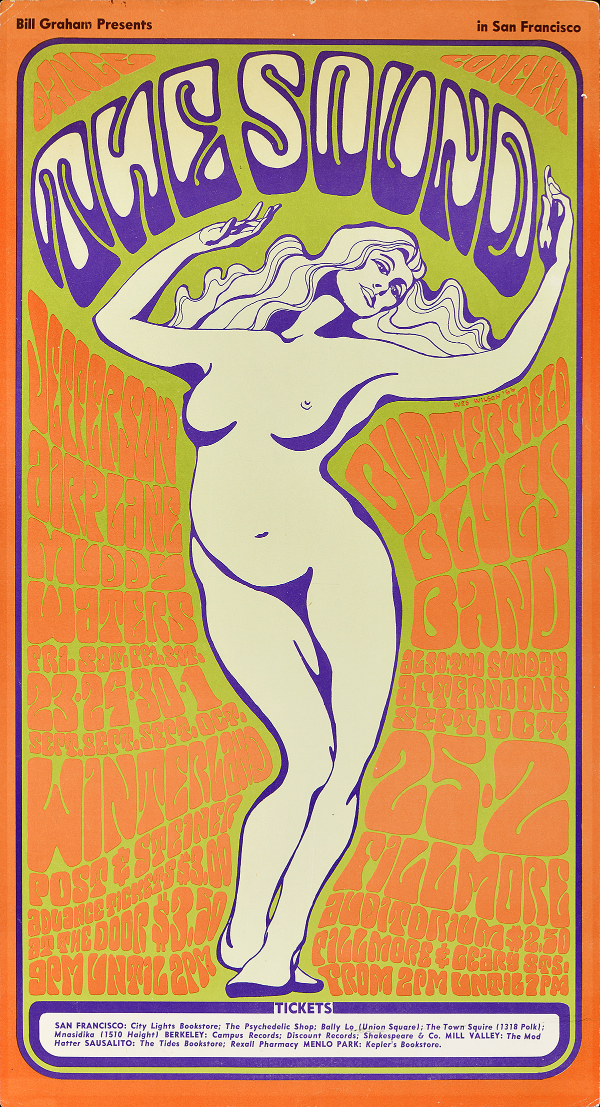
Left: The Sound, 1966, by Wes Wilson (b. 1937)
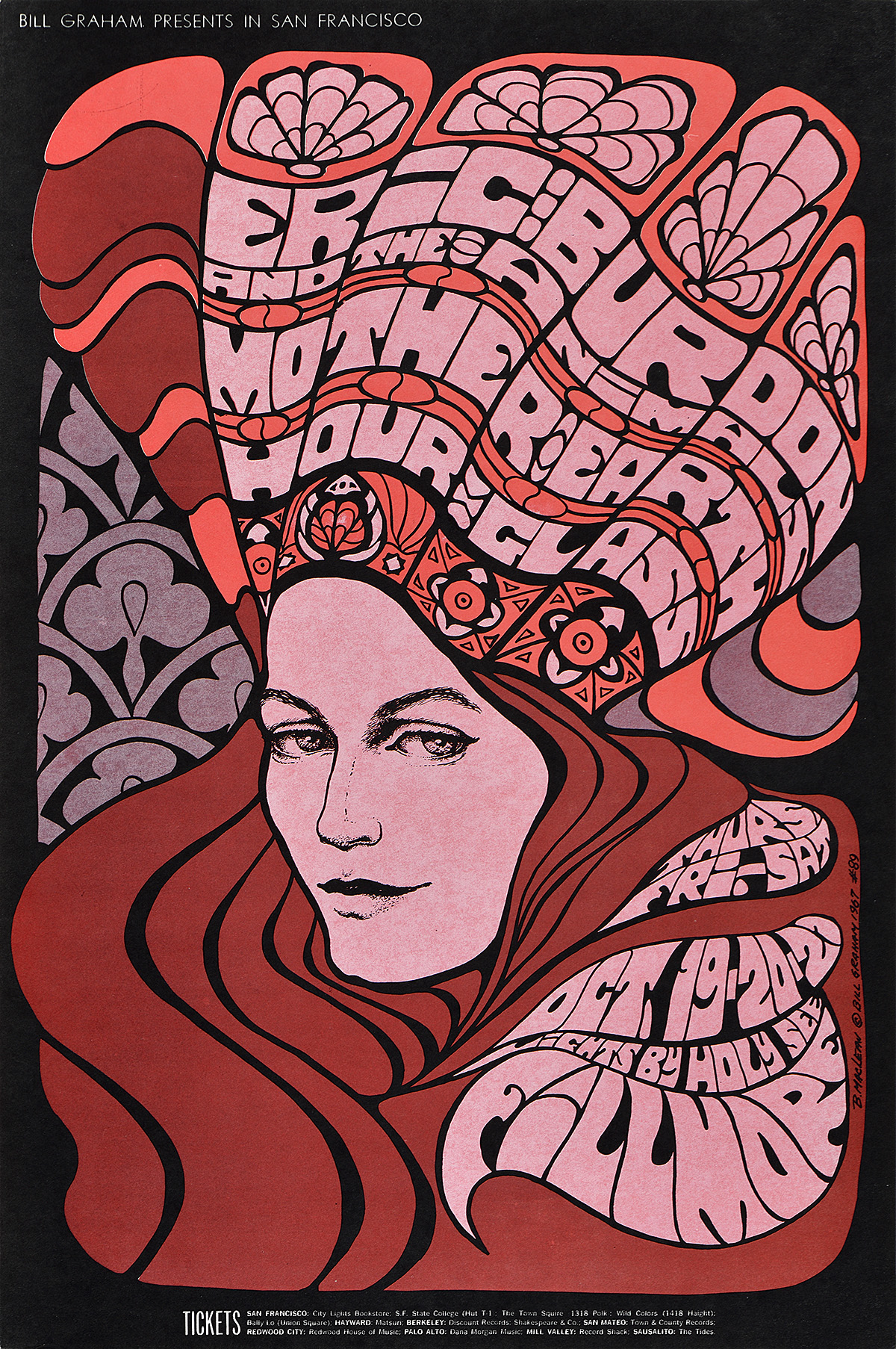
Right: Eric Burdon & the Animals, 1967, by Bonnie MacLean (b. 1939)
Concert promoters Bill Graham and Chet Helms played key roles in establishing the visual language of the psychedelic rock scene of the 1960s. They discovered and commissioned most of the posters on display here, used to advertise performances at legendary San Francisco venues the Fillmore West and the Avalon Ballroom. A few posters in this collection also feature Graham’s foray in New York with the Fillmore East. These nine designers became the most prominent concert posterists of the era, influencing fashion, art, and culture around the world.
A particularly American phenomenon, the psychedelic style (1966–72) emerged on the West Coast and quickly became a signifier of youth counterculture. Inspired by the use of hallucinogens, the designs combine contrasting colors with nearly illegible, swirling text—supposedly best viewed when high. In many cases, the compositions are so complex that some viewers cannot decipher them at first glance, bucking the idea that posters must be instantly and universally comprehensible. Many of the artists also draw on Art Nouveau and Victorian motifs. Contrary to popular myth, all of these posters were printed using photo-offset lithography—the cheapest method of mass printing at the time.
Visit the museum to see the complete set of nine psychedelic posters on permanent display.
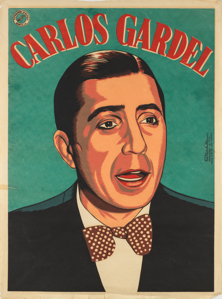
Carlos Gardel, 1945, by Eladio Rivadulla Martínez (1923–2011)
Rivadulla is considered one of the masters of Cuban poster design, creating hundreds of images for European and American films imported into Cuba during the 1940s and ‘50s. After the Cuban Revolution, he continued producing posters for political films and ideological campaigns until his death. Here, he announces the release of a cinematic biopic of French-Argentinian singer Carlos Gardel, the most important figure in tango history who was beloved throughout Cuba. Gardel died tragically in a plane crash at the age of 44 in 1935.
Silkscreen printing is an age-old technique dating back to 13th century China in which color is passed through a tightly-woven screen stenciled with a design. Traditionally, the screen has been made of silk, although today they are more commonly made of polyester mesh. The image transfers in reverse onto a sheet of paper, leaving the unstenciled areas blank. Additional colors can be added using more screens, creating a layered, highly tactile final product. During the 20th century, silkscreen posters are most often associated with protest and revolution as the materials are both cheap and can be quite compact and easy to move or hide. The Paris riots of May 1968 are best remembered through silkscreen posters, as are images of the Cuban Revolution.
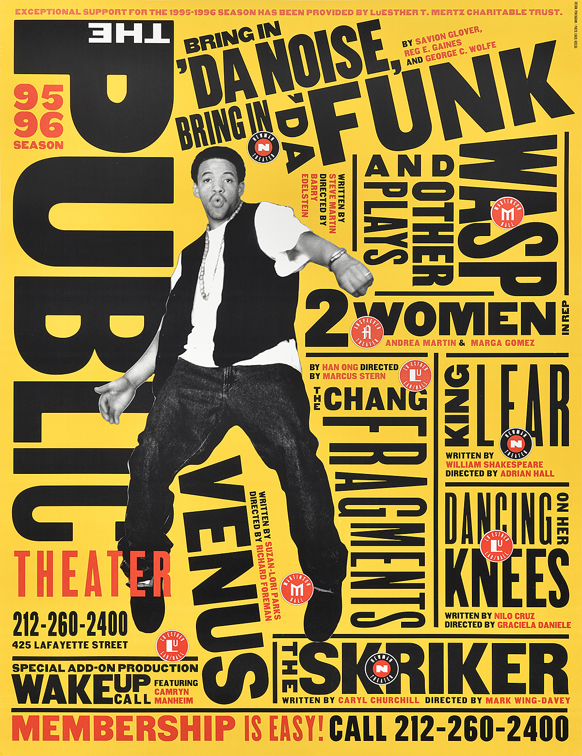
Bring in ‘Da Noise, Bring in ‘Da Funk, 1995, by Paula Scher (b. 1948)
This is Paula Scher’s first poster for The Public Theater, created while she was a partner at Pentagram. The dynamic, nonlinear placement of text combined with a bold cutout figure of one of the performers redefined theater advertising in New York City. While many posters in the city are now printed on vinyl stickers, this design was printed through photo-offset lithography on paper. Scher continues to work with The Public today, continuously editing the brand to reflect the vibrancy of both its programming and the city itself.
The contemporary poster movement could not be more varied or exciting. With the advent of Photoshop in the 1990s, designers have been able to manipulate imagery and text in a seemingly limitless digital frontier. Rules established by previous generations have been shattered, giving way to stylistic pastiche. Companies frequently commission posters from branding agencies rather than from a specific artist, resulting in most poster advertising being “designed by committee.” Today, the printed poster is rapidly being replaced by the digital sign, leaving the artistic future of the medium in jeopardy.