


Earlier this week, we hosted an amazing workshop with Isometric Studio during which our Chief Curator gave a brief history posters responding to nature and the environment. Below is an edited version of that lecture.
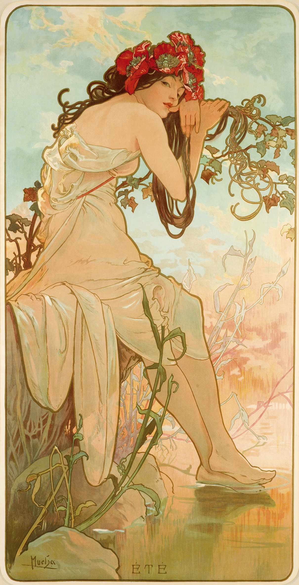
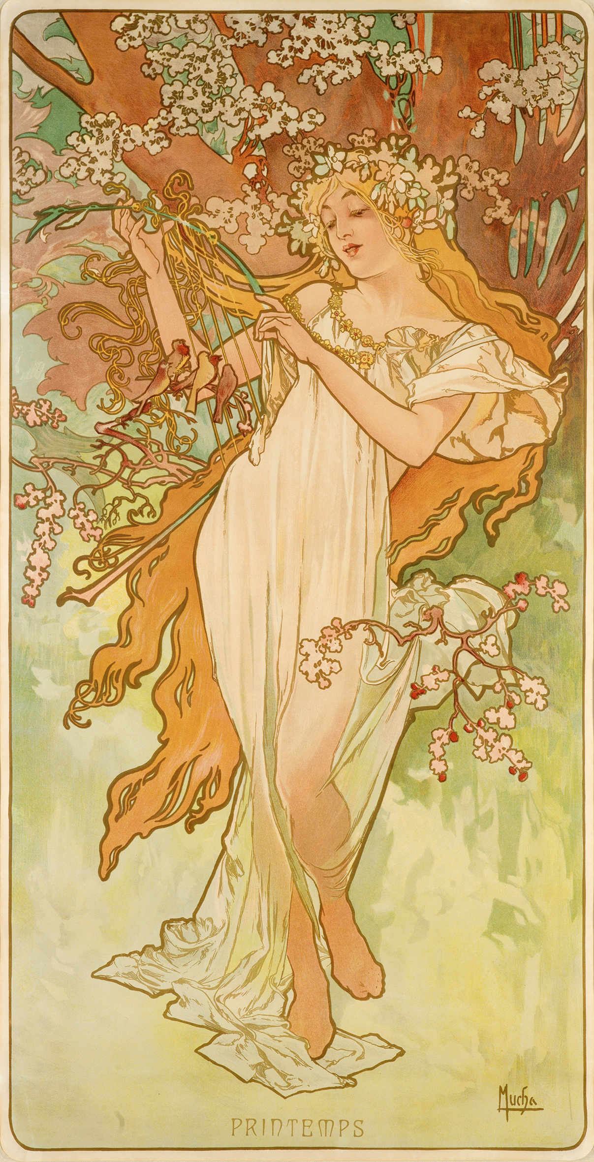
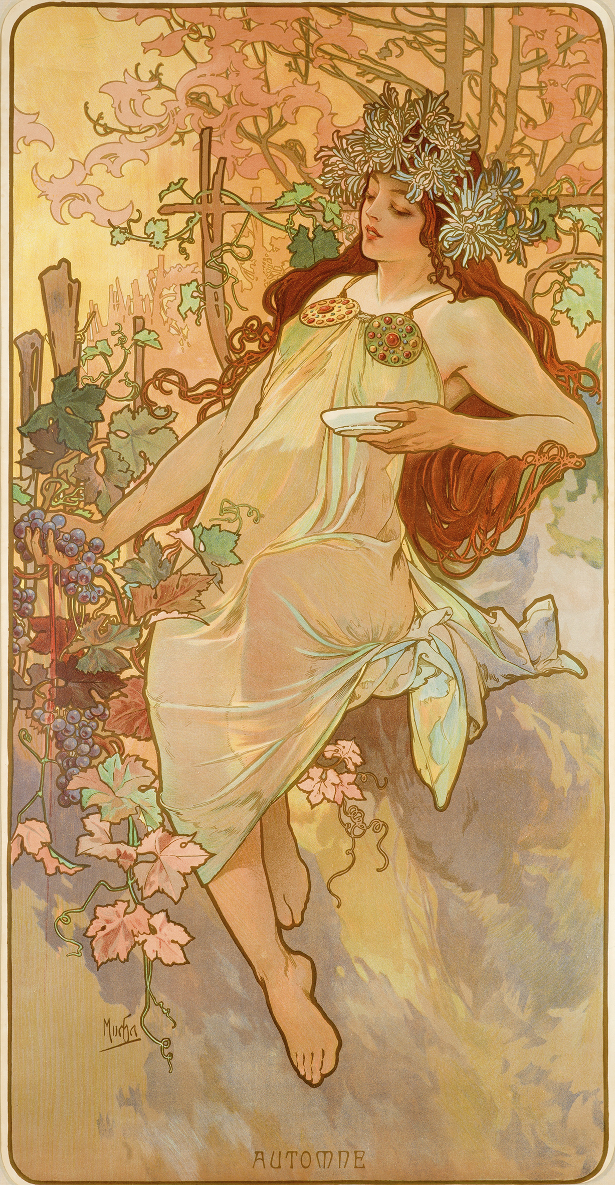
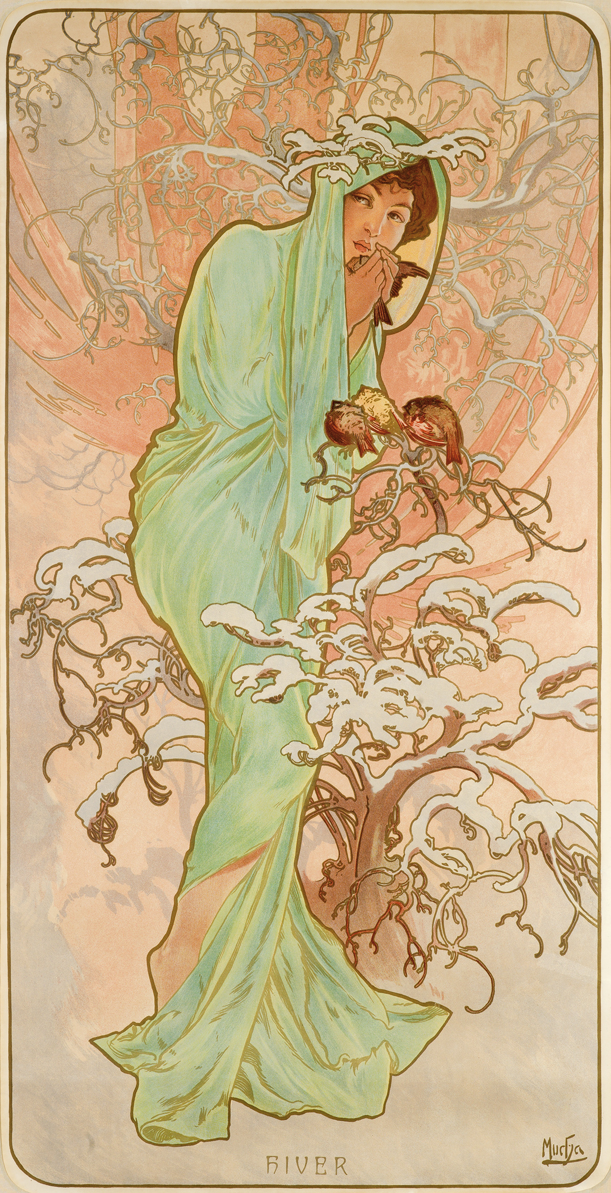
The Four Seasons, Alphonse Mucha, 1896
(image c/o The Richard Fuxa Foundation)
Environmental causes may not have been at the forefront of advertising in the late 1800s, when posters first appeared, but creating a visual personification of nature had been a common theme in art for hundreds of years prior to the dawn of lithography. So, it seems only natural that dozens of poster artists would try their hand a creating images that celebrated nature.
During the Art Nouveau period, the female form was used to represent all manner of allegorical themes, the most famous of which were—as far as posters were concerned—by Alphonse Mucha, as can be seen above in the decorative panels. He would go on to create three more different seasons series, as well as his Four Flowers. Of course, Mucha wasn’t the only artist in the medium to do this.
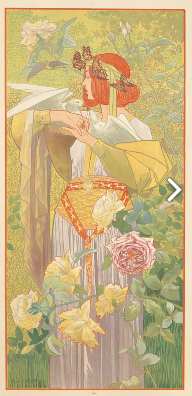
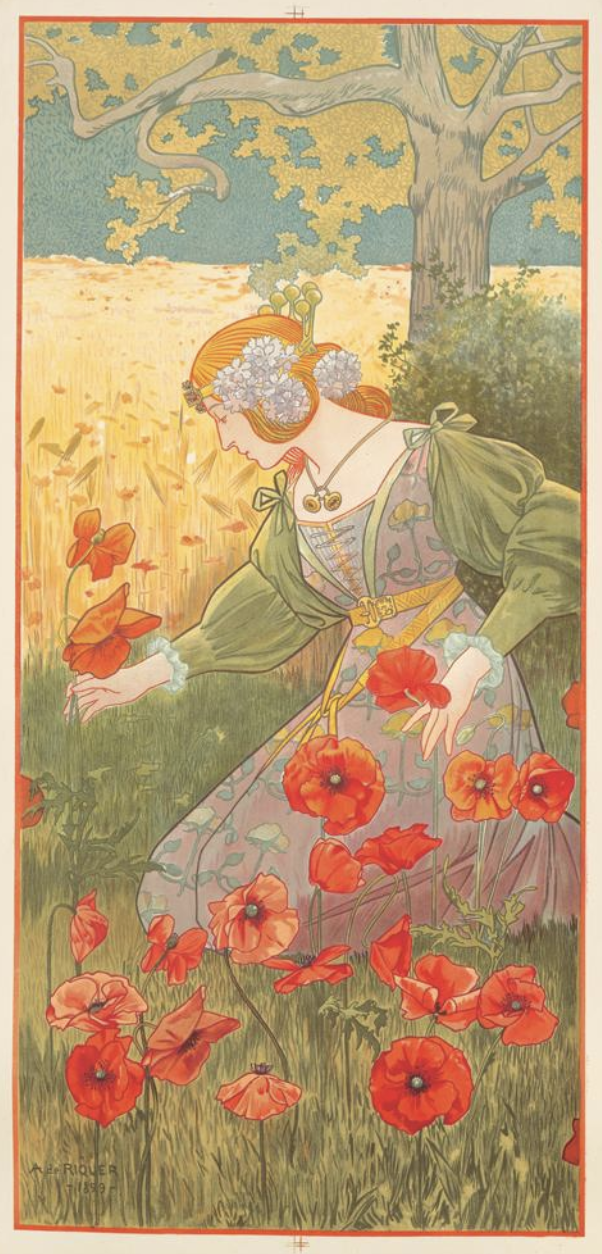
Spring and Summer panels, Alexandre de Riquer, 1900
(images c/o Pinterest)
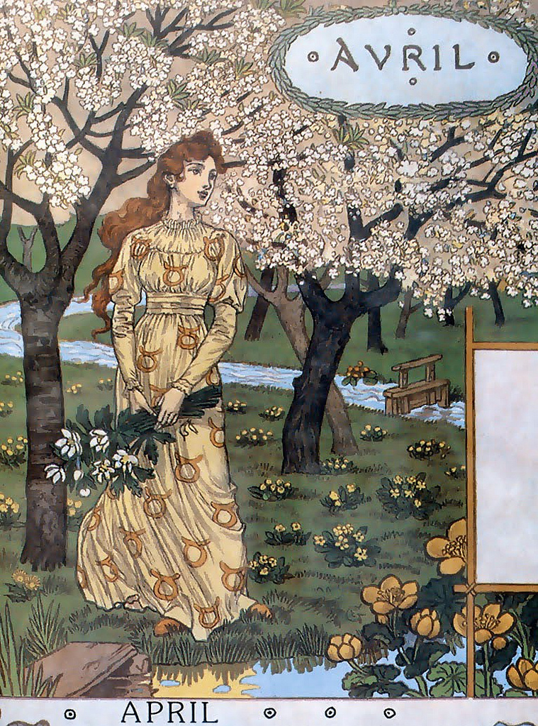
I’m a huge fan of Alexandre de Riquer’s Seasons from 1900 (above are just two of the four panels), as well as similar panels by Elisabeth Sonrel. Another famous Art Nouveau artists, Eugene Grasset, created a beautiful series of images called La Belle Jardinière, in which a woman accompanies each month of the year in a gorgeously detailed nature scene.
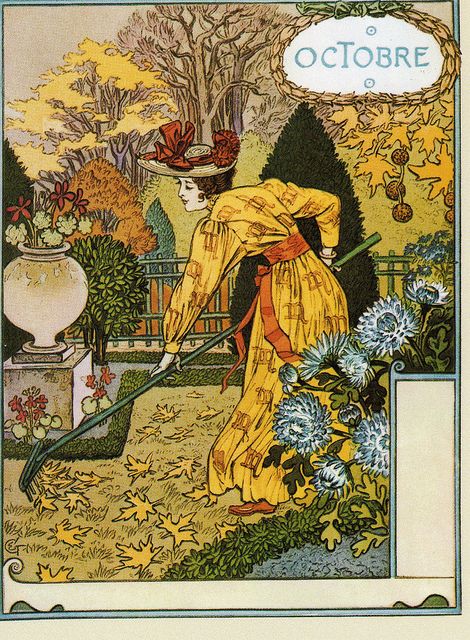
Avril and Octobre, Eugene Grasset, 1896
(images c/o Pinterest)
These decorative panels in which people, specifically women, are used to represent the natural world were some of the earliest moments in poster history where we see a conscious reference to the beauty of the environment.
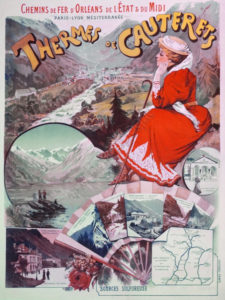
Thermes de Cauterets, M. Pallandre, c. 1890
(image c/o La Belle Epoque Gallery)
By the 1890s, the idea of traveling for health had also become ubiquitous. Hundreds of travel posters boasted the healing properties of being in these remote, beautiful locations focused on outdoor activities and the restorative properties of local spring water. The rather busy poster above promotes a town famous for its thermal sulfur baths in the Pyrenees. While some vignettes in the design focus on the local attractions, most indicate the rich variety of outdoor activities that will benefit your health, from fishing the hiking. So, now it’s all about what the environment can do to benefit you and your health. Nature is good for you!
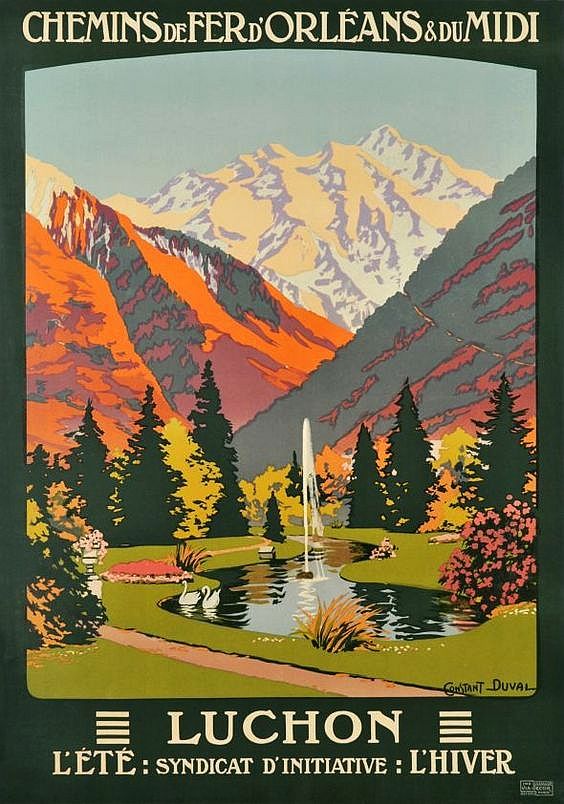
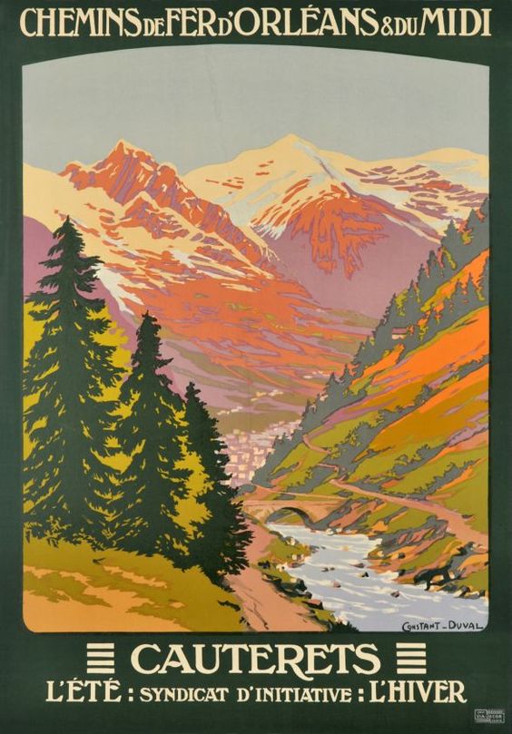
Left: Luchon, Leon Constant-Duval, c. 1920
(image c/o Paris Posters)
Right: Cauterets, Leon Constant-Duval, 1925
(image c/o Pinterest)
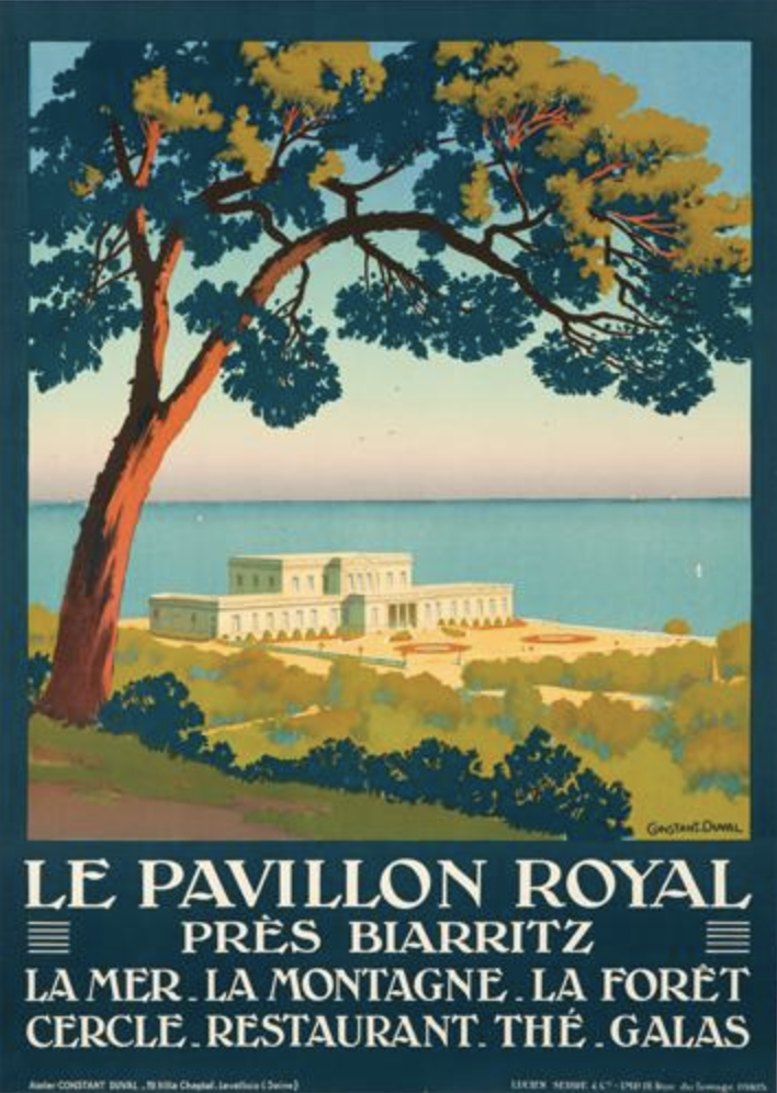
In fact, if you look at travel posters, particularly rail travel posters, from the 1910s and 20s, the main image is almost always a glorious landscape. I know the two posters above are by the same artist, but I find it so funny that they’re almost the exact same composition even though the locations are about two hours apart. And below, in another poster by Duval, even though he’s promoting a resort of sorts, he lists the sea, the mountains, and the forest before listing any of the actual amenities within the building. Nature is selling point.
Le Pavillon Royal, Leon Constant-Duval, c. 1925
(image c/o Pinterest)
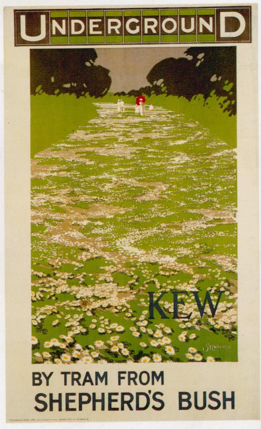
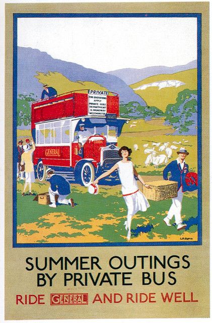
For those who weren’t wealthy enough to summer in spa towns, posters like the two below for London Transport let you know that pastoral landscapes were just a few stops outside the main city. I love the poster on the left for Kew, where the path is literally paved with flowers, as well as the one on the right where a heap of people have left London for a day picnic, complete with pastoral sheep.
Left: Kew, Thomas Charles Weeks, 1913
Right: Summer Outings, L.B. Black, 1926
(images c/o Pinterst)
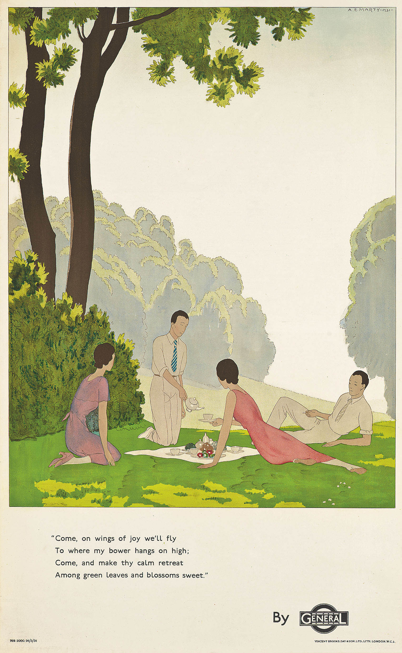
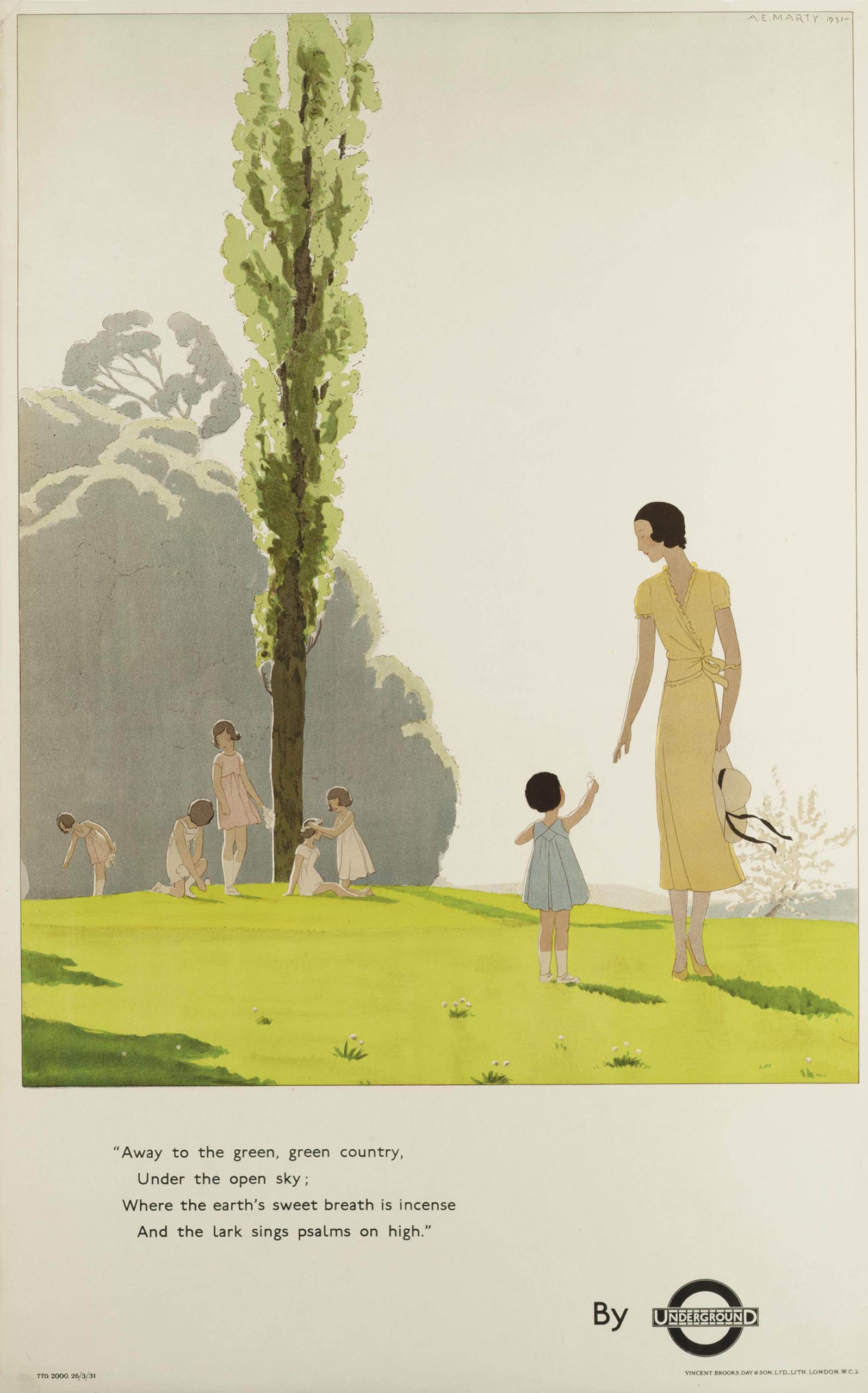
There are also the two posters below, accompanied by poems (which, incidentally, wasn’t uncommon), that emphasize the attraction and human draw to nature. Neither even say where these people are going, but simply that it is “to where my bower hangs on high” or “away to the green, green country.” Nature is now something you should seek out for pleasure, not just health.
Left: On Wings of Joy, Andre Edouard Marty, 1931
Right: Away to the Green, Green Country, Andre Edouard Marty , 1931
(images c/o Christie’s)
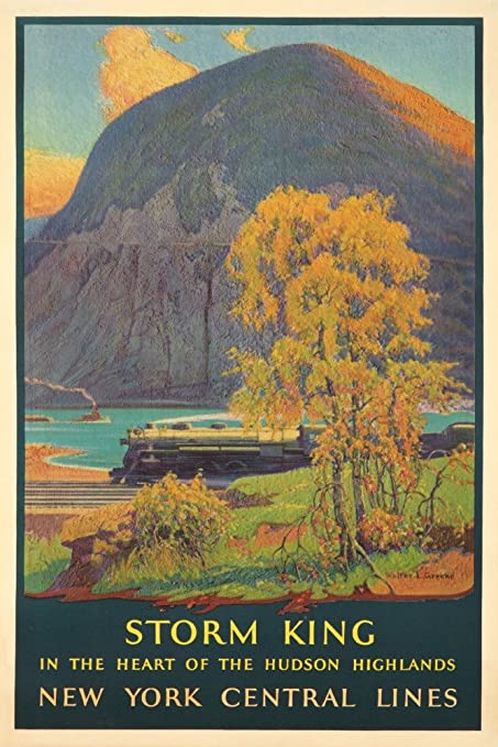
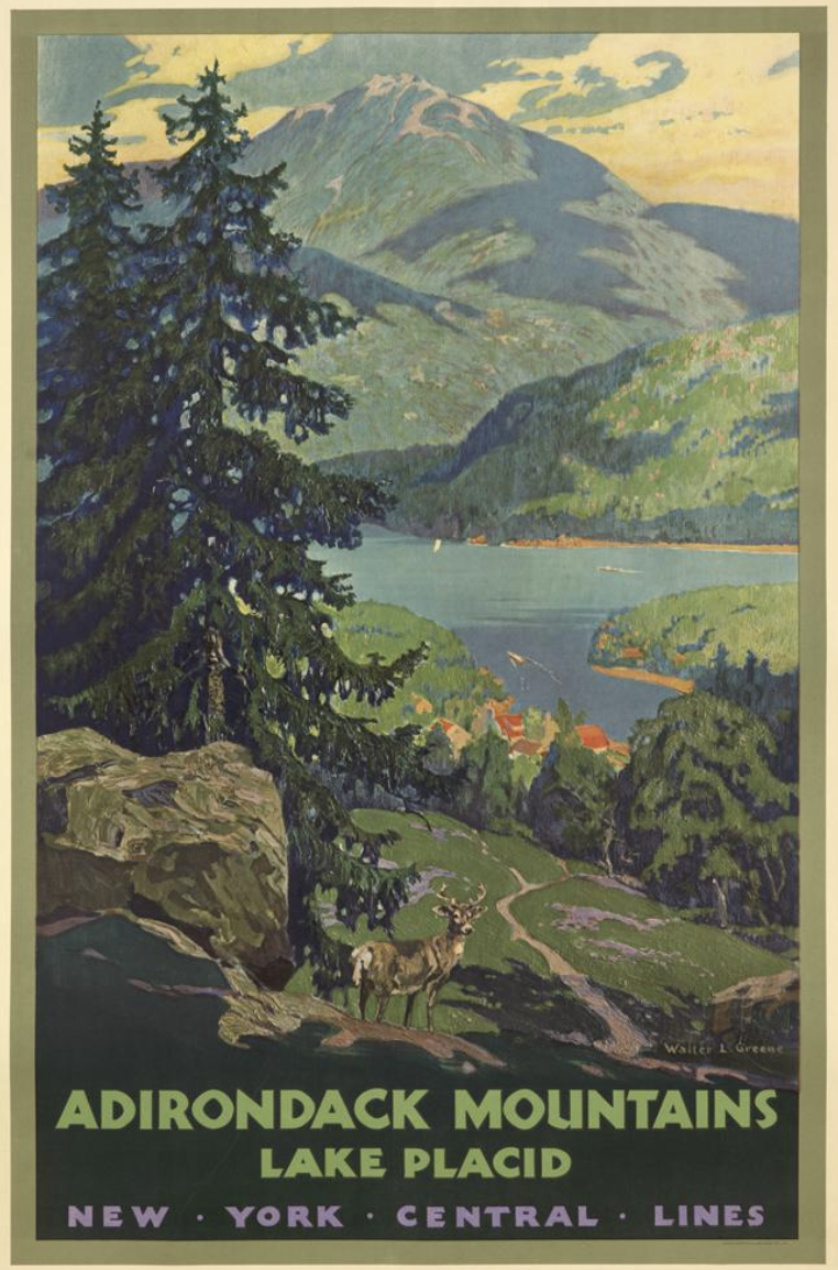
Back in the States, New York Central Line created similar posters, although less about summer idylls and more about the great expanse of the wild American landscape. The two posters below are from around 1928, and seem straight out of the Hudson River School (which, incidentally, went on to inspire a lot of early conservation efforts in the Hudson Valley). And again, the natural, untouched world is what’s being sold as the perfect place to go.
Left: Storm King, Walter L. Greene, 1928
(image c/o Amazon)
Right: Adirondack Mountains, Walter L. Greene, c. 1928
(image c/o Pinterest)
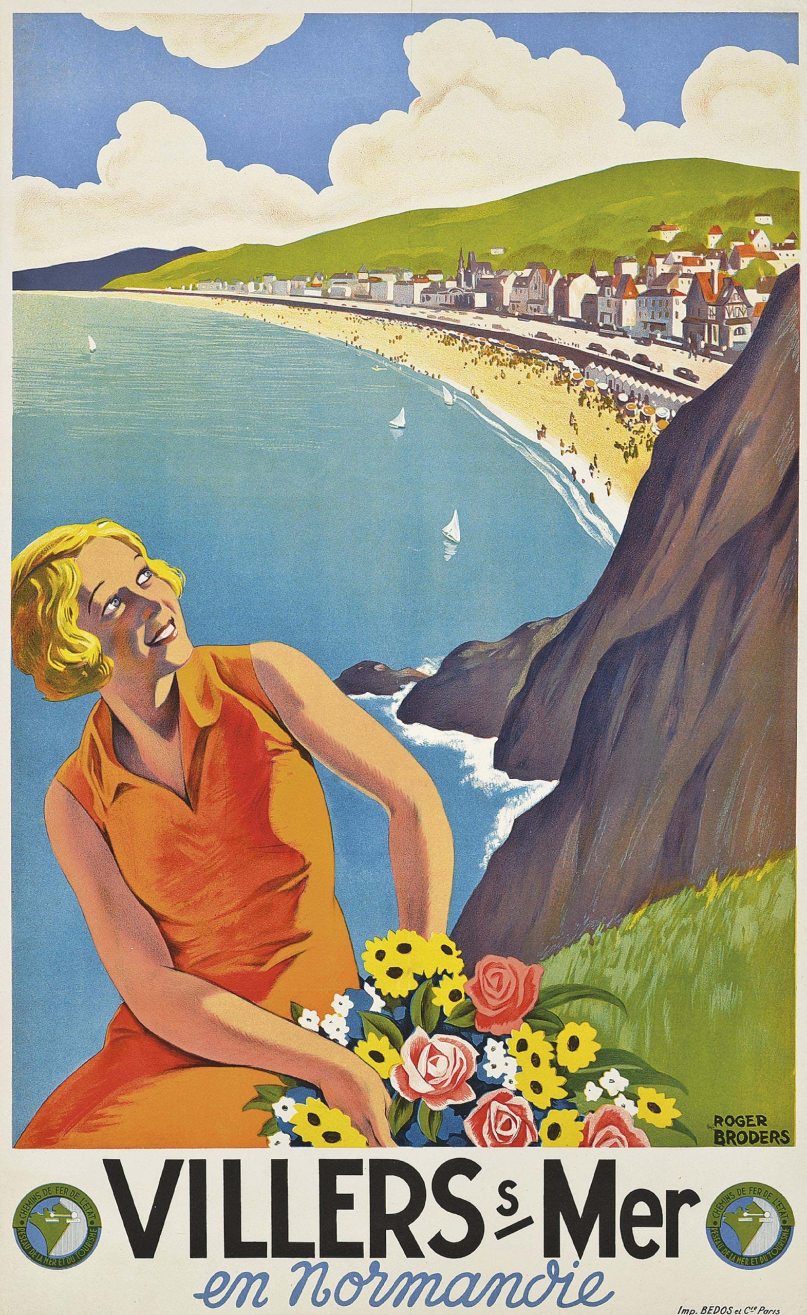
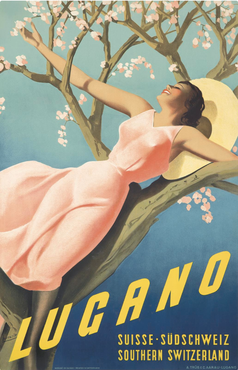
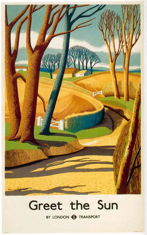
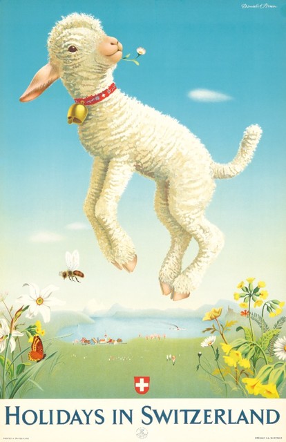
This theme of reveling in nature, be it for health purposes or just for its glorious beauty, would continue in travel posters basically up through the present-day. Certainly, by the 1930s & 40s, it was de rigueur, as can be seen in the wildly different, but thematically similar posters from that time period (shown below).
Villers s. Mer, Roger Broders, 1933
Lugano, Gino Boccasile, 1939
Greet The Sun, Edward Purer Lancaster, 1939
Holidays in Switzerland, Donald Brun, 1945
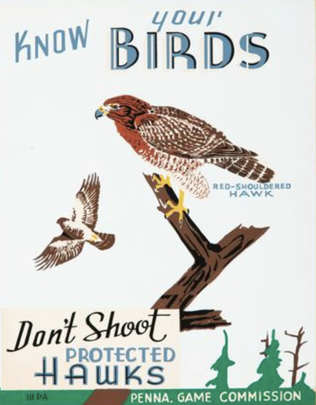
Left: Know Your Birds, Designer Unknown, c. 1935
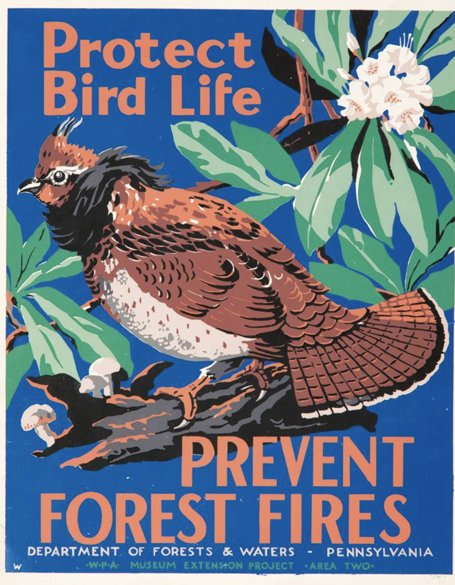
Right: Protect Bird Life, Designer Unknown, c. 1935
(images c/o Pinterest)
The big game changer in the 1930s was the creation of the WPA, which led to an explosion of posters that straight up were about protecting our natural resources. I love these two anonymous images above for the Pennsylvania Game Commission and the Department of Forests & Waters. This is one of the earliest moments we’re told to protect our wildlife by knowing what we’re shooting and not starting forest fires. These posters are now instructional, which is new.
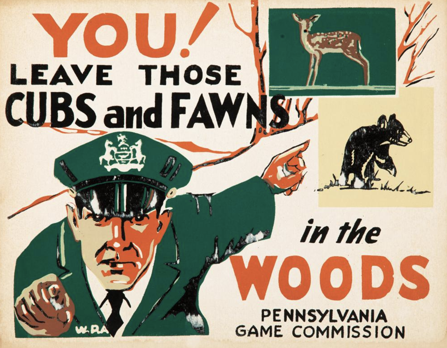
Left: You!, Designer Unknown, c. 1935
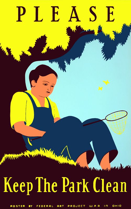
Right: Keep the Park Clean, Designer Unknown, c. 1935
(images c/o Pinterest)
Additional posters from that time period remind us of all sorts of conservation efforts, from not harming cubs and fawns during hunting season to not littering. If you’ve read our previous workshop-related blog post, you’ll remember that WPA-era posters were also incredibly instructional on matters of health and hygiene, so this was clearly a time period very concerned with promoting both civic duty and an increased quality of life overall.
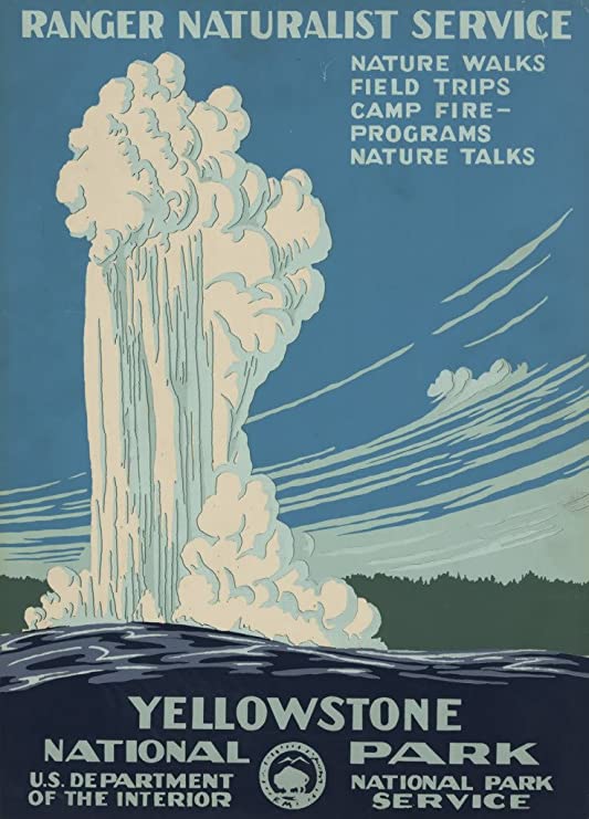
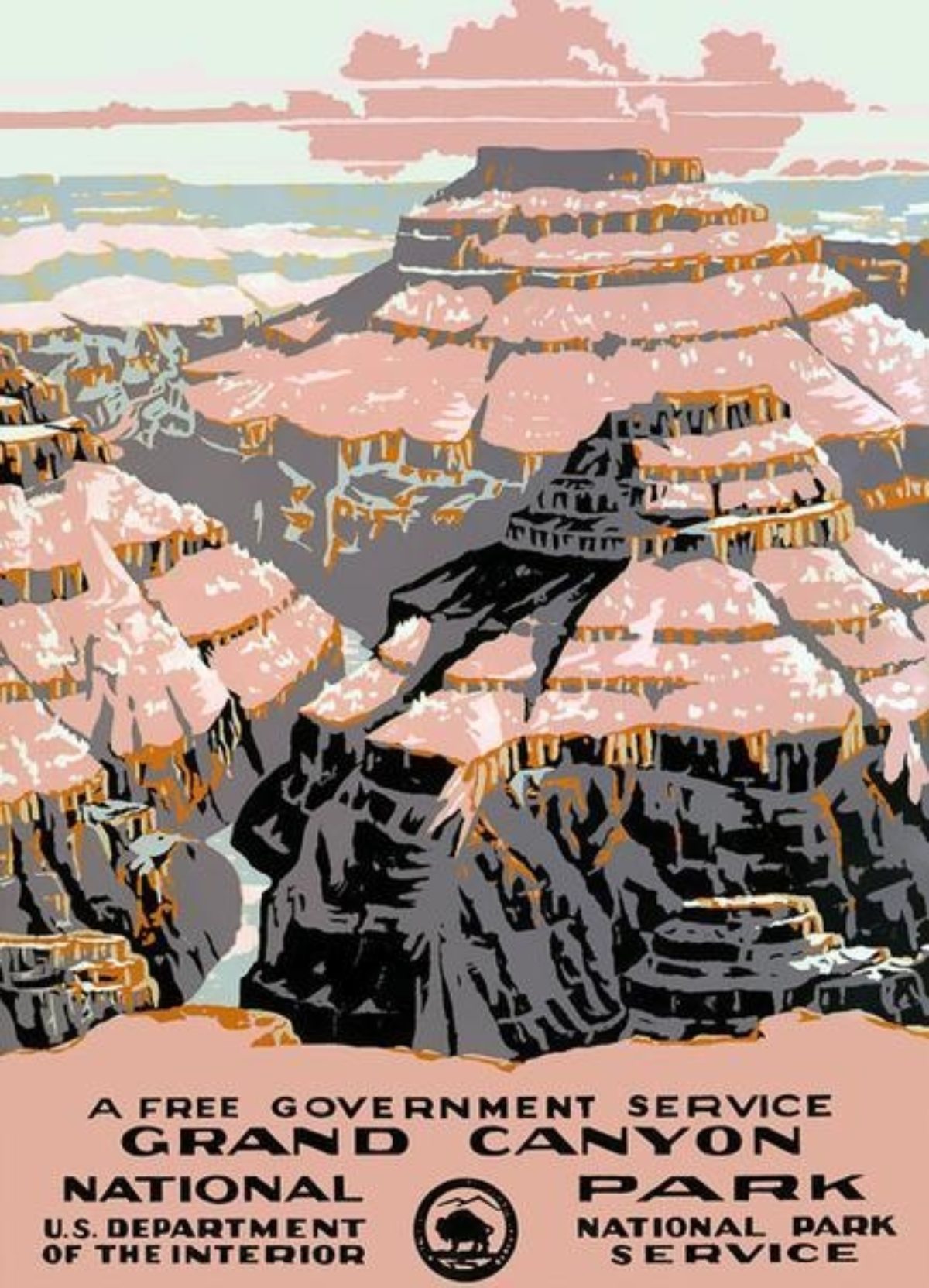
Left: Yellowstone, Chester Don Powell, ca. 1938
Right: Grand Canyon National Park, Chester Don Powell, ca. 1938
(images c/o Amazon)
You could also say that the posters created by the WPA that celebrate our National Parks are a continuation of those 1920s travel posters, wherein we are overwhelmed by awe-inspiring vistas that tempt us to visit them and to also preserve their beauty for future generations.
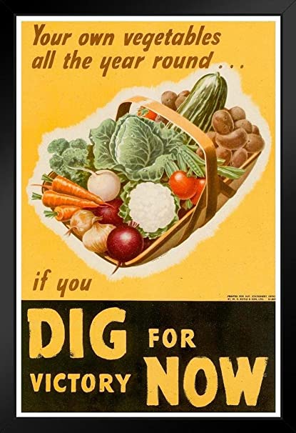
Left: Food is a Weapon, Designer Unknown, 1943
(image c/o The Observer)
Right: Dig for Victory Now, Irene Mitchell, c. 1943
(image c/o Amazon)
During World War II, the concept of nature as a finite resource became more of a focus in posters. In addition to all the propaganda asking people to produce more goods and services for the war effort, there were also a string of posters that reminded us to conserve everything from water to food, and even to grow our own food.
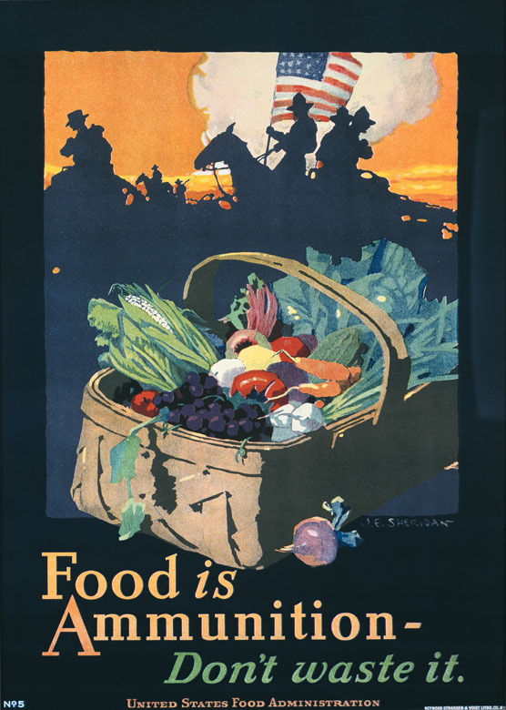
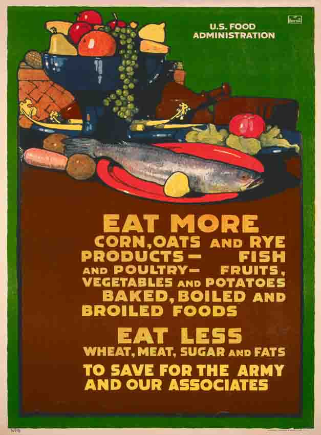
Left: Food is Ammunition, J.E. Sheridan, c. 1918
Right: Eat More, L.N. Britton, 1917
(image c/o Poster House Permanent Collection)
This had also been a theme in posters during World War I, shown above. Now, none of these posters are at all about saving the planet, but they do keep reminding everyone of the simple benefits of the earth, which is a theme that really only pops up before the 1960s in times of crisis. And that’s really interesting—we only seem to care when there’s a problem.
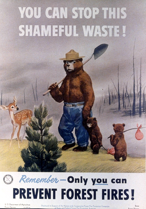
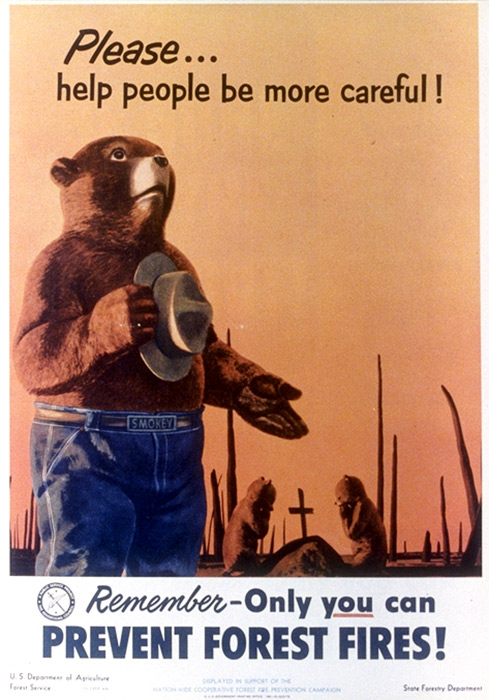
Left: Prevent Forest Fires, Designer Unknown, 1950
Right: Prevent Forest Fires, Designer Unknown, 1953
(images c/o smokeybear.com)
One exception to this observation is the iconic Smokey the Bear, born in 1944 to encourage people to be more careful when out in nature. You’ll remember him from my PSA blog post a few weeks ago. He’s clearly a popular poster bear!
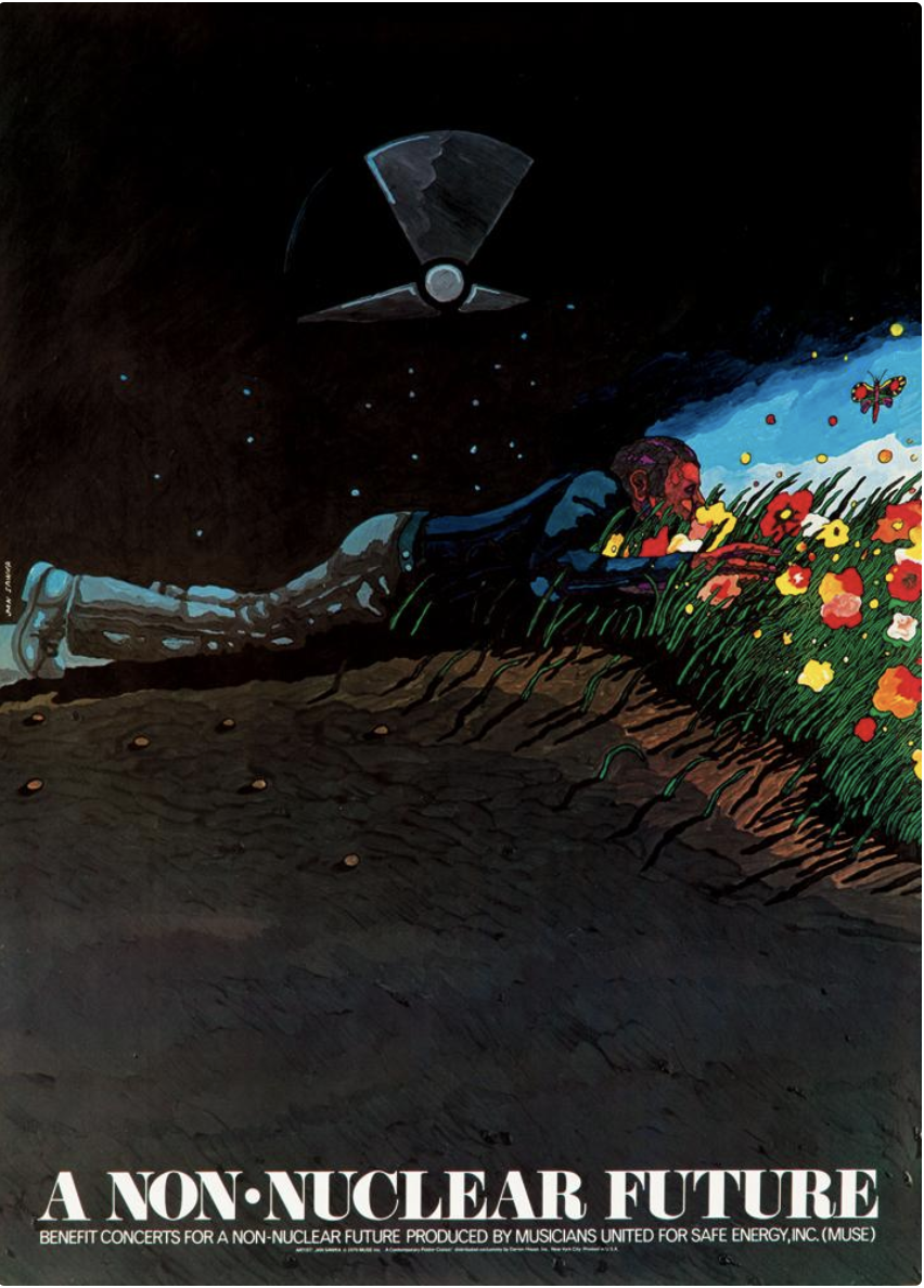
Left: A Non-Nuclear Future, Jan Sawka, 1979
(image c/o Pinterst)
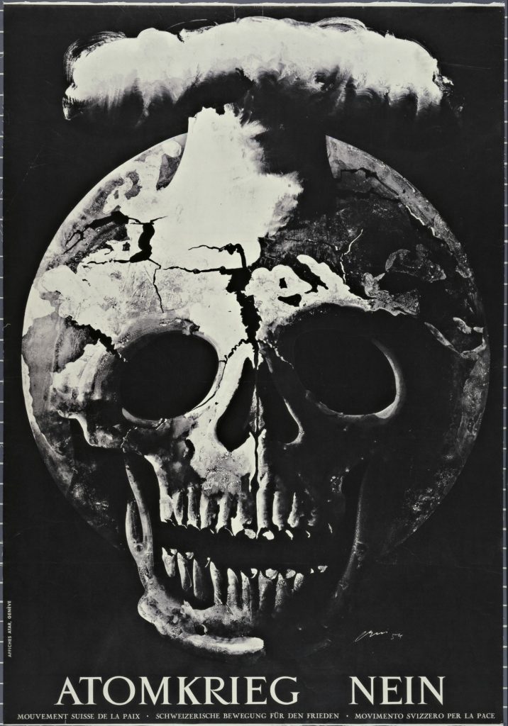
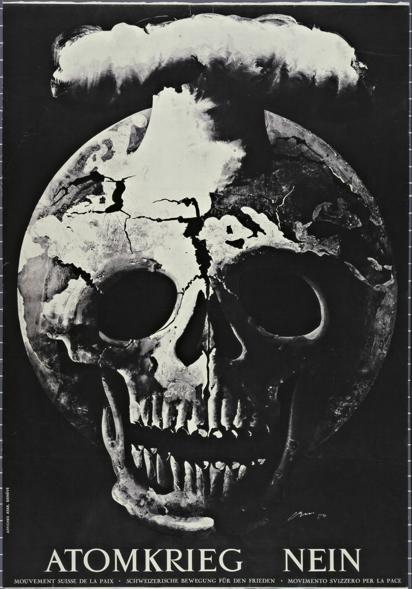
Right: Atomkrieg Nein, Hans Erni, 1954
(image c/o MoMA)
With a few earlier exceptions (like the Hans Erni poster above), the 1960s is the first era in posters wherein we are consciously focused on the dangers of pollution and the idea of humans negatively impacting the environment on an international scale. A lot of this is the result of nuclear testing and its awful side effects. This is also a time period where we saw environmental disasters like oil spills getting national news coverage, and best sellers like Silent Spring making people think more about their surroundings and how they can be better stewards of the planet.
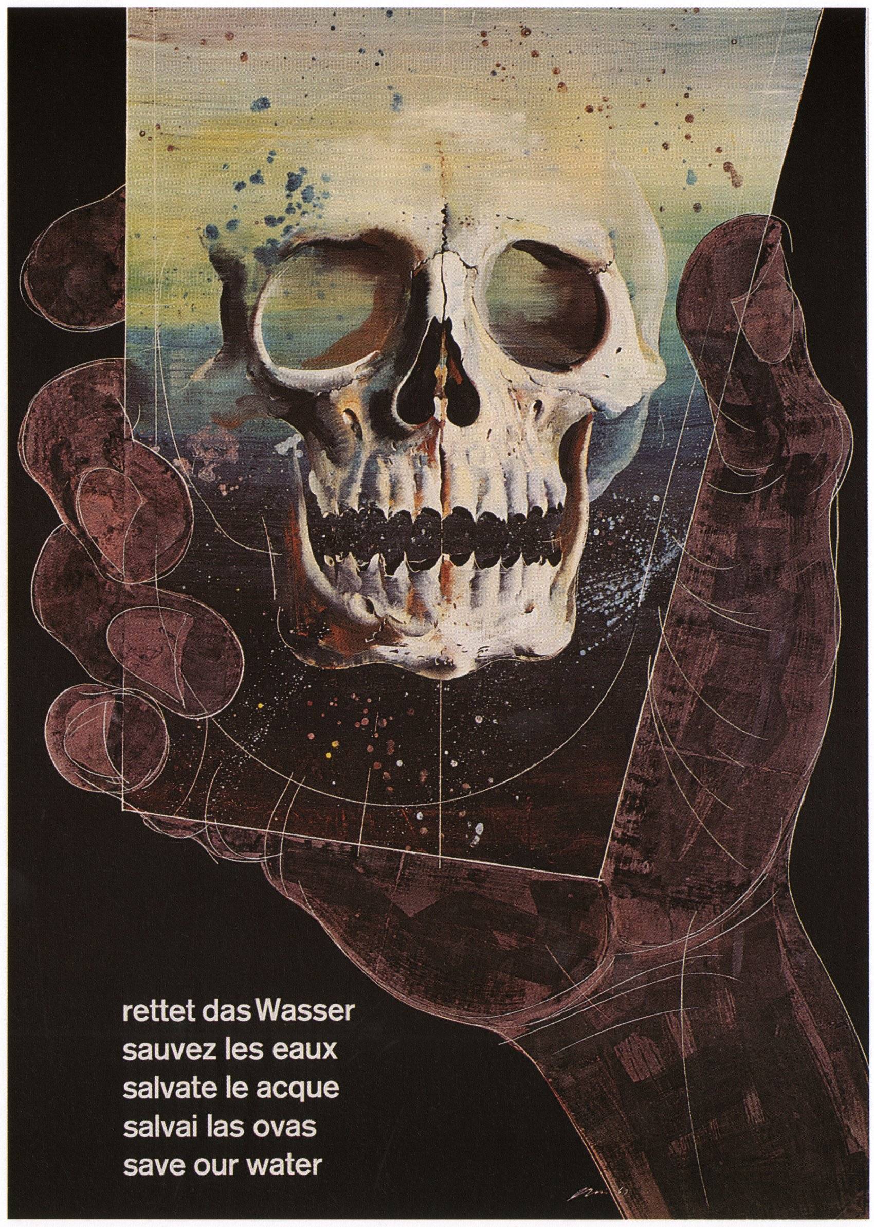
Right: Save Our Water, Hans Erni, 1963
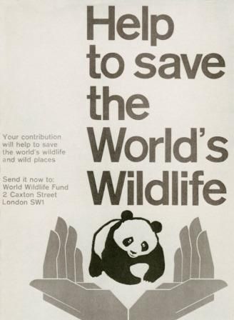
Left: World’s Wildlife, Designer Unknown, 1961
(images c/o Reddit)
You’ll see environmental posters from this period moving forward as generally fitting within two categories: anti-nuclear (which, essentially, are also anti war posters) and posters focusing on resource conservation and preservation. There are a lot of skulls. Incidentally, the World Wildlife Fund was established in 1961, and the image above was their first poster.
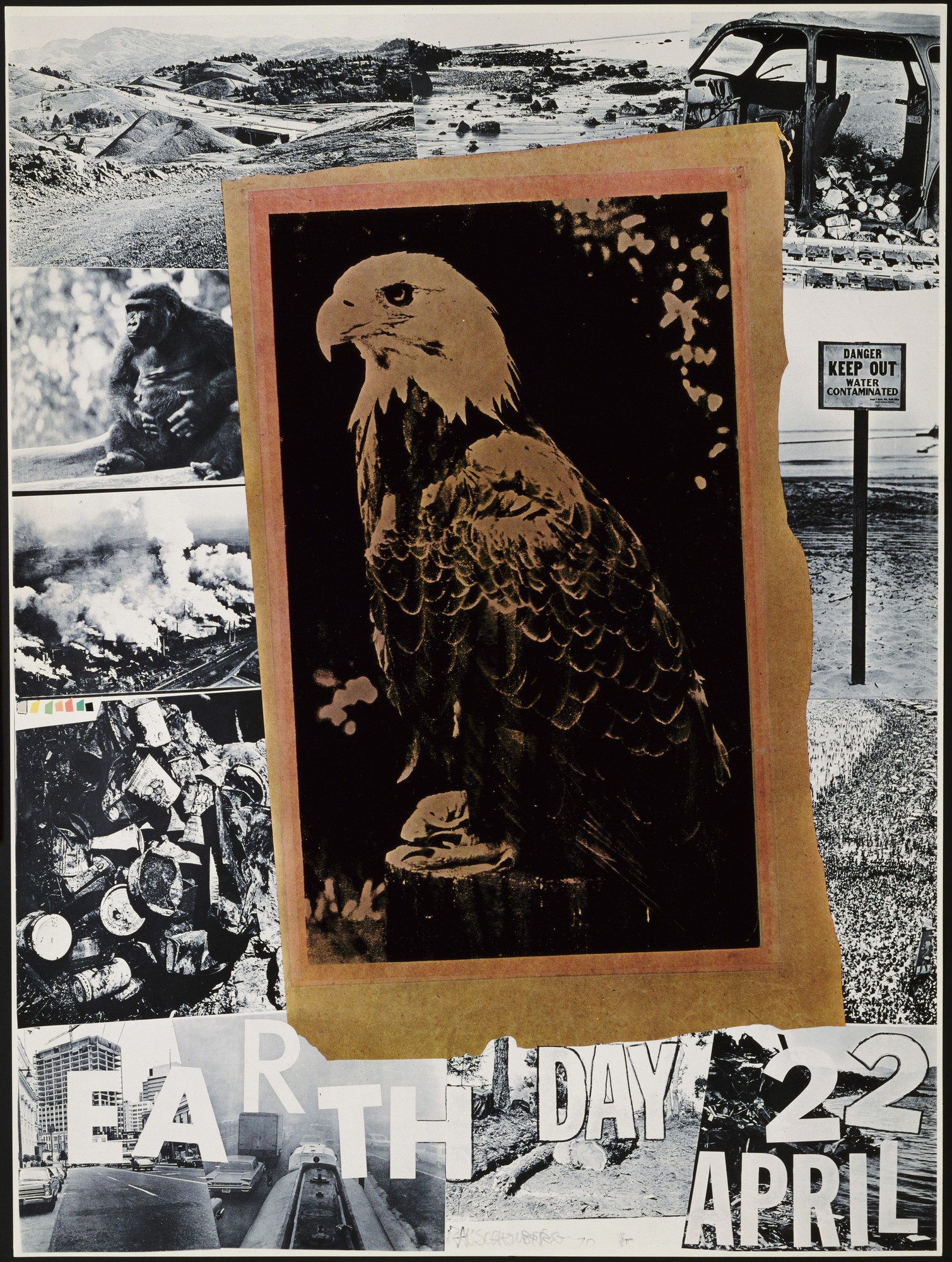
Earth Day, Robert Rauschenberg, 1970
(image c/o MoMA)
Then, in 1970, Earth Day is born and posters get serious about the environment. In fact, they get celebrity serious because Robert Rauschenberg creates the very first Earth Day poster (shown above).
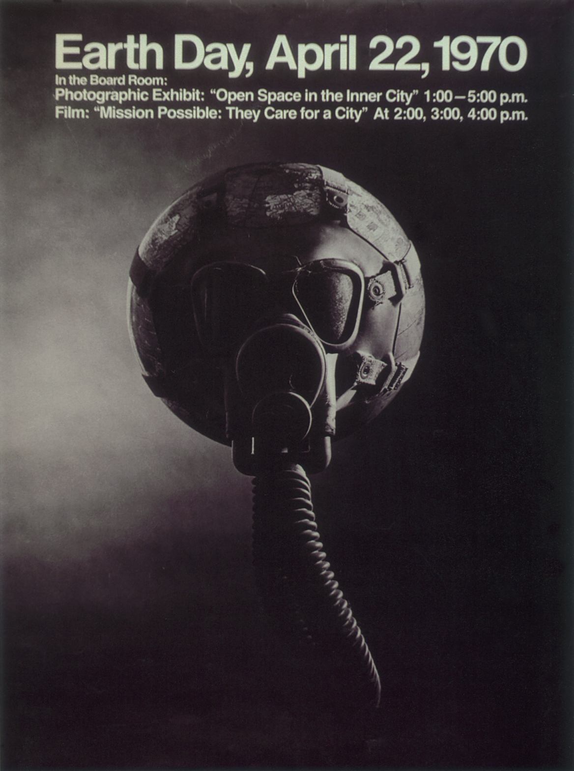
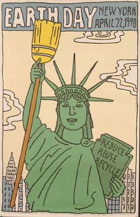
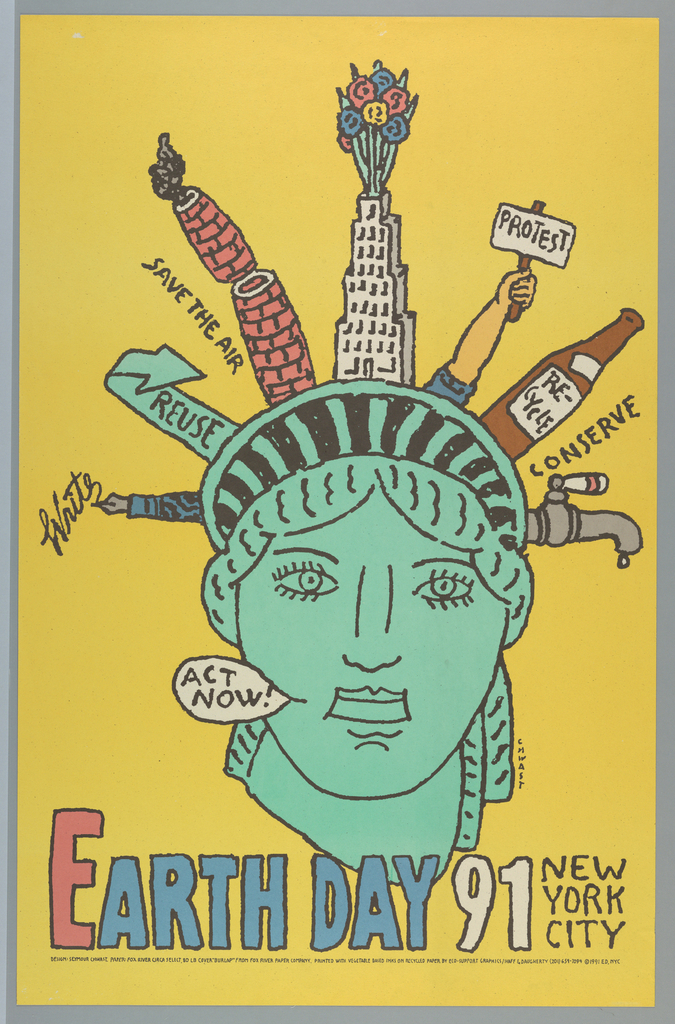
Earth Day, Robert Leydenfrost & Don Brewster, 1970
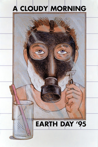
Earth Day, Seymour Chwast, 1990, 1991, & 1995
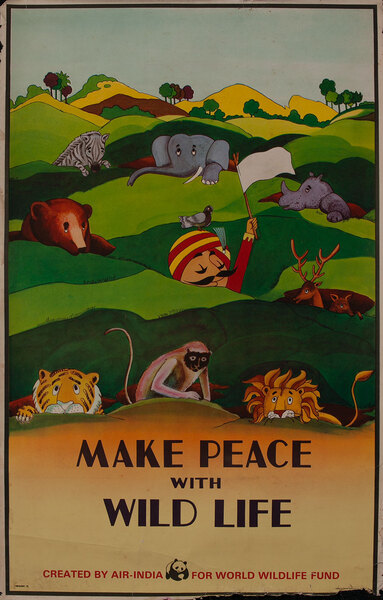
From then on, you get hit after poster hit of designs drawing attention to saving the planet, typically focusing on cleanup and beautification or the dangers of pollution. It even becomes sexy for big corporations to promote environmental issues, like the poster below by Air India.
Make Peace with Wildlife, Designer Unknown, 1975
This is also the time when Greenpeace is founded, and suddenly ecology is not just trendy, but fashionable and sexy, as can be seen in the psychedelic-inspired posters below. The continuation of this fad is probably best seen today in the fact that going green has become so expected that “greenwashing” has become a thing in advertising.
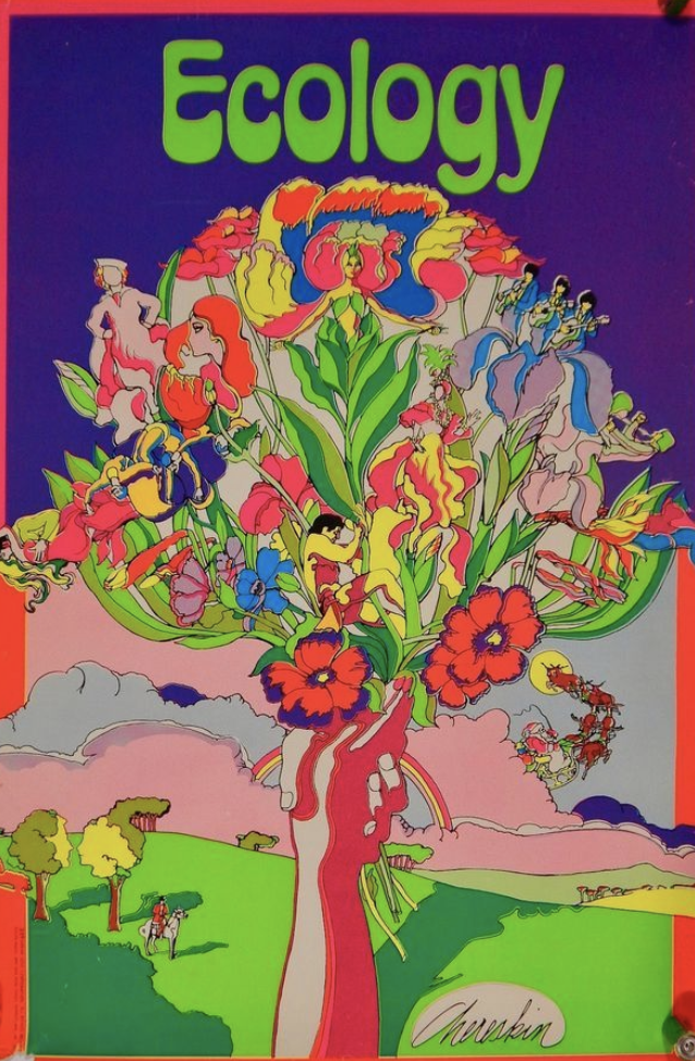
Left: Ecology, Ron Chereskin, c. 1973
(image c/o Pinterest)
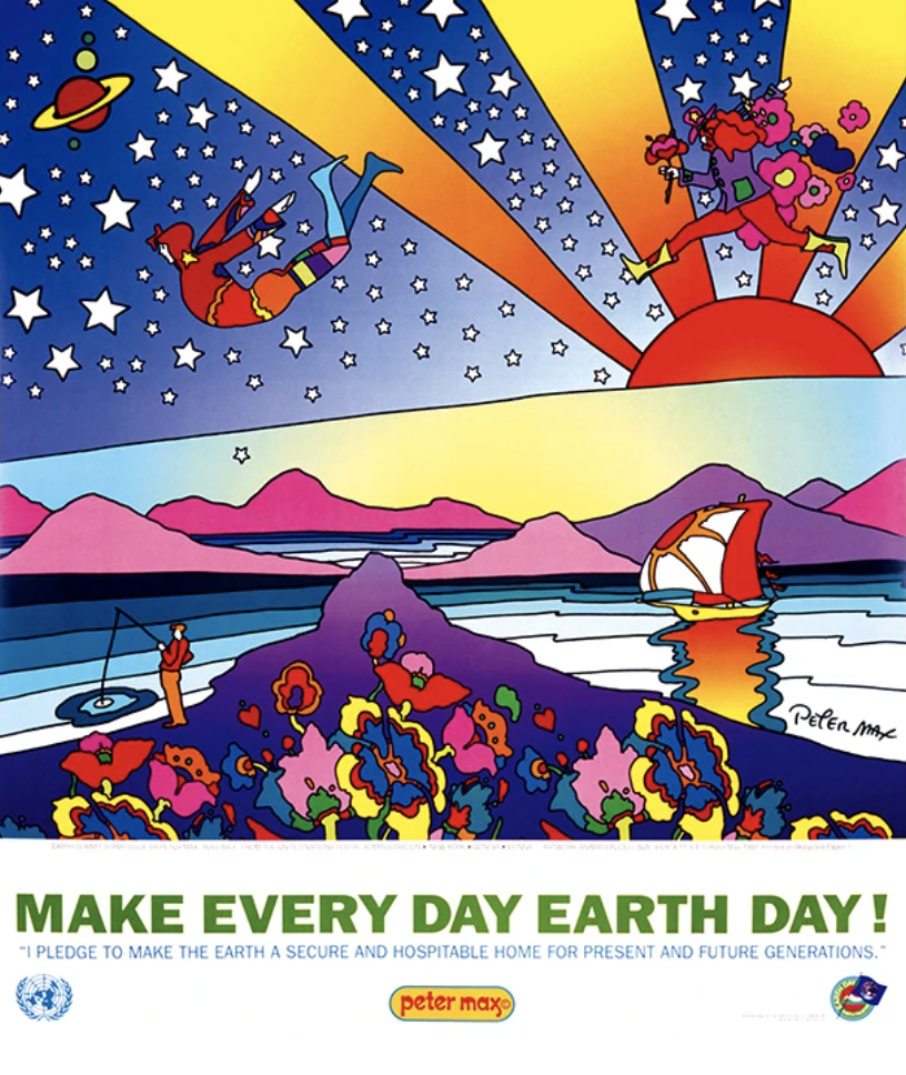
Right: Make Every Day Earth Day, Peter Max, 1992
(image c/o the artist)
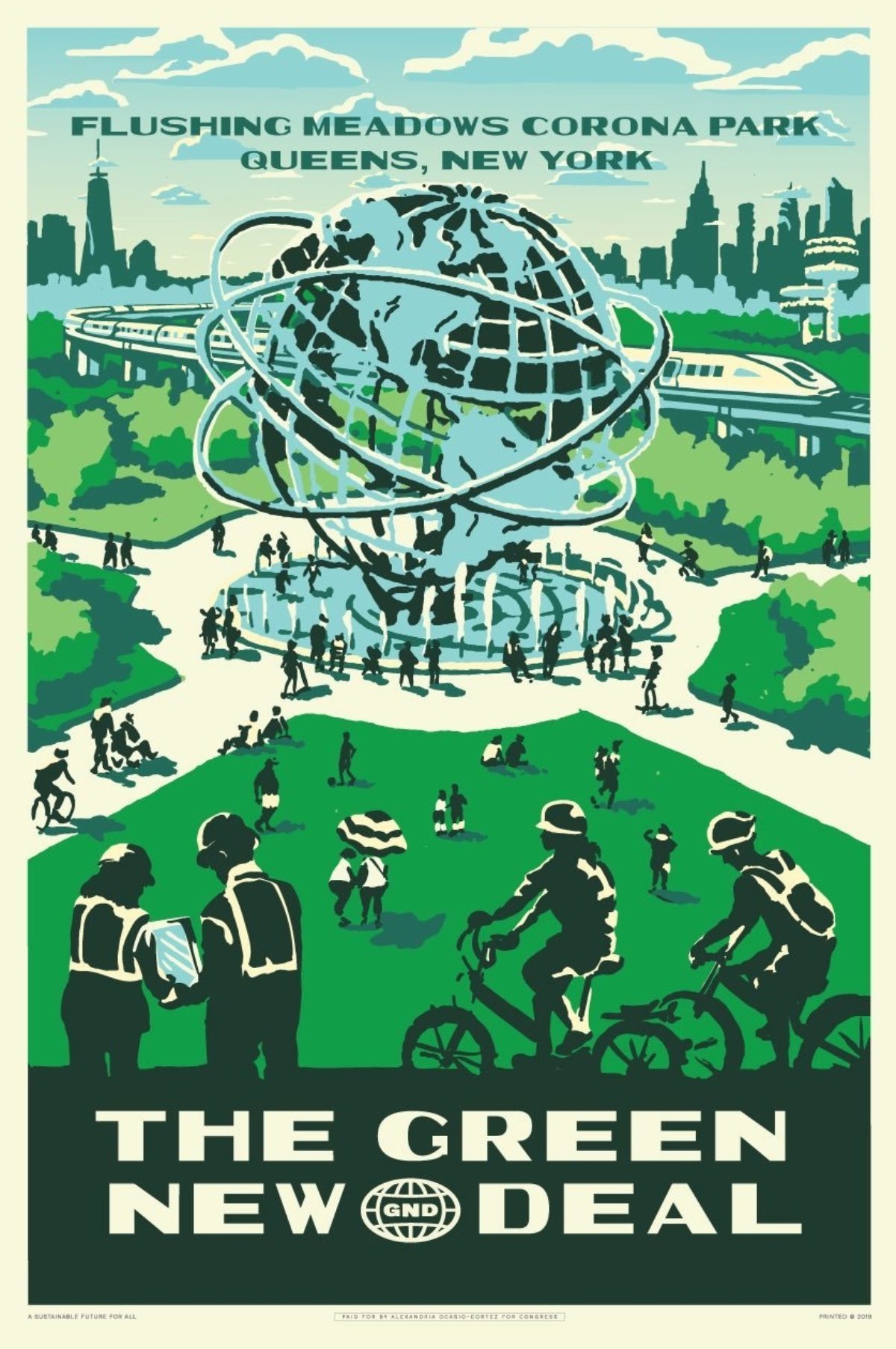
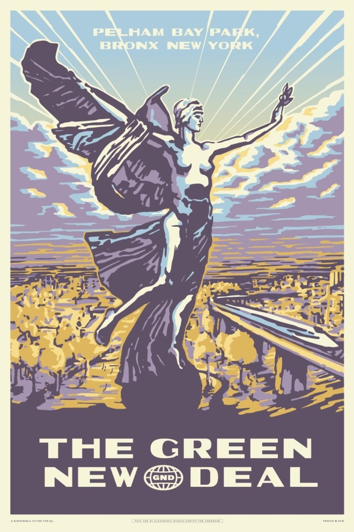
Obviously there are a zillion other examples of posters that deal with nature and its preservation, but I’m going to leave you with two of the most nationally-recognized environmental posters of the past year. They are part of the series put out by Alexandria Ocasio-Cortez in promotion of The Green New Deal. I’ve done an entire blog post on these already, but suffice it to say you can see a lot of influence from those early WPA posters in how the design team at Tandem has decided to promote this environmental cause. What’s perhaps most interesting is that these posters are no longer just about the great expanse of undisturbed wilderness or what you can do to help, but really about man living in harmony with nature—sort of an ideal, utopian vision of the future.
Left: The Green New Deal/Corona Park, Tandem, 2019
Right: The Green New Deal/Pelham Bay Park, Tandem, 2019
(images c/o Tandem)