


In October 1964, a 23-year-old Swiss artist and graphic designer named Gérald Zahnd arrived in Montreal. He was full of dreams and hopes for a great career in the New World and soon made new friends who helped him find work with architects on various public art projects. By April 1967, his monumental sculptures for public and private institutions had made the first page of the Canadian magazine Architecture Bâtiment Construction. Then, in 1968, he was introduced to people in the local theater world. The best was yet to come.
This was a critical moment in Quebec’s history; in 1960, the Liberal Party had come to power, introducing the “Quiet Revolution.” The new government had embarked on an accelerated modernization of Quebec society, one that included an unprecedented investment in the arts that ultimately led to a cultural flourishing. The theater community was among those that benefited from this. Zahnd became the right person in the right place at the right time, and quickly began to create posters for some of the most avant-garde theaters in Montreal: the Centre du Théâtre d’Aujourd’hui, the Théâtre du Rideau Vert, the Théâtre Populaire du Québec, and the Théâtre du Nouveau Monde.
Les belles soeurs (1968), by Gérald Zahnd
Image Source: Gérald Zahnd
These theaters presented classics reinterpreted by up-and-coming directors as well as contemporary plays that revolutionized the conventions of dramatic writing. In 1968, for the Théâtre du Rideau Vert, Zahnd created the first poster for Les Belles-soeurs (The Sisters-in-Law) by Michel Tremblay, a young unknown who would go on to become one of Quebec’s most important playwrights. Les Belles-soeurs became his signature play, and was subsequently performed thousands of times around the world. It was translated into many languages, with a musical version produced in 2010, a cinematographic interpretation in 2024, and a symphonic interpretation in 2025.
Zahnd studied at Swiss schools of design where he learned about the basic elements of a good poster: it must be an attractive, high-quality composition that instantly communicates a simple idea and includes typography that clearly reinforces the message. He was not, however, a strict follower of the precepts of the Swiss School of graphic design (also known as the International Style).
Les posters (1968), by Gérald Zahnd
Image Source: Gérald Zahnd
Zahnd favored illustration and did not hesitate to break with the rigidity of the highly structured graphic grid that largely defined the posters of the Swiss School. He also drew on Pop art and Cubism in his designs, sometimes dabbling in abstraction, incorporating touches of humor, and exploiting the vibrant colors offered by screen printing.
As the publicity budgets of Montreal theaters at the time were limited, most of Zahnd’s posters, intended to hang in their lobbies or on the walls of local restaurants, cafés, and shops, were screen-printed by hand on paper or light cardboard in small sizes (generally 45 x 65 cm) in runs of only 25 to 50. Moreover, the style of these posters varied depending on the theater, reflecting the spirit of its management, the available budget, and the nature of the advertised play.
Left: Tabarin (1969), by Gérald Zahnd
Image Source: Collection of Marc H. Choko
Right: Tango (1969), by Gérald Zahnd
Image Source: Gérald Zahnd
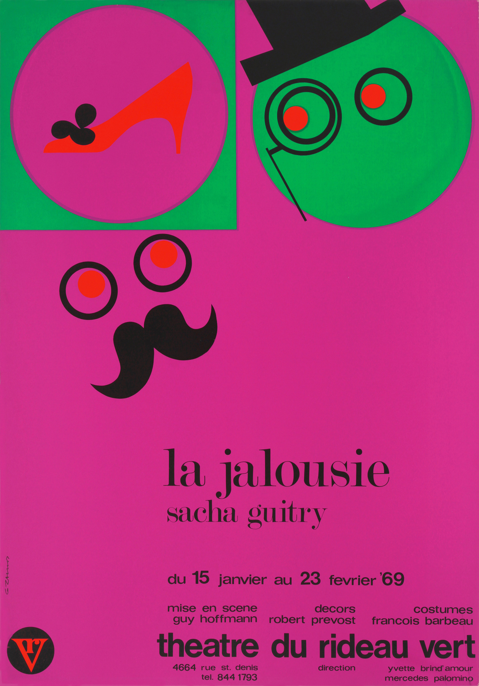
In his posters for the collectively run Centre du Théâtre d’Aujourd’hui, for which Zahnd worked as a designer in 1968 and 1969, the title of the play and a simple image occupy most of the space. The address of the theater is barely visible but the visual impact of these small posters was powerful.
Left: La jalousie (1969), by Gérald Zahnd
Image Source: Gérald Zahnd
Right: Le contrat (1969), by Gérald Zahnd
Image Source: Gérald Zahnd
Zahnd also designed a new logo, publication covers, programs, and anniversary brochures for the Théâtre du Rideau Vert.
In his posters for the Théâtre du Rideau Vert, in contrast to his compositions for some of the other theaters, the designer had to include the names of the cofounders and artistic directors, Yvette Brin’Amour and Mercedes Palomino, as well as that of the author, the director, the name of the theater, and, later on, those of some of the technicians and actors. Zahnd designed these joyful, colorful compositions that were then produced by the screen-printing master Tomatsu (Tom) Yamamoto in Montreal.
Left: Black comedy (1970), by Gérald Zahnd
Image Source: Collection Marc H. Choko
Right: Dreyfus (1976), by Gérald Zahnd
Image Source: Gérald Zahnd
The designer produced theater posters in Montreal between 1968 and 1979, and experienced a great deal of creative freedom during this period. Gradually, however, increasing financial constraints meant that he was forced to limit the colors in these compositions to three, and, finally, to only two.
Left: Une soirée en octobre (1975), by Gérald Zahnd
Image Source: Gérald Zahnd
Right: Le temps d’une vie (1976), by Gérald Zahnd
Image Source: Gérald Zahnd
Another venue, the Théâtre Populaire du Québec, hired Zahnd sporadically between the late 1960s and the mid-1970s. In these posters, the designer was restricted to two colors from the very beginning and he systematically used photography in compositions in which more classic typography and the grid system prevailed.
Left: Mistero Buffo (1973), by Gérald Zahnd
Image Source: Gérald Zahnd
RightLeft: Ubu (1974), by Gérald Zahnd
Image Source: Gérald Zahnd
In 1973, Zahnd began working for the Théâtre du Nouveau Monde. Like the Théâtre du Rideau Vert, it remains a popular venue in Montreal. The designer was also restricted to two colors here and was required to integrate a great deal of informational text. Zahnd chose much more playful styles of illustration and typography as well as dramatically contrasting colors to maximize their attractiveness.
Between 1968 and 1979, Zahnd created more than 130 posters for the four main theaters in Montreal, the most exceptional output of its kind in Quebec’s history.
At the same time, he worked as a graphic designer for film and audio-visual distribution agencies, engineering groups, insurance companies, and many of his friends, producing brochures, annual reports, invitation cards, logos, and other printed materials. After 1979, he gradually abandoned graphic design and began to devote himself solely to the painting that he had always worked on.
Since Zahnd had never belonged to a formal group or movement of graphic designers and had neither participated in the highly publicized graphic production for Expo 67 (the 1967 Montreal World’s Fair) nor the 1976 Montreal Olympics, his posters and graphic work were eventually forgotten.
Want to know more about Gérald Zahnd? Check out Z comme Zahnd (Montréal: Éditions Somme toute, 2025) by Marc H. Choko.
Marc H. Choko is professor emeritus at the Université du Québec à Montréal School of Design. He is passionate about posters and graphic design, is the author of some fifteen books, and has curated around one hundred exhibitions in Quebec and in a dozen countries. He is an honorary member of the Quebec Society of Graphic Designers (2013) and a founder of the Quebec annual graphic students social poster competition (since 2014).