In The Shop: Paula Scher

While our galleries change over from Mucha and Cyan to Ghana the Women’s March, the Shop is presenting a capsule collection and sale of some of Paula Scher’s best poster designs for The Public Theater.
Paula Scher is one of the most influential graphic designers in the world. Described as the “master conjurer of the instantly familiar,” Scher straddles the line between pop culture and fine art in her work. She began her career as an art director in the 1970s and early 80s, when her eclectic approach to typography became highly influential.
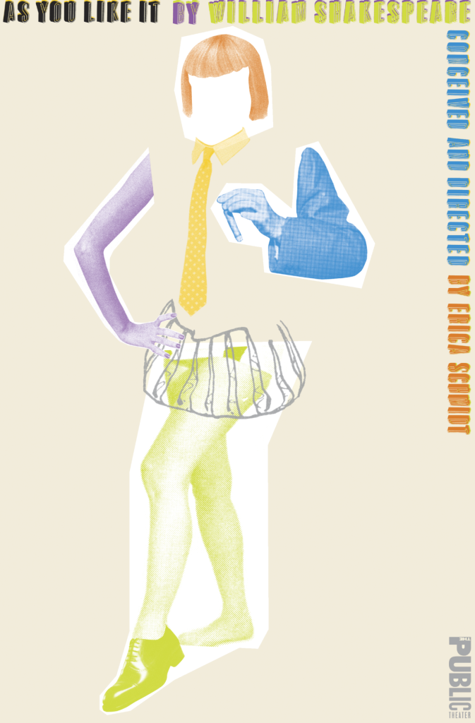
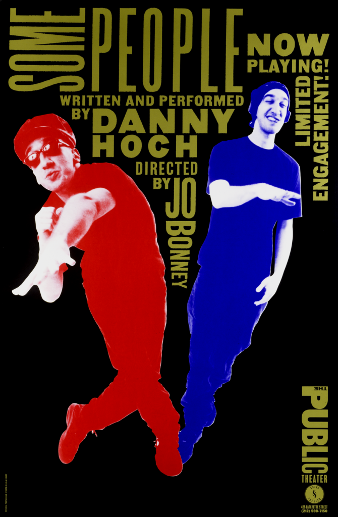
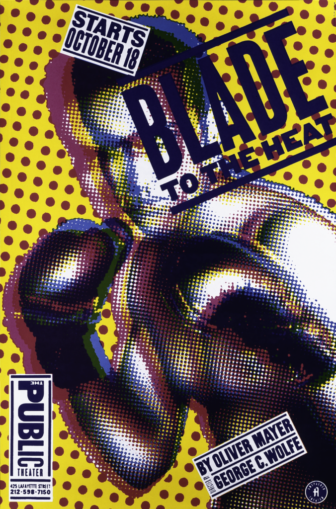
In 1994, Paula Scher was tasked with rebranding The Public Theater, a New York-based cultural institution with a mission to show theater that is “artist driven, radically inclusive, and fundamentally democratic.” Scher used typography in dynamic and exciting ways to create a vibrant identity for The Public that is instantly recognizable. Relying on a combination of bold, sans-serif type and sharp, simple images, the posters reflected the pulse of the city and the dynamism of The Public’s productions.
Scher also created the logo and identity for Poster House utilizing unique typeface. Designed to function like a frame, the Poster House logo uses a custom font that evokes design styles throughout history from Art Deco to 70s display type. Scher has created iconic identities for major museums such as MoMA, The Cooper Hewitt, and The Philadelphia Museum of Art.