

David Bownes is the former Head of Collections at London Transport Museum, Director of Collections at the National Army Museum, and the author of several books on poster history.
A fashion-conscious visitor to the Swinging London of the late 1960s could hardly have missed the achingly cool ad campaigns for leading women’s shoe retailer T. Elliott & Sons. From giant billboards to “car cards” in Tube trains, trendy graphics and innovative product photography helped establish the brand as the hottest footwear in town. Elliotts’ chic credentials were enhanced by a stellar client list that included 60s icons Lulu and Britt Eckland, and by frequent features in high-end magazines.
But it hadn’t always been the case. The transformation of Elliotts from traditional shoemakers to cultural trendsetters was due to the company’s far-sighted and early adoption of styles and selling techniques aimed at the new, youth-centered market.
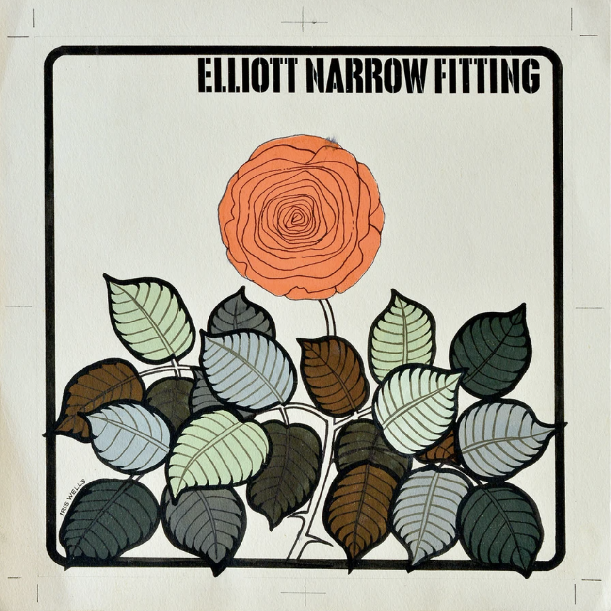
Flyer, Iris Wells, c. 1964
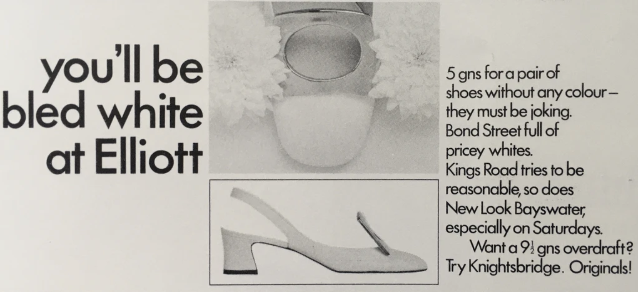
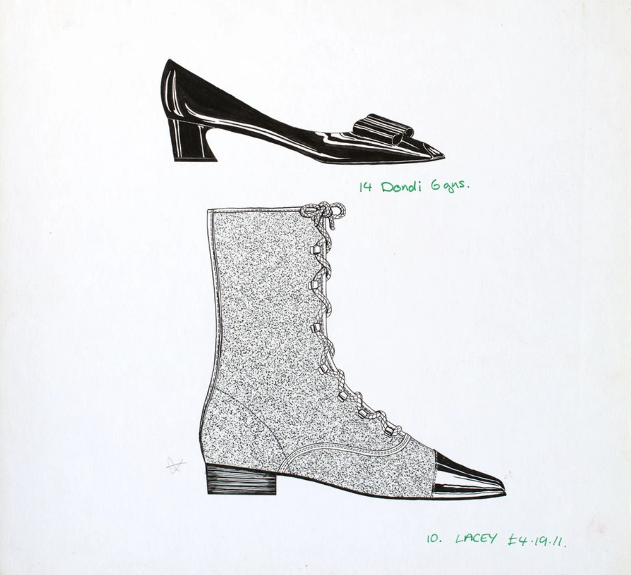
Before the mid-60s, Elliott was principally known for selling high-quality women’s shoes in narrow fittings—a speciality retained into the 1970s. From flagship stores in Westbourne Grove and Knightsbridge, the long-established family business served a largely upper-middle class clientele. Brochures from this time show Aubrey Hepburn-esque models parading the company’s footwear in Mediterranean locations with court shoe styles predominating those on offer.
Brochure, Iris Wells, 1964
Quite why the company changed focus in the mid-60s is unclear; but, a new approach to advertising is apparent from about 1962/3, when the company hired the London Ad agency Foley Brickley & Partners to manage its campaign. At first, flyers and catalogues followed traditional lines, but under the artistic direction of Bob Wright and with designs by Iris Wells and Paul Christodoulou, the company’s publicity started to take a more radical turn.
New product lines were targeted directly at a younger, hipper audience. An early example of this approach can be seen in Christodoulou’s poster for the company’s Bond Street store, tellingly marketed as a trendy boutique, which opened in 1963.
Elliott, Paul Christodoulou, 1963
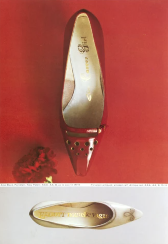
Central to Elliotts’ revived range and advertising campaign was the re-introduction of the fashion boot for women, inspired by the contemporary passion for Victoriana and Art Nouveau. This appreciation of the zeitgeist was to set the tone for the company’s future publicity, and ensured that Elliott products were rarely off the pages of fashion magazines. The super model Jean Shrimpton, for example, was photographed for Tatler in October 1964 wearing a pair of “Victorian Granny lace-up boots in black reversed calf…from Elliott Narrow Fitting Shops.”
Brochure illustration, Iris Wells, 1966
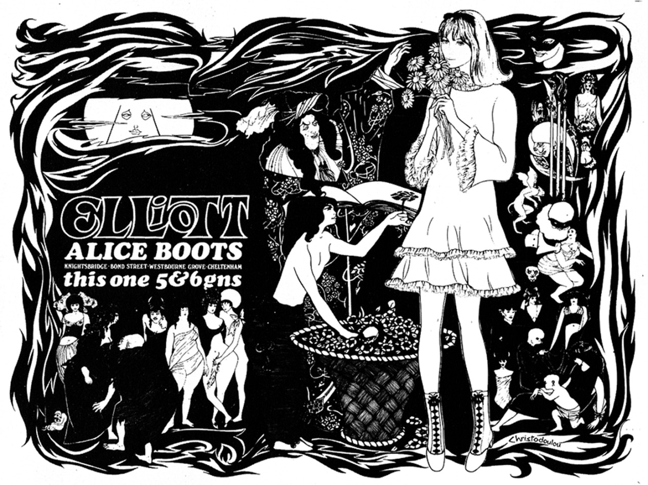
The launch of the popular Alice boot in 1966—another Victorian-style throwback—offered even greater opportunities to connect with youth culture. Christodoulou devised a strikingly trippy poster for the new boots, featuring surreal illustrations by Aubrey Beardsley (1890s) and a Twiggy-like “Alice.” The oblique reference to Lewis Carroll’s Alice in Wonderland, with its drug-friendly 60s subtext, would not have been lost on the target audience. Copies of the poster were available to the public for 5 shillings in testimony to its on-trend appeal.
Elliott Alice Boots, Paul Christodoulou, c. 1966
The retro “Victorian” look, as re-imagined for the 60s generation, was developed in Elliotts’ wider publicity. Magical fairies and mysterious plants complemented the Alice campaign, while sales catalogues bristled with medieval maidens promoting the “Pre Raphaelite-Collection.”
Innovation in direct-mail marketing also saw the introduction of well-designed promotional material, such as playing cards, elegantly printed invitations to in-store events, and a variety of attractive purse-sized price lists. It was a huge success. Wright, Wells, and Christodoulou received a prestigious Design & Art Direction (D&AD) award in 1966 for their joint efforts.
Elliott, Iris Wells, c. 1966
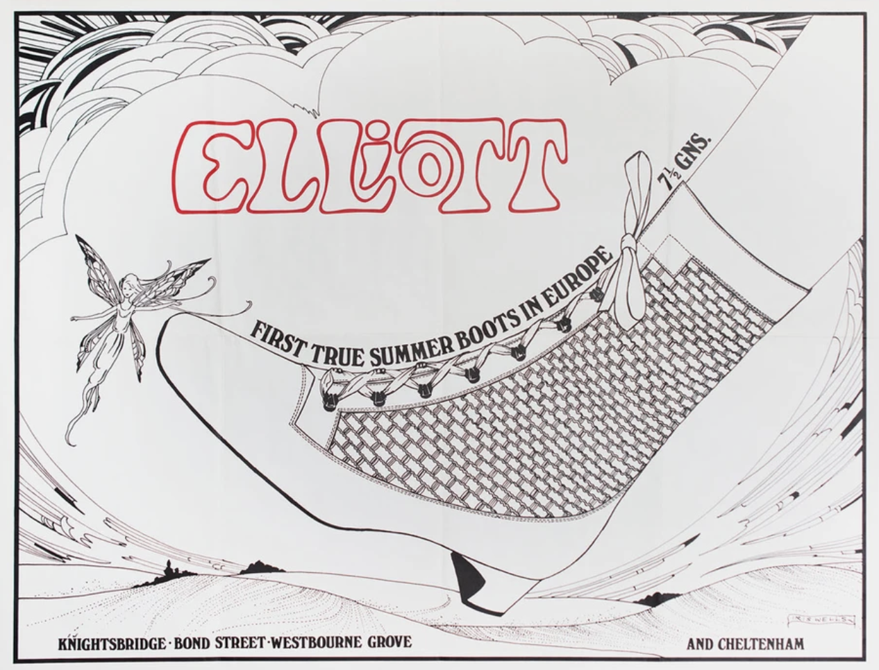
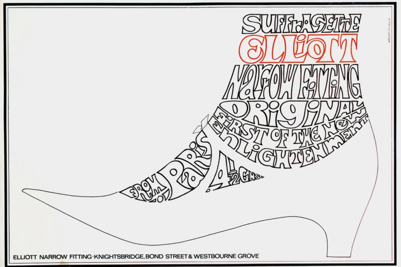
Although difficult to date with certainty, it would seem that the campaign was followed with posters by Iris Wells for summer boots (“First True Summer Boots in Europe”) and by Bob Wright & L.R Clynick for Suffragette shoes (“First of the New Enlightenment”). Everything about these products, including the look, branding, and advertising, was contemporary and “cool.” The poster for Suffragette shoes, for example, is reminiscent of Klaus Voorman’s cover artwork for the Beatles Revolver album (1966)—a far cry from Elliott’s more conservative approach of five years earlier.
Elliott, Bob Wright & L.R Clynick, c. 1966
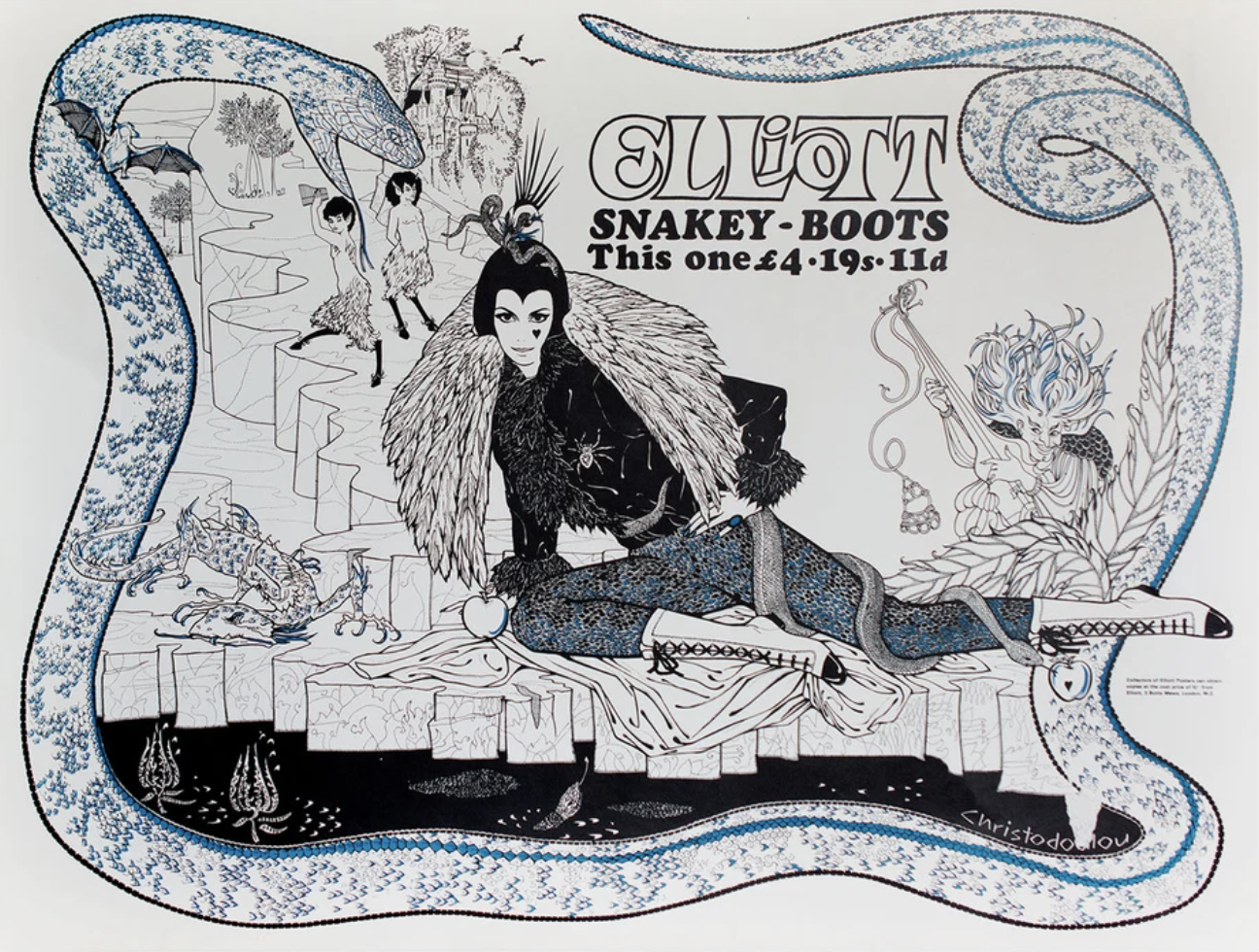
By now, Elliott was using the Dunn-Meynell Keefe agency for poster advertising. Art direction continued to be handled by Bob Wright, with occasional commissions from Paul Christodoulou—including a splendid design for Snakey Boots c. 1967. As with his design for the Alice boot, the new poster featured vintage illustrations by Aubrey Beardsley and was also available to buy at 5 shillings.
Elliott, Paul Christodoulou, c. 1967
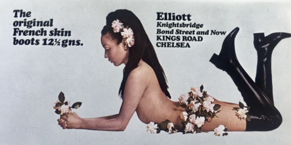
Towards the end of the decade, Elliott’s promotional style shifted again to embrace the latest trends in fashion photography. Out went the romanticized world of Alice and Beardsley, and in came the depiction of near-naked models wearing nothing but skin-tight boots. In the words of the fashion historian Hilary Fawcett (2013) “the fetishistic and sexual significance of women’s shoes here is overt.”
Elliott, Dunn-Meynell Keefe, 1967
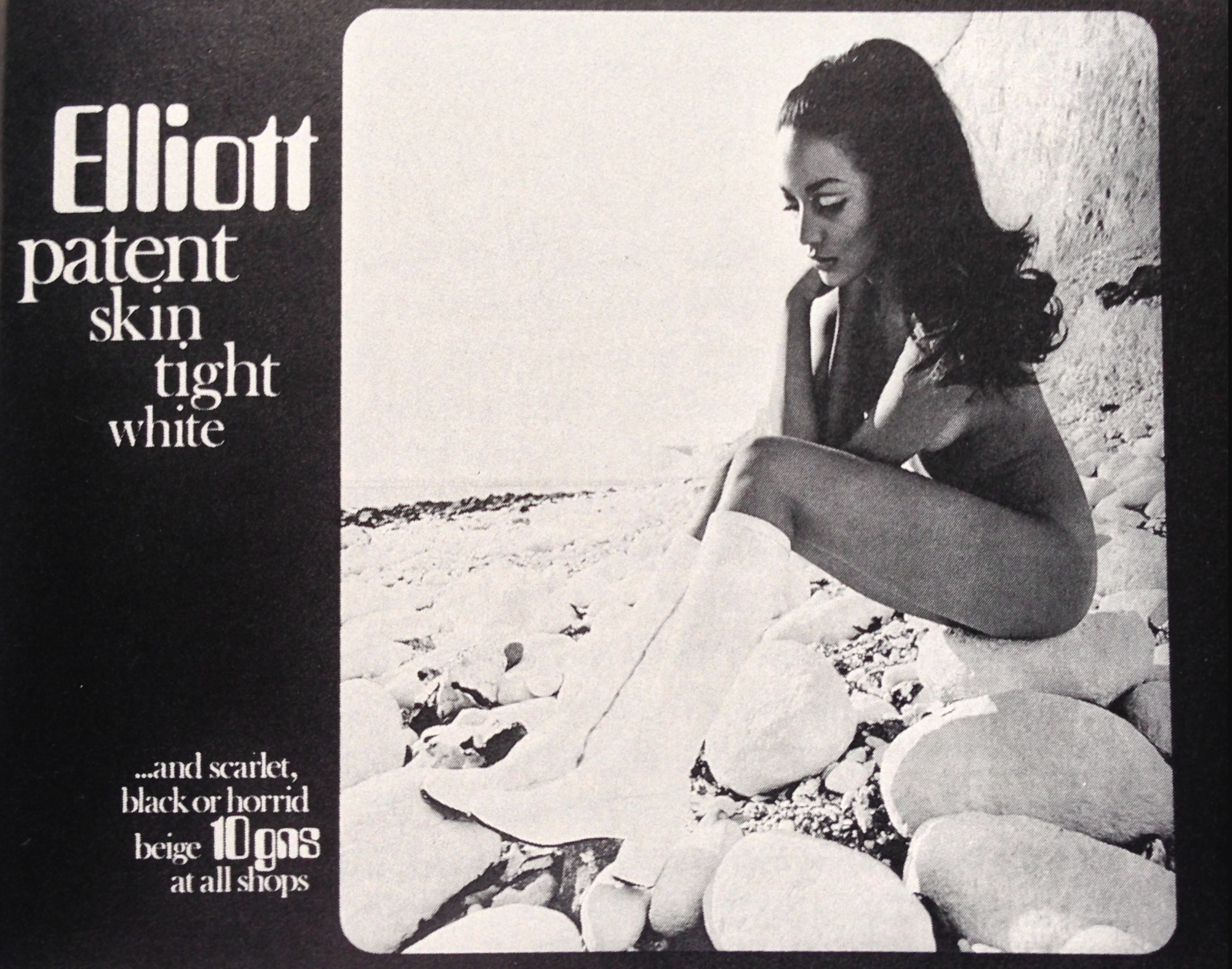
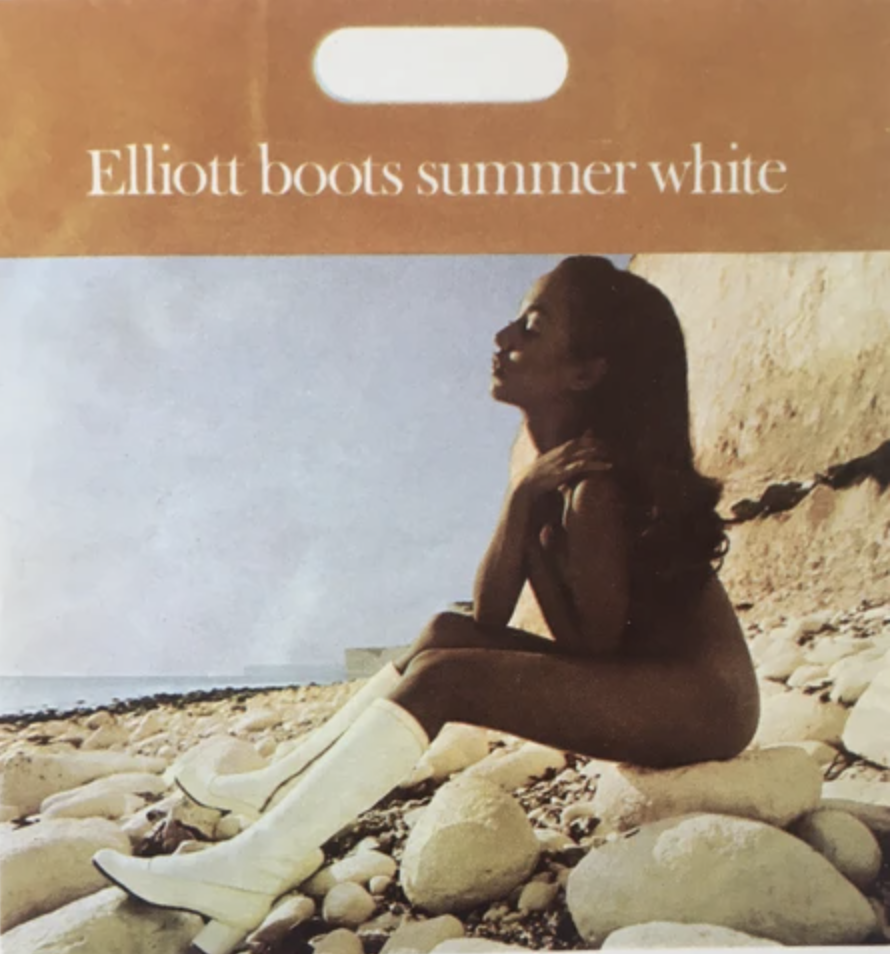
This change in direction was not without controversy, but the advertising industry loved it. One of the most notorious posters (below), was a winner in the 1969 British Poster Design Awards. The photographer, Roy Cuthbert, later recalled that he was influenced by Bill Brandt’s studies of the female nude from a decade earlier—arguably one of the first examples of high art photography being co-opted for fashion advertising. The shoot took place at Beachy Head in Sussex, the location of some of Brandt’s most famous pictures.
Elliott, Bob Wright/Roy Cuthbert, 1968
While commenting that the poster was “not the most subtle,” the Design Journal agreed that it was certainly successful:
…the beautiful girl wearing nothing but a pair of Elliott boots…appears on posters, Underground train cards, brochures and carrier bags. No one, according to Elliotts, can see enough of her. She appears in her improbable nudity simply to prevent her clothes distracting attention from her boots; consequently the photographer has in fact revealed very little of her. For years now Elliott posters have had a decorative value that has put them in great demand by collectors; predictably, the new series is no exception. And London Transport report, for what it is worth, that the lady is seldom defaced or adorned with graffiti.
Shopping Bag, c. 1968
The reference to the decorative value and collectability of Elliott posters at the time is revealing, suggesting that an objective of the advertising campaign was to raise brand awareness by crossing the boundary between the hoardings and the home. It is revealing, too, that London Transport claimed the poster was “seldom defaced,” as later Elliott posters from the 1970s and 80s were the subject of much criticism for their objectification of women and would certainly not meet current Transport for London advertising standards.
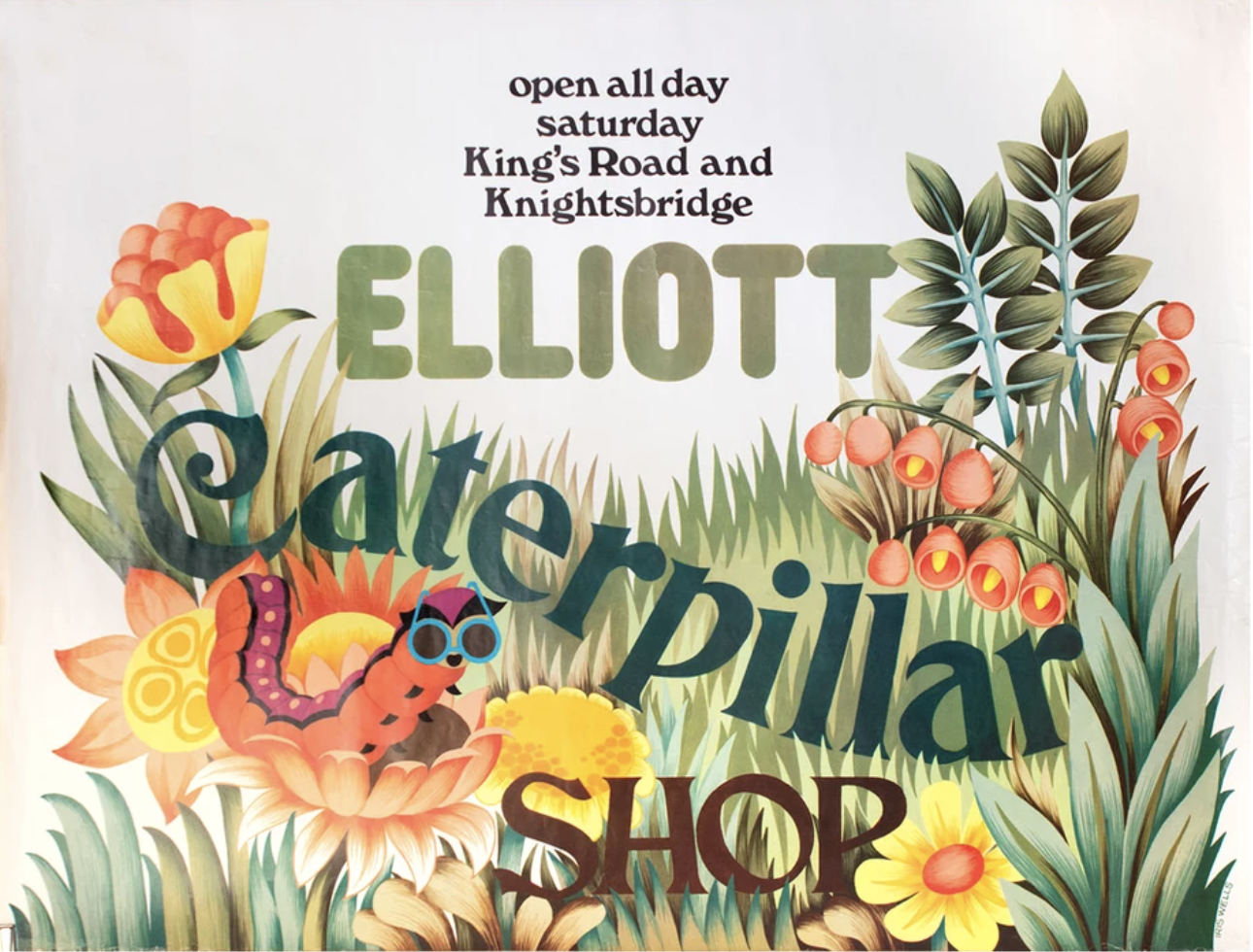
Elliott Caterpillar Shop, Iris Wells, 1969
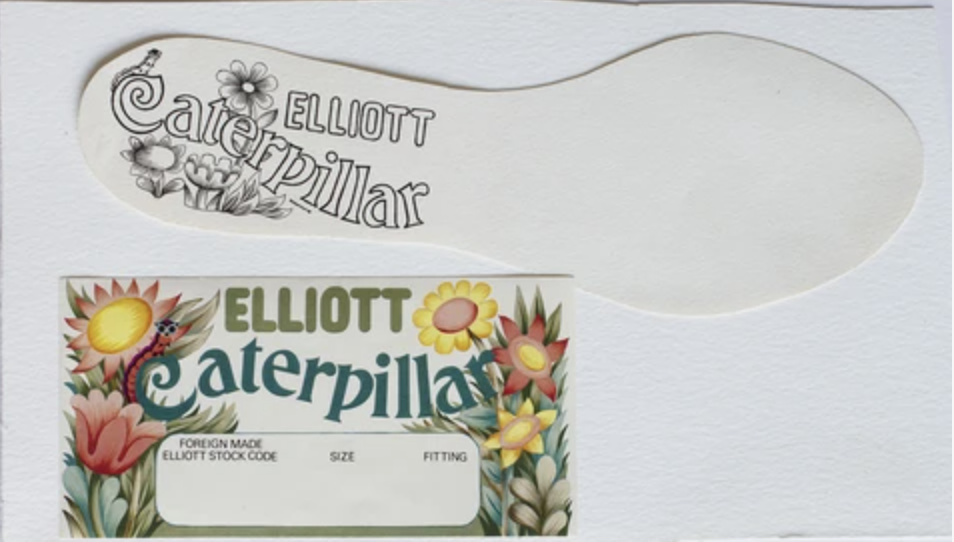
During the switch to fashion photography, there was, however, one last illustration-based campaign for Elliotts before the decade ended. In 1969, Iris Wells—by now working for a range of clients including the BBC—was recalled to design the branding for the company’s Caterpillar range. Her gloriously colorful representation of a sunglasses-wearing caterpillar crawling among the vegetation echoed Well’s original work for Elliott in the early 60s, and was used on packaging, insoles, and posters.
Insoles & Mailer, Iris Wells, c. 1969
Note on sources
In compiling this post, I am indebted to the wonderful online article The Fall of the House of Elliot? by Andy Peake, that generated fascinating responses from several former employees and those associated with the company’s advertising campaigns, including Roy Cuthbert (mentioned above). I also drew on Hilary Fawcett’s 2013 essay “Handbags and glad-rags: the rise and rise of accessories in fashion and advertising,” in Wharton, C. (ed), Advertising as Culture.
Other sources include Modern Publicity (especially 1964, 1965, 1968, 1969, & 1970), the Design Journal (1969), and the design archive of Iris Wells (personal collection).
All images provided by the author.