
Poster House is very sad to announce the death of Armin Hofmann, one of the greatest graphic designers of his generation.
A leader in the mid-century, grid-based Swiss design movement, Hofmann brought a pared-down simplicity and thoughtful compositional eye to the field, creating some of the post memorable and iconic posters of the era.
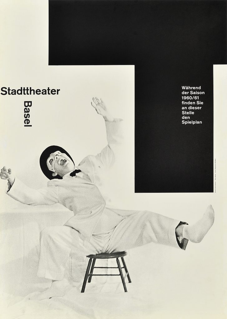
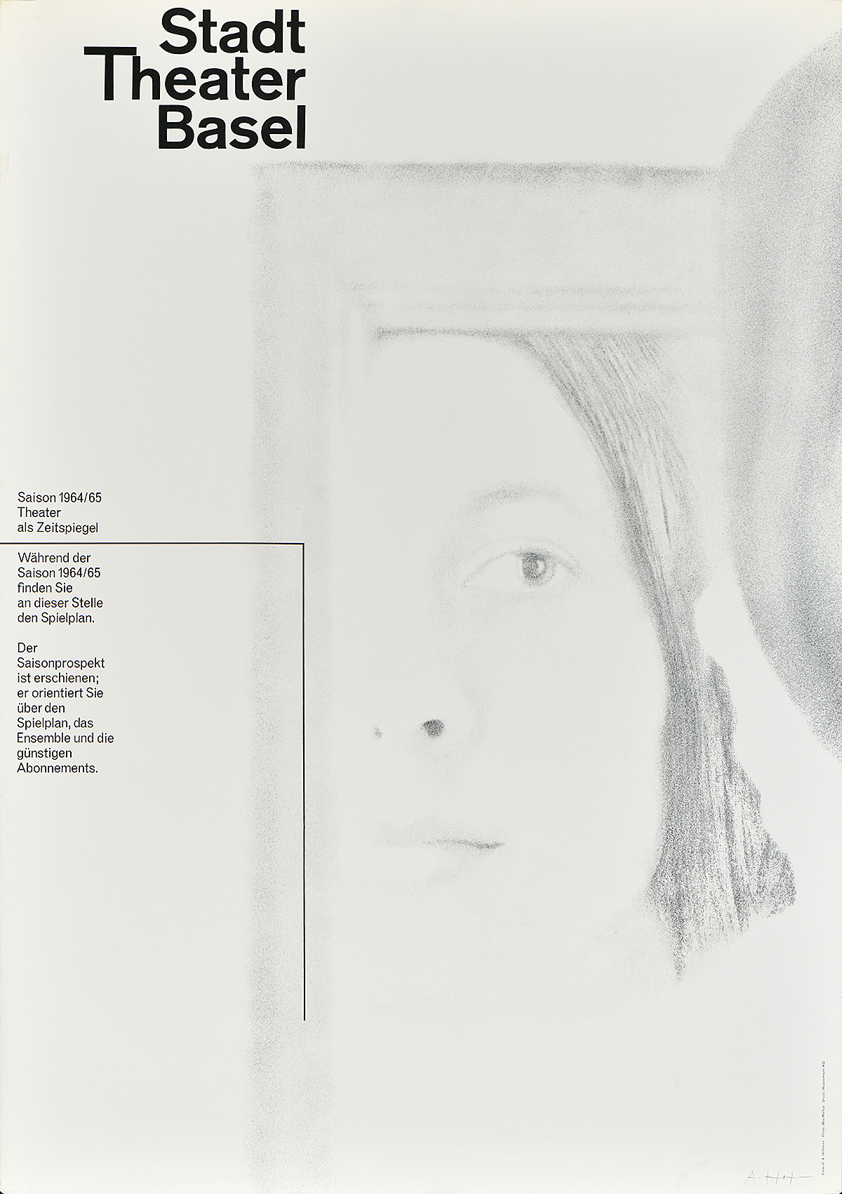
Stadt Theater Basel, 1964
Starting in 1947, Hofmann taught at the Schule für Gestaltung in Basel, where he instructed students to be more playful with their incorporation of grid systems in design. He would later travel extensively outside of Switzerland, taking up teaching positions in Philadelphia, New Haven, and Ahmedabad, India. An overwhelming number of his students would go on to become leaders in the design field, including Wolfgang Weinngart, the leader of the later Swiss Punk movement.
The aesthetic Hofmann taught emphasized harmony among point, line, and plane in two-dimensional compositions, highlighting contrast and tension between forms. While he used flexible grid systems to create his posters, he did not rigidly adhere to them, prioritizing clarity of communication above all else. He also experimented with the incorporation of black-and-white photography in his works, often pushing the imagery beyond the point of factual representation and into the realm of the abstract.
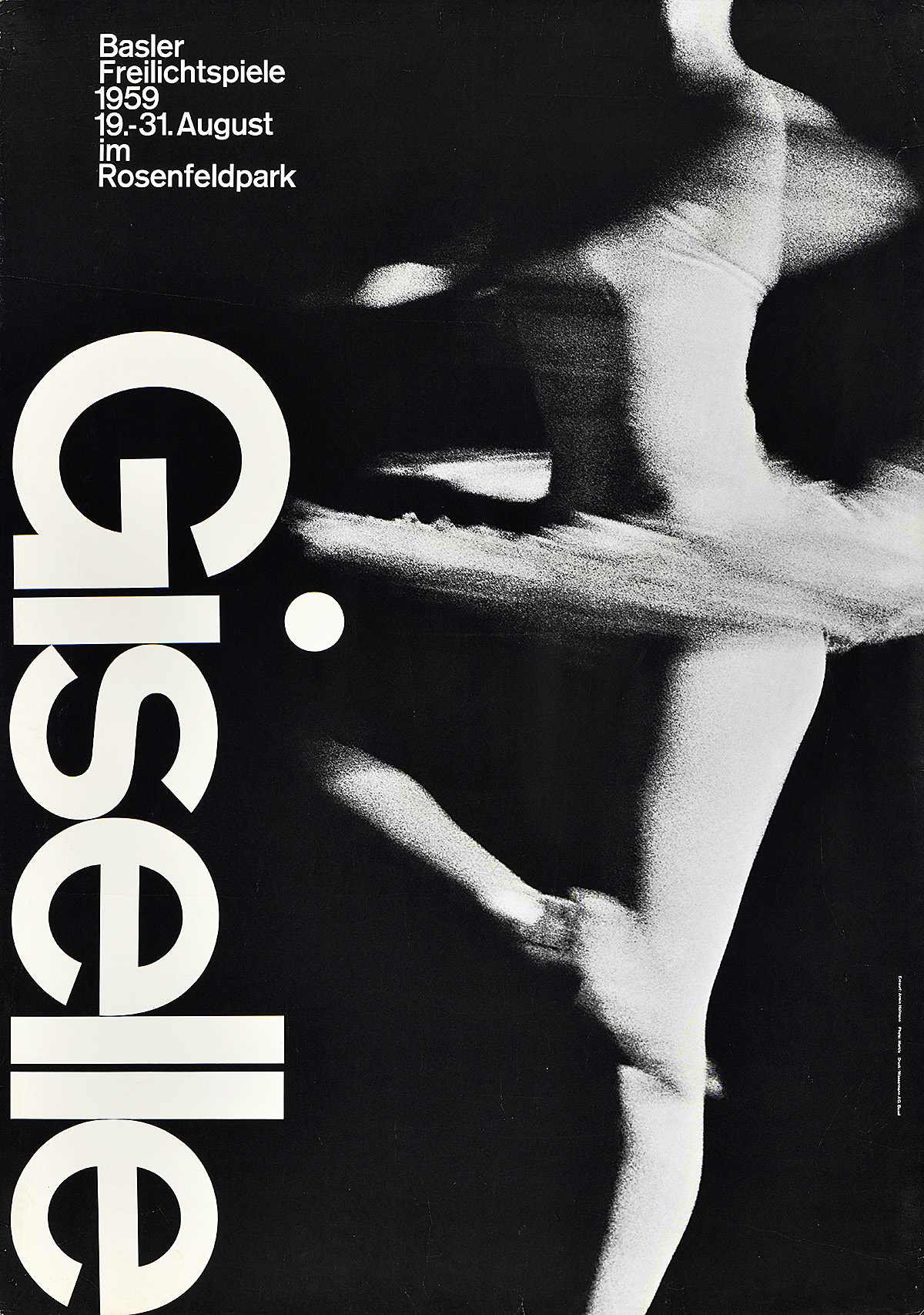
Giselle, 1959
Perhaps his most enduring poster is his 1959 design for an outdoor production of Giselle. In it, he breaks from the rigidity of the grid structure in favor of design sensibility. While the majority of the text mathematically relates to the placement of other elements within the poster, the dot on top of the “i” in the title extends beyond the ascension of the letterforms. It also is round (dots and periods in most sans-serif typefaces at this time are square), cheekily nodding to where the dancer’s knee would be and cleverly tying the title to the image. Printed via photo-offset, the white of this poster is the actual paper. It provides a stark contrast to the gentle halftones of the nearly-abstracted photograph that elegantly suggests movement rather than the presence of a human figure.
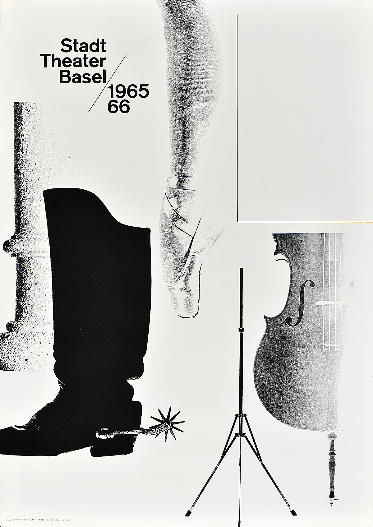
Stadt Theater Basel, 1965
Hofmann also created numerous posters throughout the 1950s and ‘60s for the Basel City Theater. The piece above is one of his most famous, which he often referred to as his “feets” design because his incorporation of a ballet slipper and cowboy boot. His economic approach to presenting information allowed for this poster to be used by the theater throughout a given season, utilizing the rectangular box in the upper right to update the weekly schedule of events and avoid the cost of designing and printing a new poster every time.
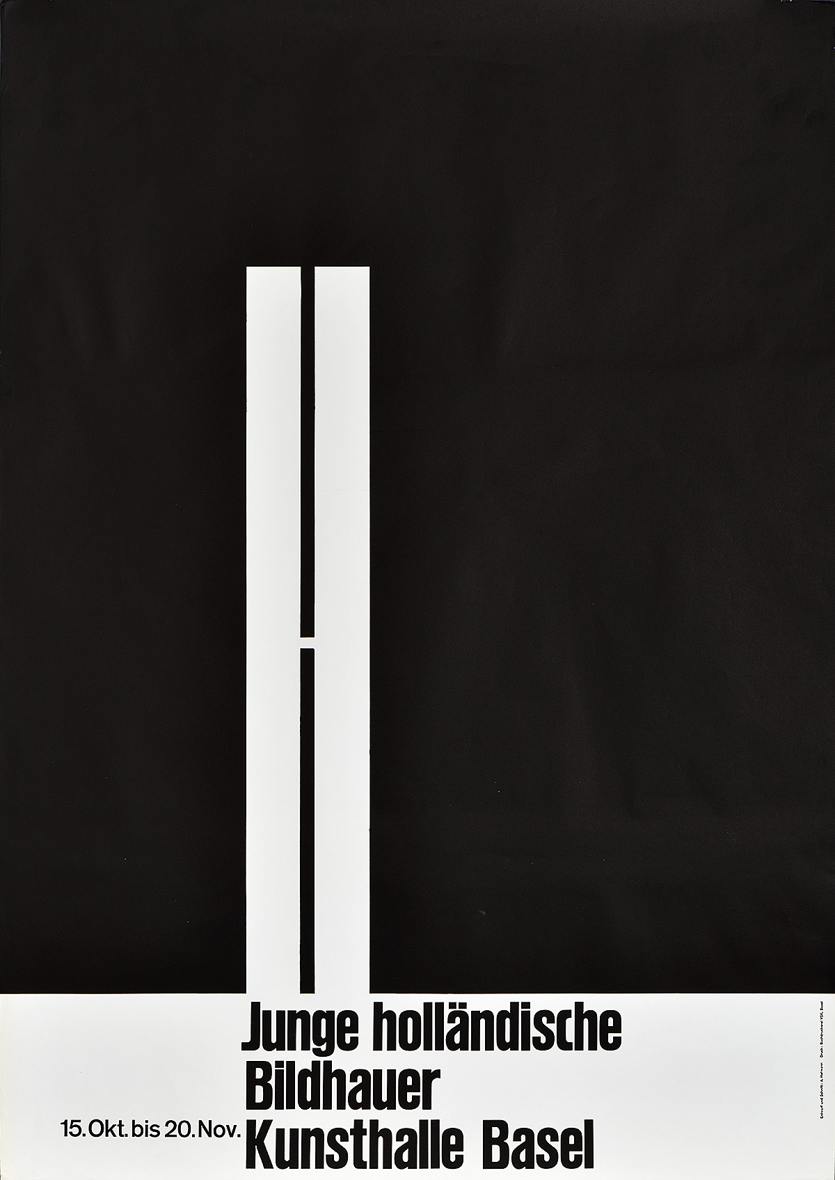
Junge Holländische Bildhauer, 1960
While the majority of his best-known works were created through photo-offset lithography, Hofmann was also a master of letterpress printing, as can be seen in this design for an exhibition of Dutch sculptors at the Kunsthalle Basel. Slight irregularities in the giant “h” indicate that he used hand-cut in linoleum to create the motif, while the lower text is most likely Haettenschweiler Schmalfette wood type. This ability to move seamlessly between printing methods is a hallmark of the greatest designers of his generation, and a skill which Hofmann effortlessly brought to all of his posters.
Although he lived to be 100 years old, Armin Hofmann’s importance in design history was still being explored in 2020. Not only was he the subject of a new book released earlier this year, but he also is one of the stars of Poster House’s exhibition The Swiss Grid, currently on view through February 14, 2021.