
What happens when you take a working artist (who also happens to be our Associate Director of Public Programs), a curator with no artistic skills, and a no-holds-barred printer and lock them in a print shop in Detroit for four days?
Magical chaos, that’s what!
The day after Labor Day, Poster House colleagues Salvador Munoz and Angelina Lippert flew out to Motor City to spend the week with one of the museum’s favorite living poster designers, Amos Paul Kennedy, Jr.
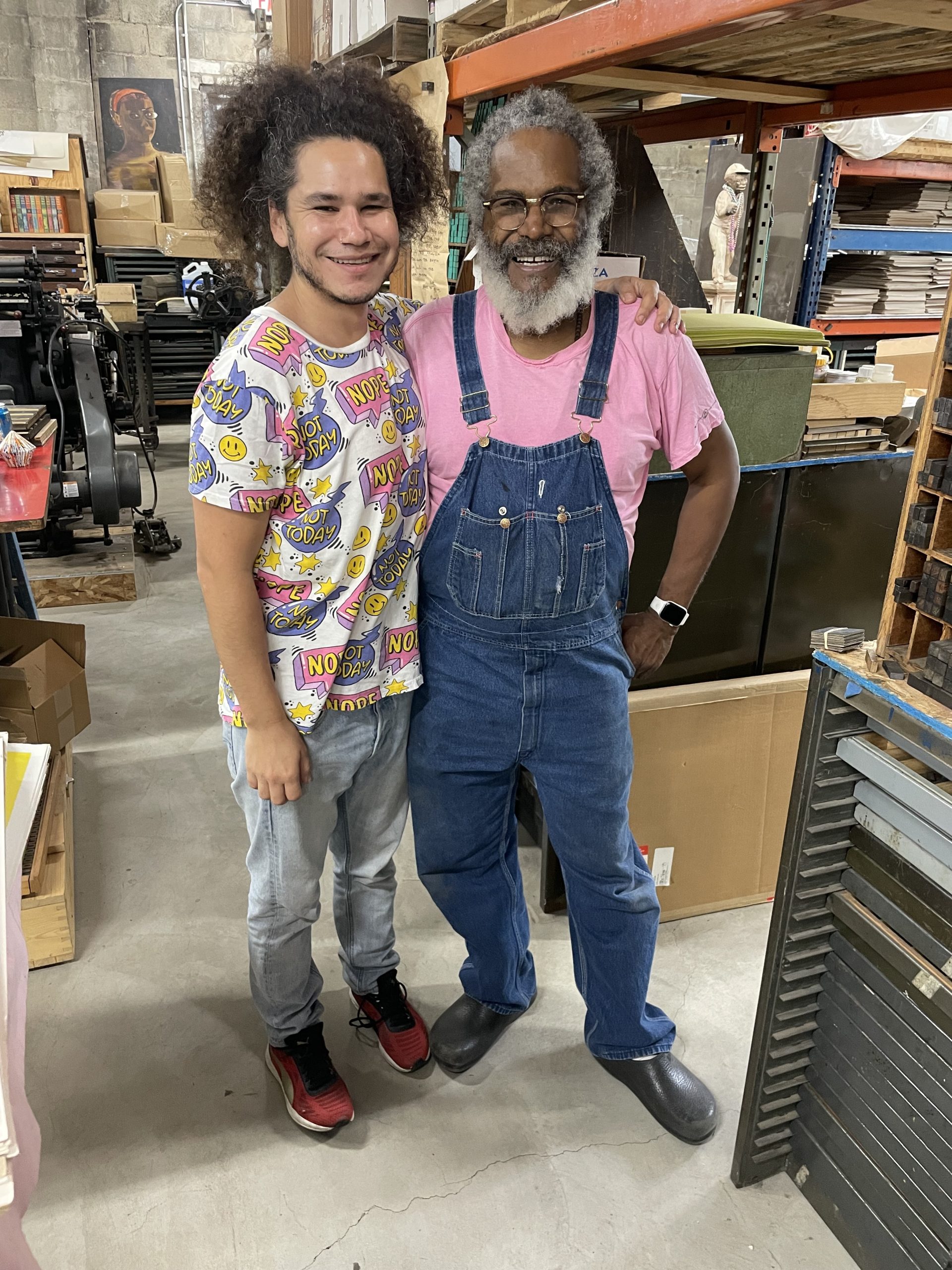
The team.
“So, what do you want to print?” Those first words uttered by Amos the moment they entered the shop set the tone for the week—they could print anything they wanted; the only limit was their imagination and willingness to try.
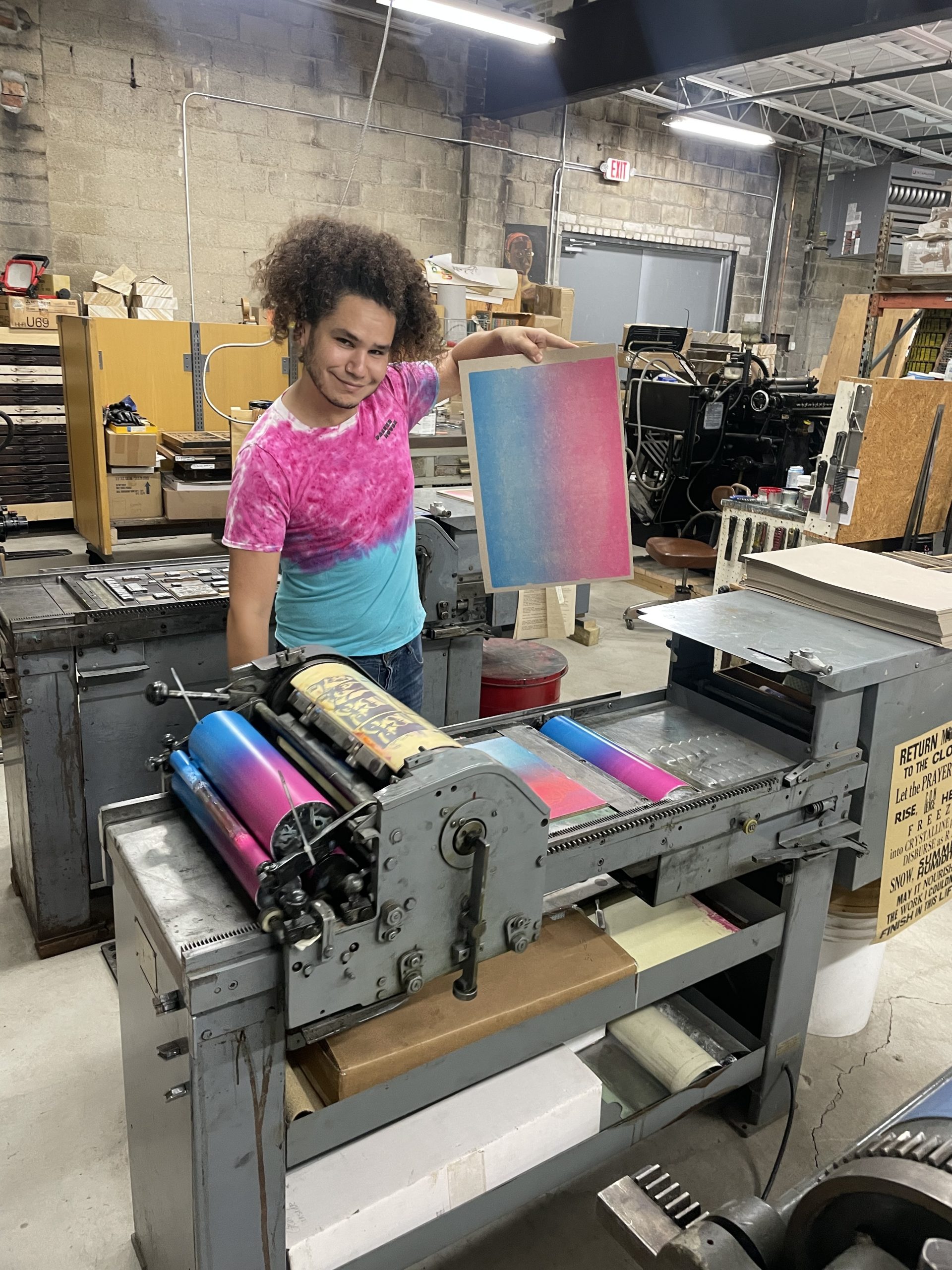
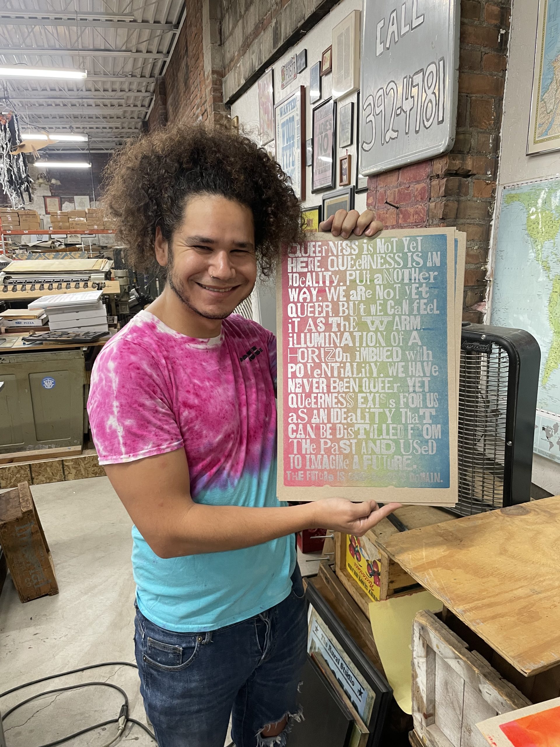
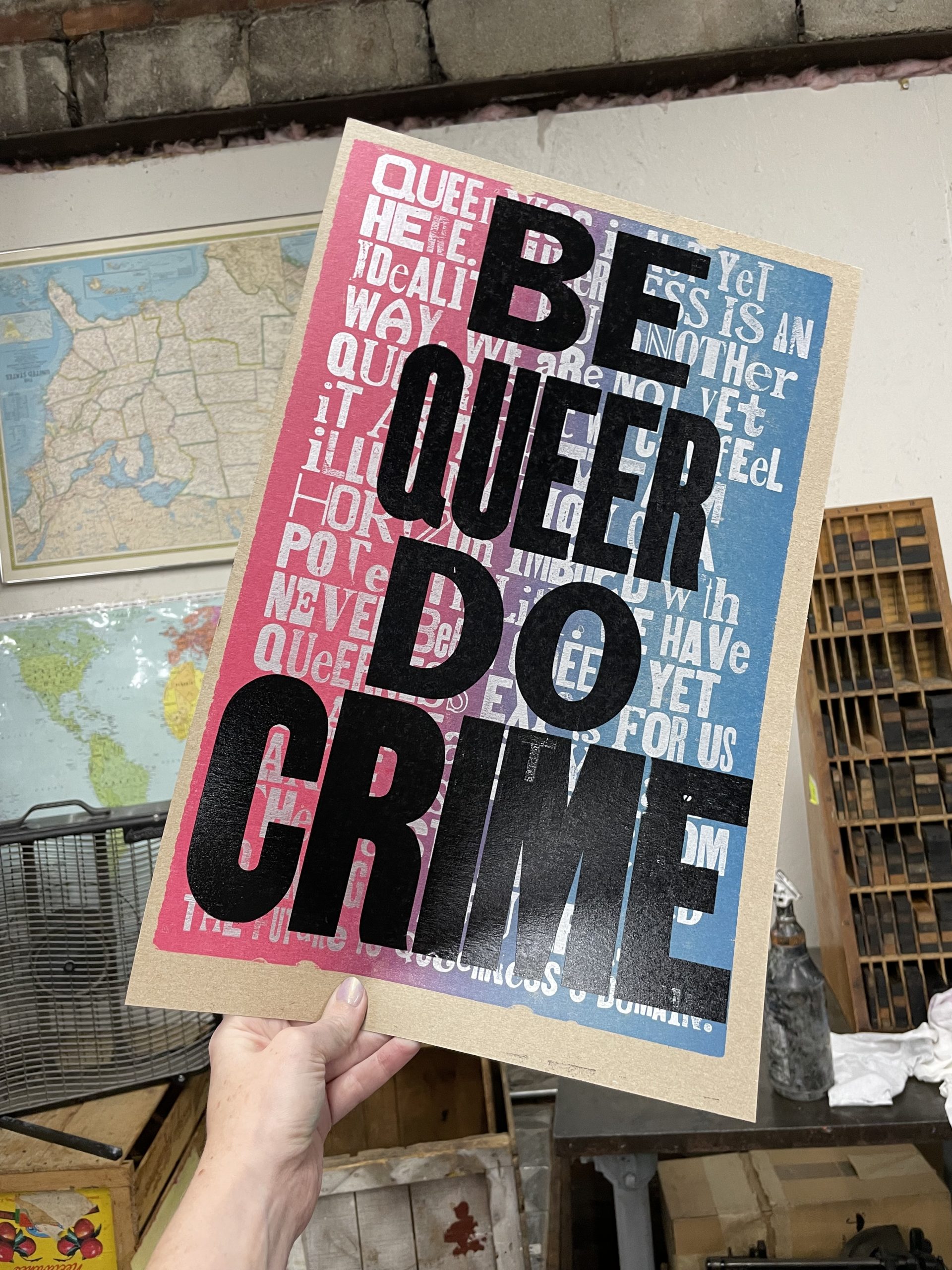
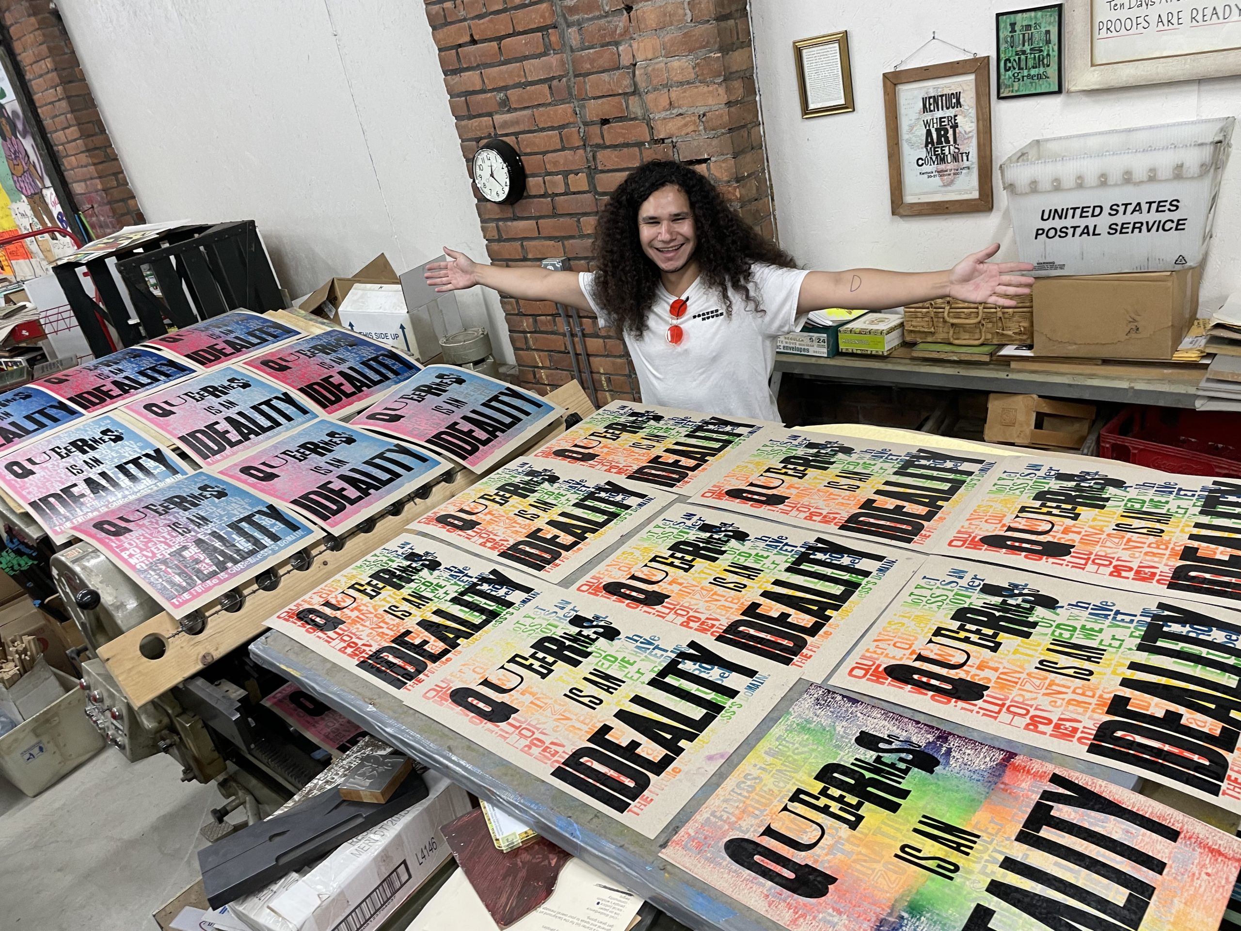
Fresh from his summer residency with the Wassaic Project, Salvador was eager to focus on creating a project with personal resonance. He quickly dove into Amos’s collection of orphan type, hunting around for enough letters to recreate a quote from Cruising Utopia: The Then and There of Queer Futurity by José Esteban Munoz:
“Queerness is not yet here. Queerness is an ideality. Put another way, we are not yet queer, but we can feel it as the warm illumination of a horizon imbued with potentiality. We have never been queer, yet queerness exists for us as an ideality that can be distilled from the past and used to imagine a future. The future is queerness’s domain.”
Salvador with his background and quote.
Meanwhile, Angelina had less of a concrete plan. Having spent two weeks under the intense tutelage of Dafi Kühne back in July, being told to f*ck around and find out was both liberating and terrifying. What if she fucked around too hard? What if she broke all of letterpress? What if the design was an absolute failure, thereby destroying her reputation as a curator and sending her career into a death spiral?
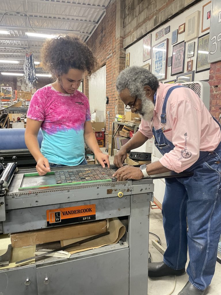
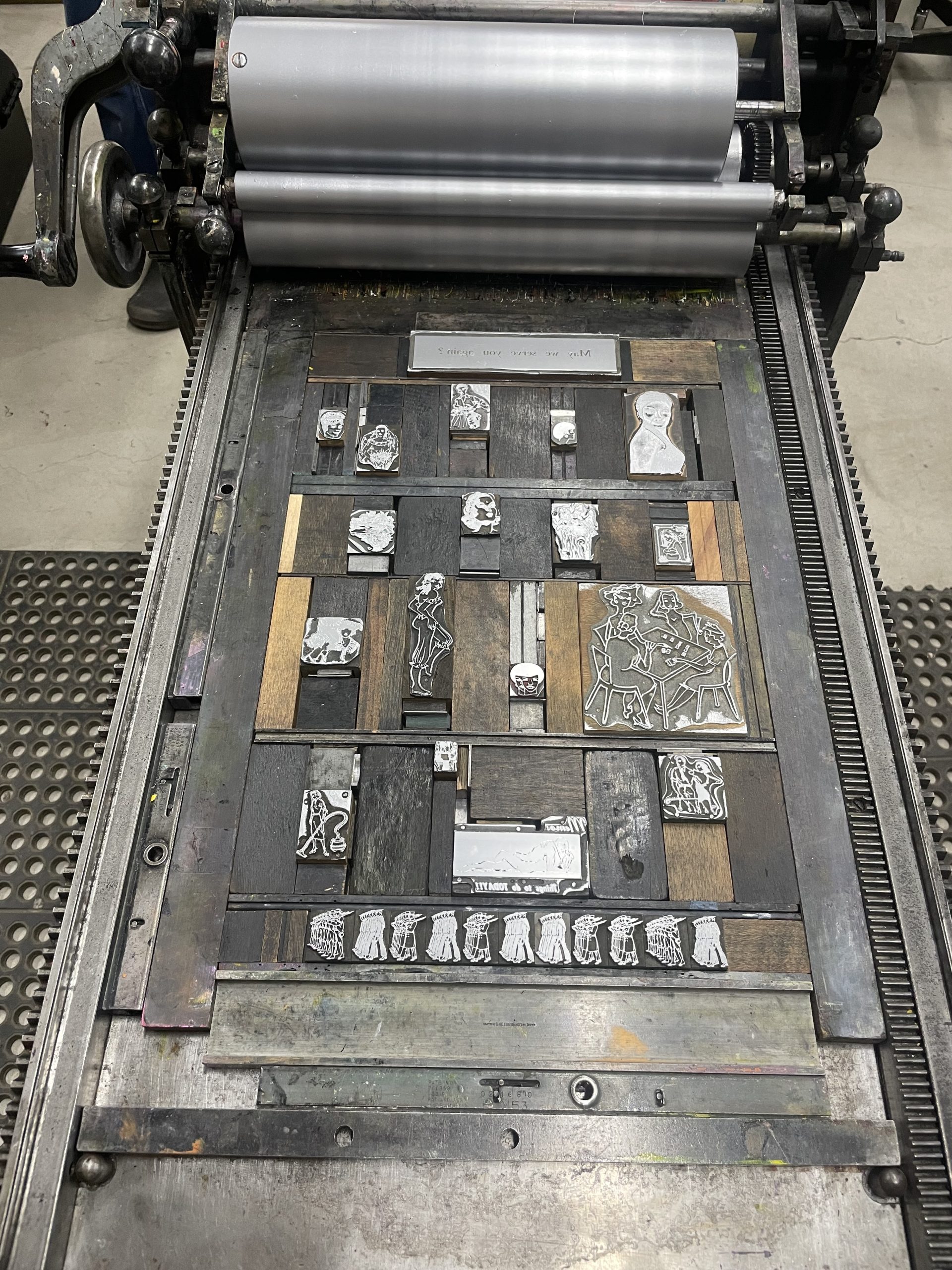
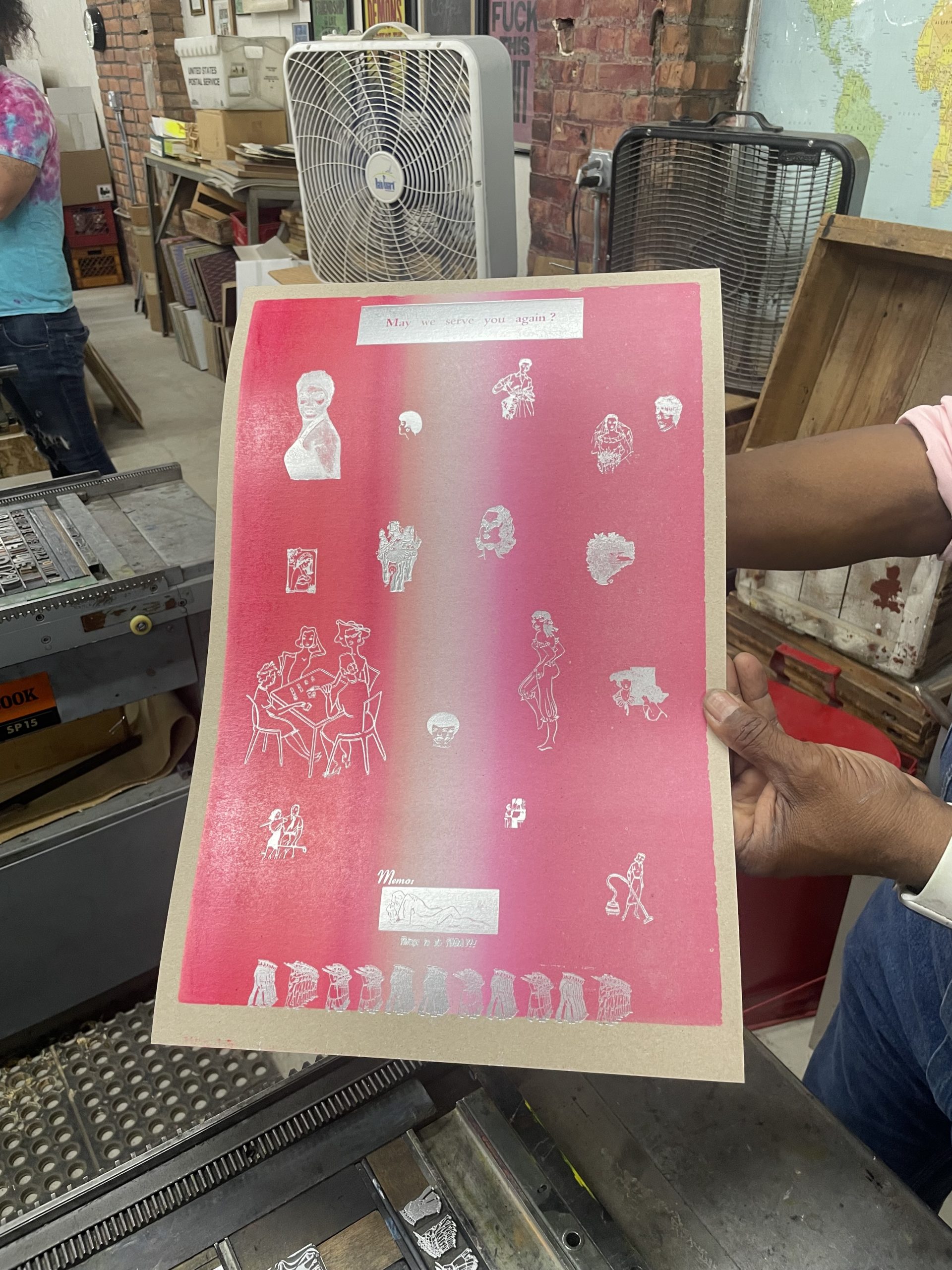
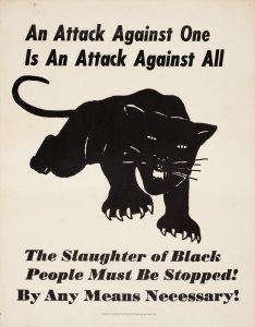
Taking the advice she often tells other curators, she let the objects be her guide. She asked Amos to show her the drawers of printer’s cuts (carved blocks of images) for inspiration—and lo and behold, a feminist narrative emerged!
Angelina’s printing skills in action.
By the end of Day 1, Salvador had set way too many lines of type to count (16, to be exact), and Angelina had rolled out over 120 sheets of ombré bubble-gum pink backgrounds (some mixed with Day-Glo orange for that Malibu Barbie lewk).
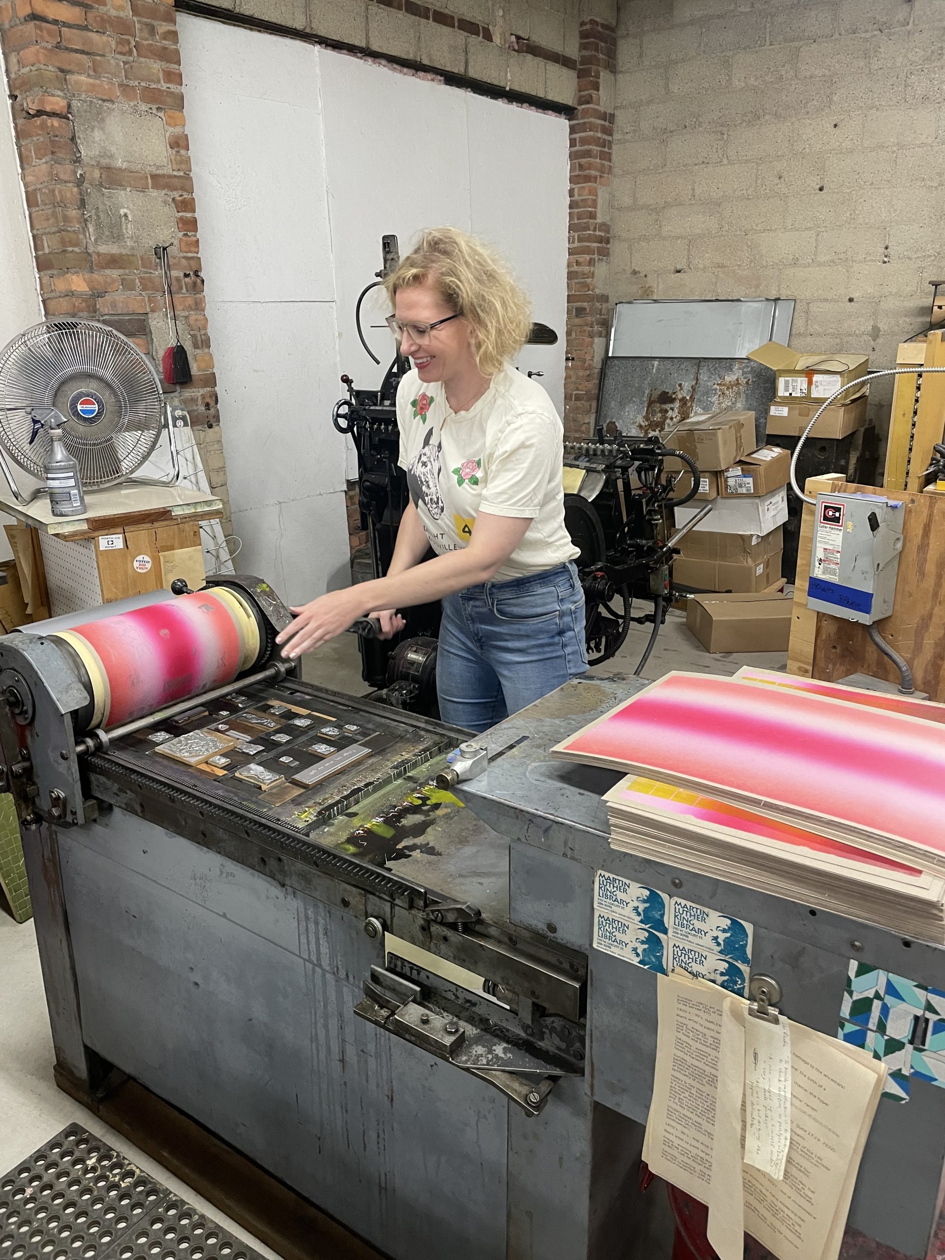
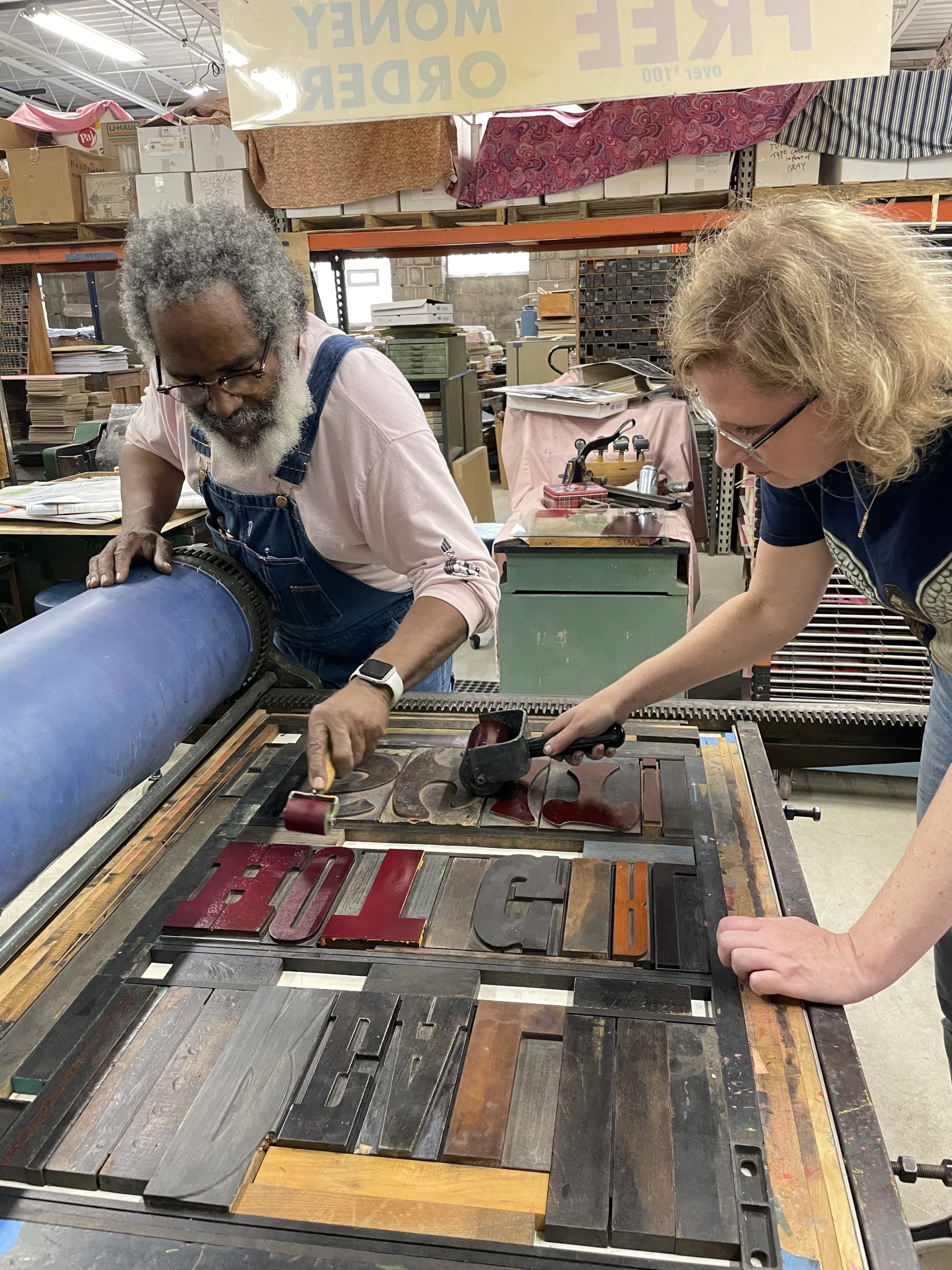
Day 2 began with Angelina arranging her second (or in some cases, third) layer: printer’s cuts of mid-century women in domestic situations hovering above a sharp parade of well-tailored men marching along the bottom of the page. Rather than use black or white ink, Amos instructed her that silver was actually the best ink he’d found to make a background like hers pop.
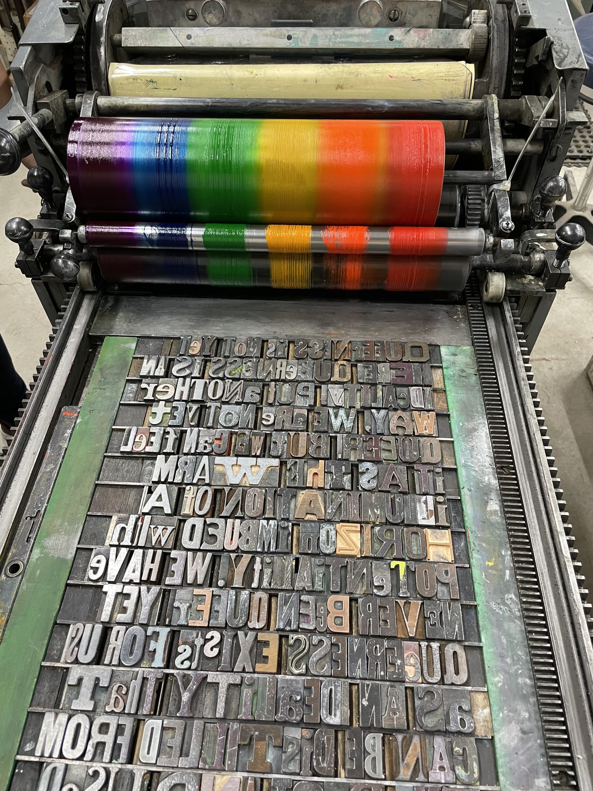
Salvador wanted to offset some prints of his quote against a colorful backdrop; so, he chose the colors of the trans flag (that oddly also matched his t-shirt) in his first attempt at a rainbow roll. His efforts were so successful that Amos encouraged him to up his game and add more colors, a full pride flag’s worth of shades soon emerging on the press bed. With a little tinkering and inspiration from Lead Graffiti, Amos and Salvador adjusted the Vandercook so that the roll no longer oscillated, allowing for straight lines of color. Through this, Salvador printed his quote in brilliant shades of red, orange, yellow, green, blue, and violet, creating a new, powerful background for his project.
Left: Salvador’s lockup about to get covered with rainbow ink.
Right: Angelina’s first and second layers.
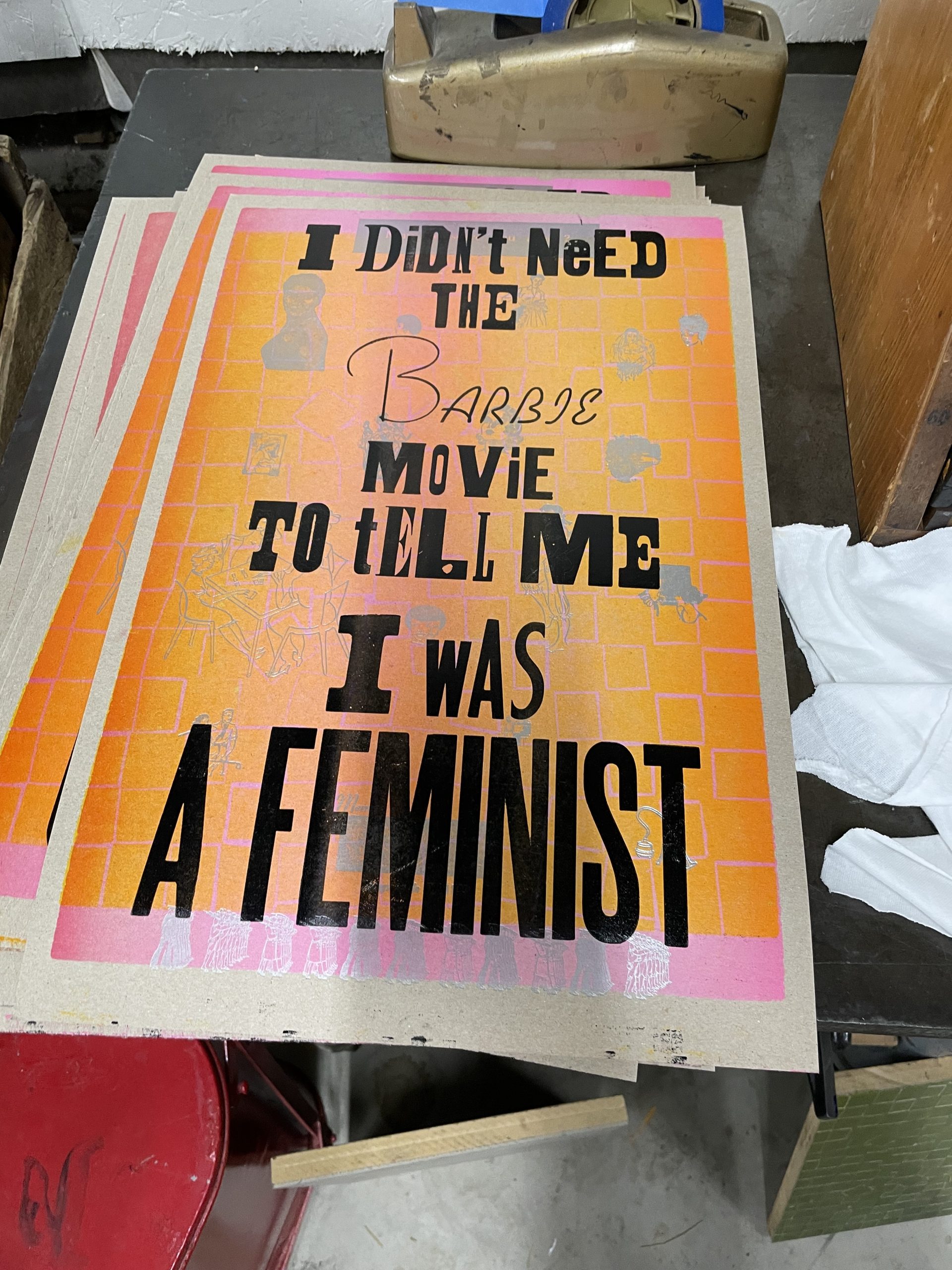
Back on Angelina’s press, she harnessed her disappointment in the Barbie movie (sorry, Greta Gerwig) and created three Amos-style, pithy sayings to place on top of the various iterations of her base layers. The best part was discovering a typeface within Amos’s collection that felt similar enough to the iconic Barbie logo—a true triumph of Amos’s memory to even locate it among the thousands of pieces of wood type he has in the shop.
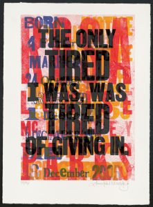
While Angelina’s posters dried on the rack, Day 3 focused on adding the final layers to Salvador’s project. Much like with Amos’s own output, sayings both funny and serious found their way onto the press bed, proving you can be inspirational and still have a sense of humor.
Left: One of three variations of Angelina’s final prints.
Right: One of three variations of Salvador’s final prints.
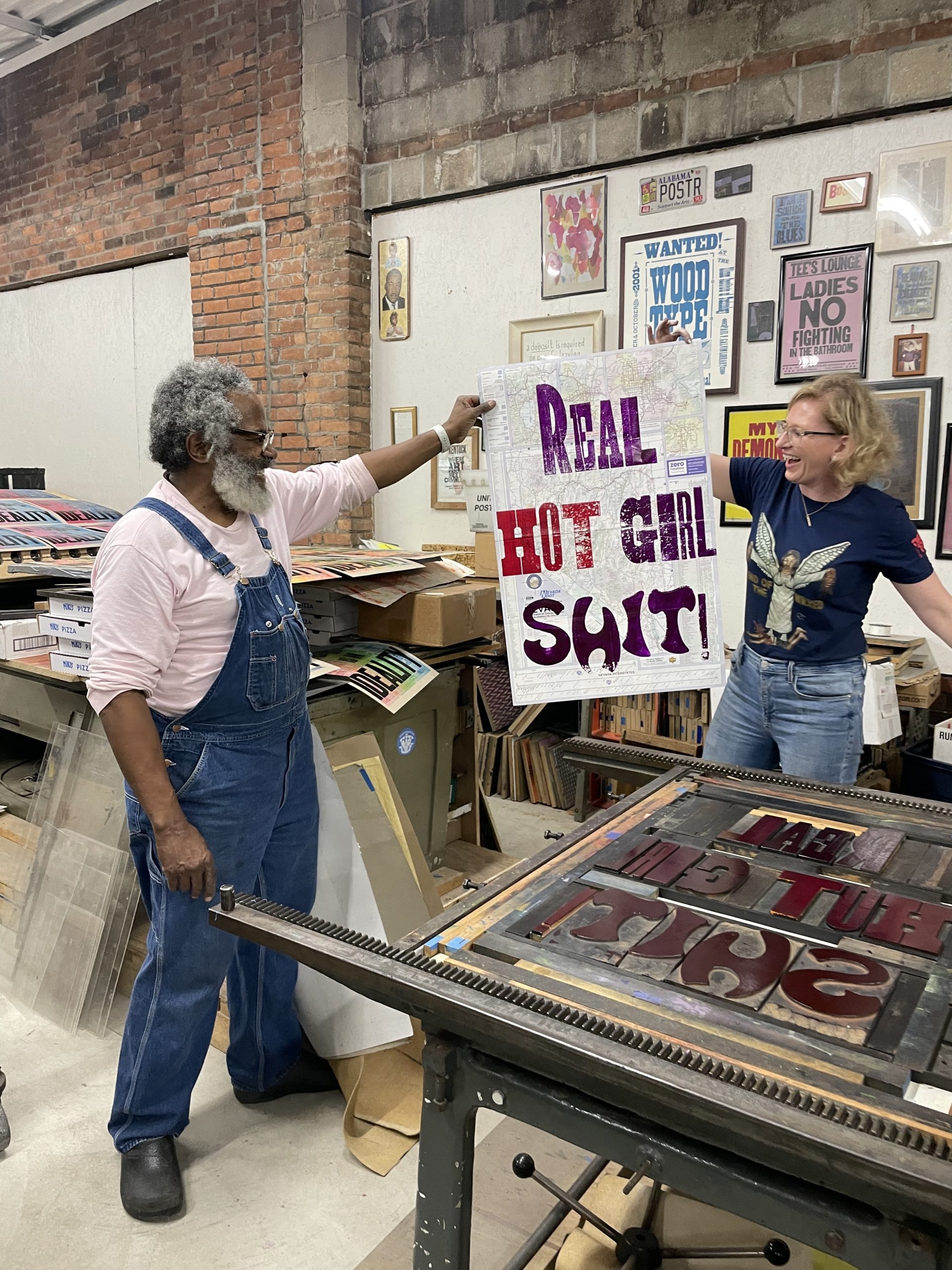
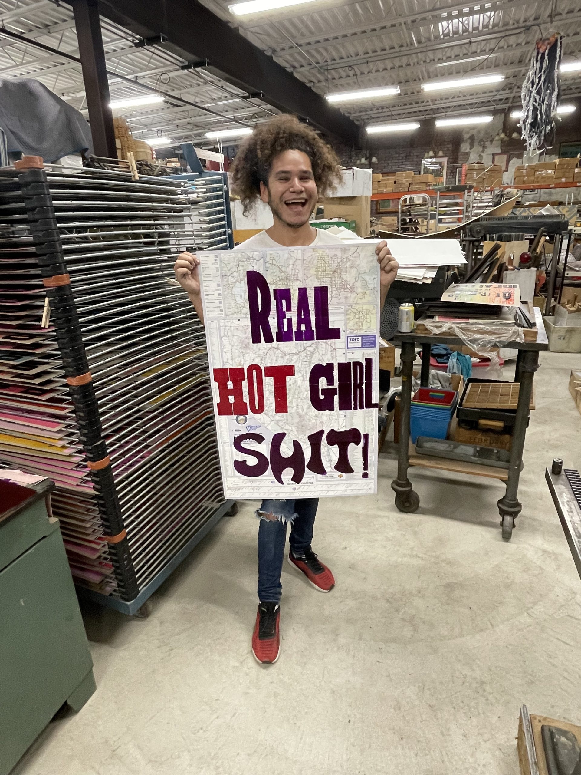
As a coda to their individual work, Amos suggested they spend the last of their time with him working on a large press. Looking to Salvador for content, the team decided the immortal words of Megan Thee Stallion were worthy of the task: Real Hot Girl Shit would be printed in large format on a map of Nevada (unbeknownst to them, Megan would release a single later that day in which “I’m hot like Nevada” features—we cannot say if this is a sign or not, but we are open to the partnership).
The final project, printed on a map.
Overall, the week in Detroit was a massive success (even if it took them two extra days to get home due to canceled flights and a spontaneous road trip across America), so much so that Salvador plans to return and work on a more fleshed out printing project. Poster House also hopes to bring Amos to New York City this coming January for a workshop in collaboration with the Center of Book Arts, deepening our commitment to celebrating poster designers working today.
Some more outtakes.