
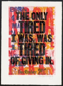
Our Chief Curator just finished two weeks of intensive typography and letterpress instruction during Dafi Kühne’s Typographic Printing Program in Näfels, Switzerland.
Reading is very different than doing. As a poster historian, I’ve studied endless books on advertising history, many of which have conflicting explanations about how individual posters were printed. Put aside the arguments over whether something is letterpress or photo-offset, the actual processes are often described in entirely different ways. The only way to fix this and truly understand the medium to which I’ve dedicated my life is to physically try my hand at making something.
Luckily, Poster House believes in a robust professional development program, and agreed to let me apply to Dafi Kühne’s Typographic Printing Program so that I could become better acquainted with letterpress printing (in particular, its European iteration).
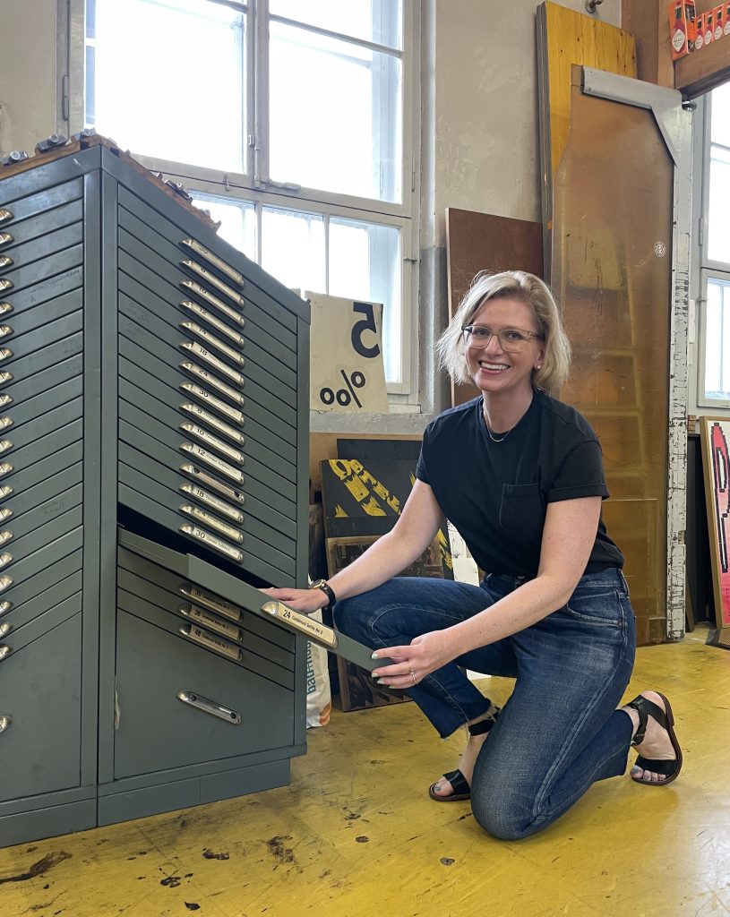
Braying like a champ
For those who aren’t familiar with Dafi, he’s arguably the foremost letterpress printer in Switzerland. If you’ve visited Café des Affiches at Poster House, you might have seen his sausage-shaped poster on permanent view or even a handful of his other designs that cycle through our Digital Poster Wall where we highlight pieces in our Permanent Collection. I first became familiar with his work during the pandemic when someone forwarded me a link to his award-winning Printing Show—clearly someone this wild about printing would be my kind of guy.
Held at his studio in Näfels, Switzerland, his Typographic Printing Program is a two-week intensive (and I really want to emphasize the “intense” in “intensive”) where participants from around the world go through design bootcamp.
Our group was small—seven in total, hailing everywhere from Qatar and Switzerland to Germany and the USA. Some were recent design school graduates, others taught design—I was definitely the only non-designer. Yet, despite my very vocal trepidation, everyone was incredibly kind and supportive, especially once we got to the physical poster-making.
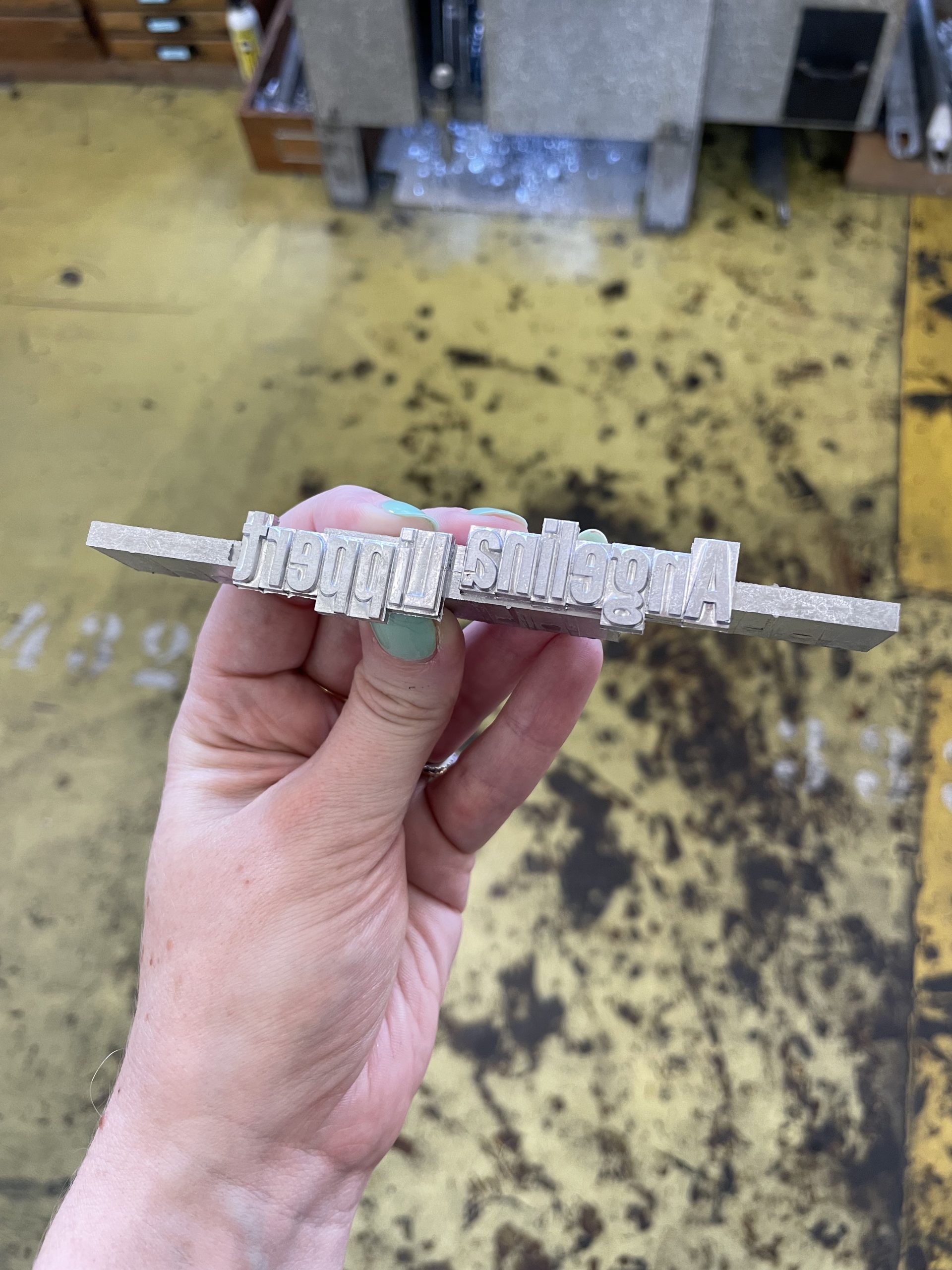
Left: My name in two lead slugs
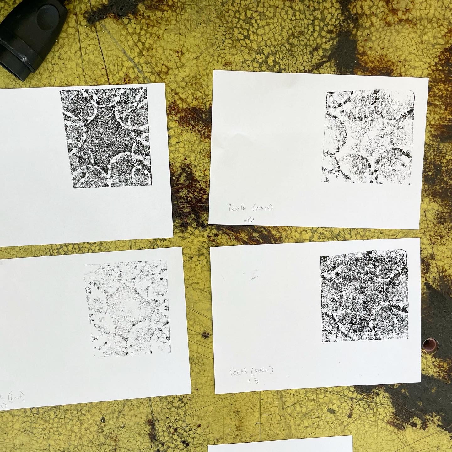
Right: Four impressions of my teeth
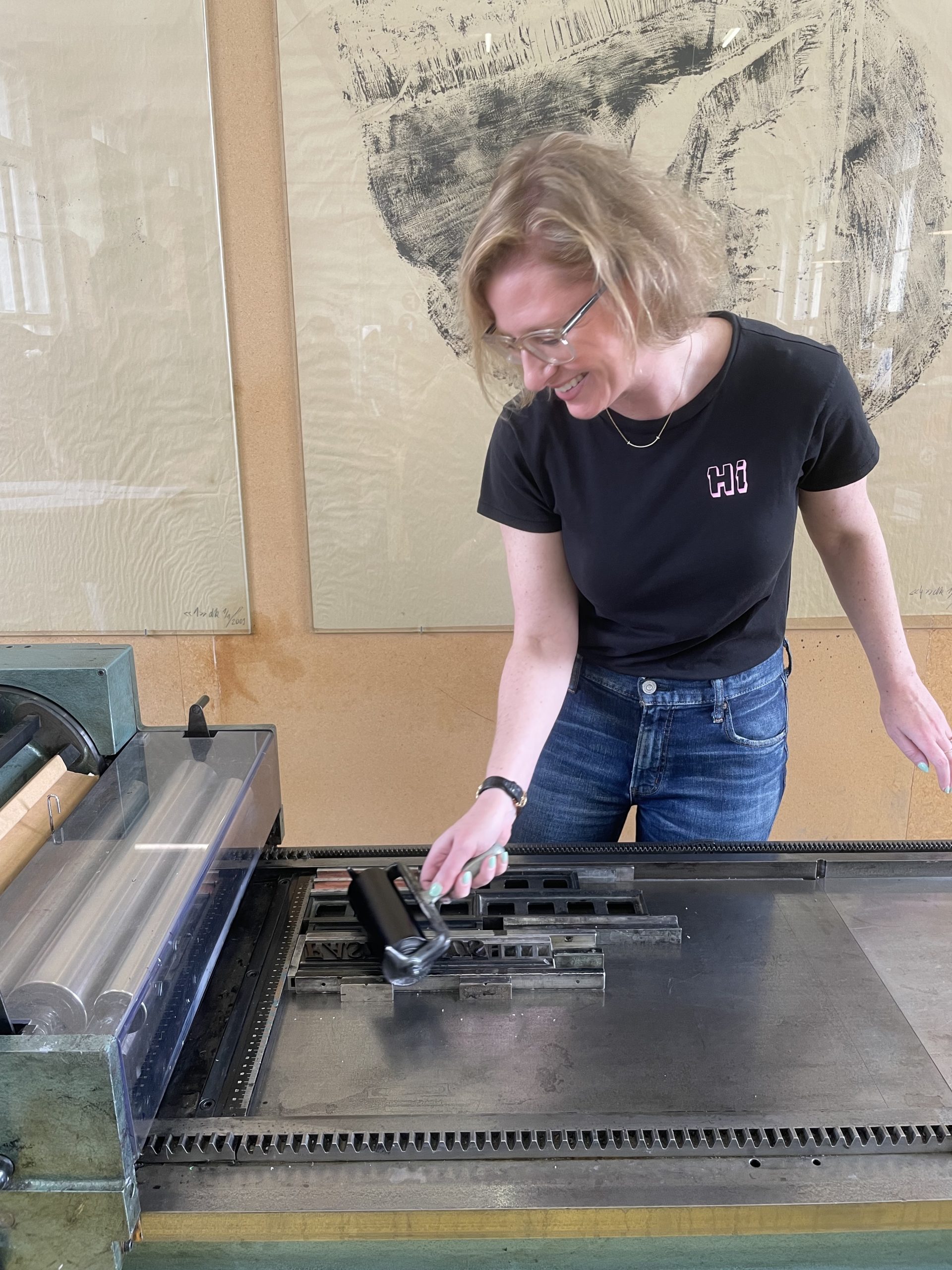
Before we got to dive into the designing deep end, though, we had to learn the basics. We started by using a Ludlow machine to cast hot metal slugs of our names for our notebooks (yes, just like in school, we were instructed to take notes!). More on this later, but casting slugs is my new life calling. We then had a day of chipboard experiments in printing, seeing how various tools left their marks on a surface. Ever the innovator, I decided to see what biting into cardboard would produce—turns out, my teeth make a pretty compelling impression (thanks Dr. Badality!), but not compelling enough to make the final round where the group picked our favorites and replicated them by category into a quick, large-format print.
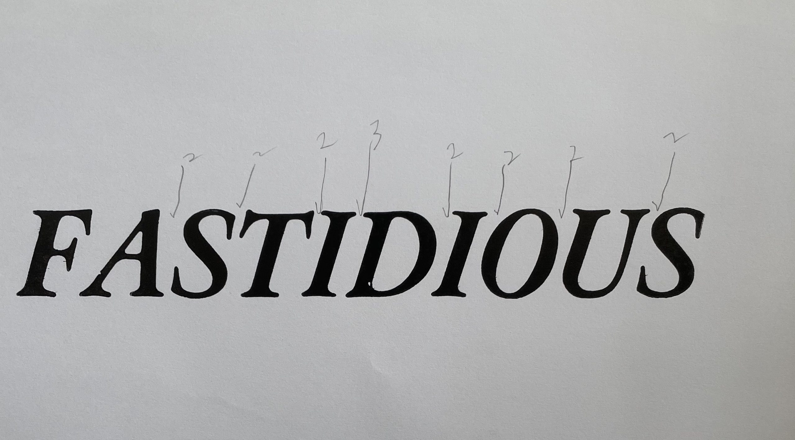
The next day, we focused on kerning—mastering how the spaces between letters are determined by a typesetter. This might sound like something fairly simple; however, we spent the better part of nine hours trying to get this right. I chose the word “fastidious” in honor of my anal-retentive editing style, and dear Lord was that hard. Never has a hairspace weighed so heavily on my soul.
Midway through kerning
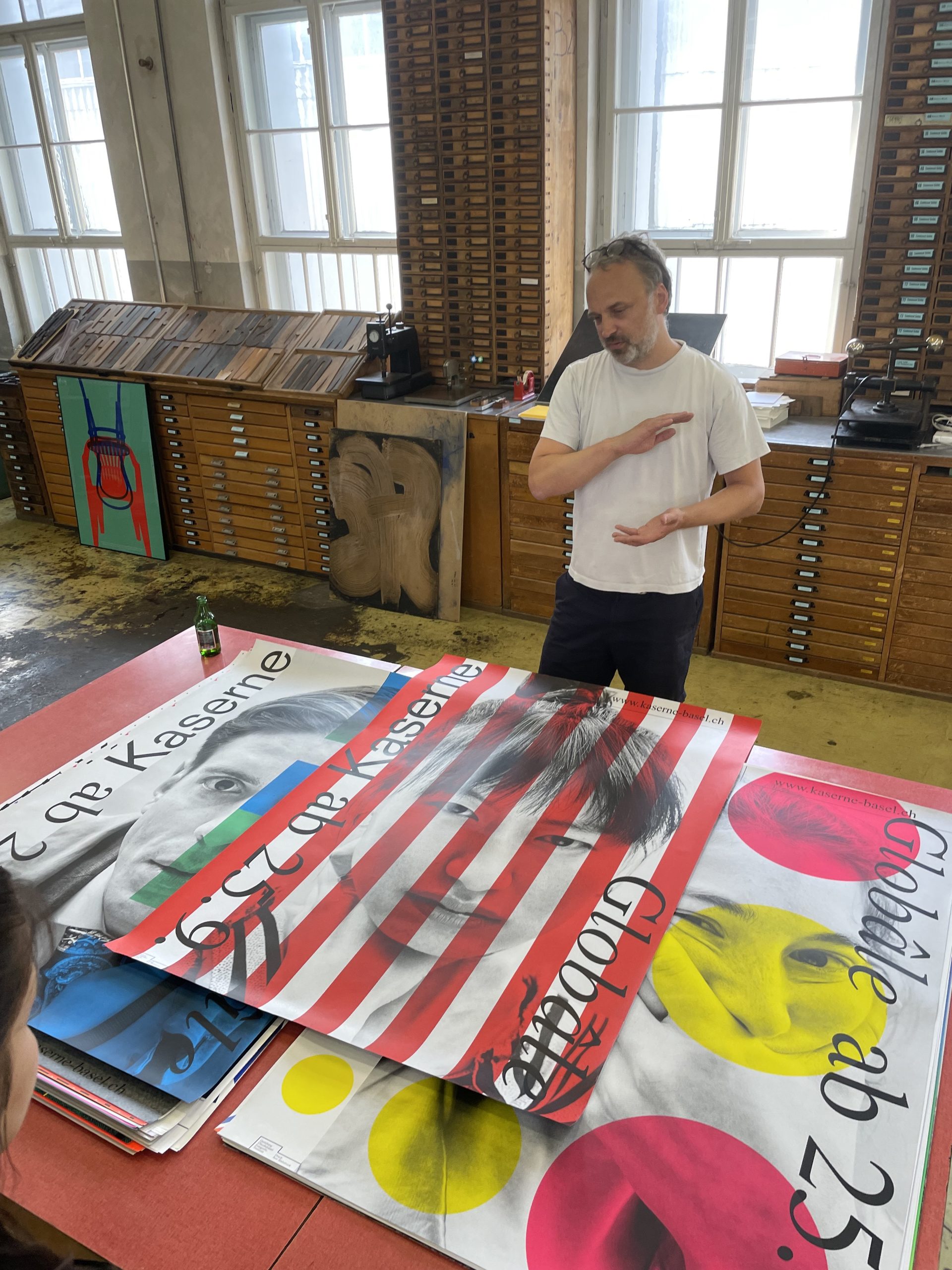
I should also mention that the end of the work day did not generally mean the end of our time in the studio. We had a handful of great evening lectures throughout the program, introducing us to working designers outside of the field of letterpress. The first visit was from Jiri Oplatek of Claudia Basel. He showed us a really wild array of posters he’s designed for cultural institutions in Switzerland, the majority of which are done through silkscreen. I seriously wish the U.S. invested more in our paper advertising because between Dafi’s and Jiri’s work alone, our streets and subways would look 1,000% better.
Jiri explaining his posters
After getting familiar with the basics of letterpress printing, we then had to think about our individual projects. We were tasked with creating an imaginary event in Näfels—it could be anything we wanted, but it had to be hosted in a real place, have actual dates, and be fully fleshed out as a concept. You’ve heard of method acting? Think of this as method event planning. As we have an environmental show coming up in the fall, I thought a local honey festival where people can learn about the importance of bees might be a nice nod to Poster House’s programming.
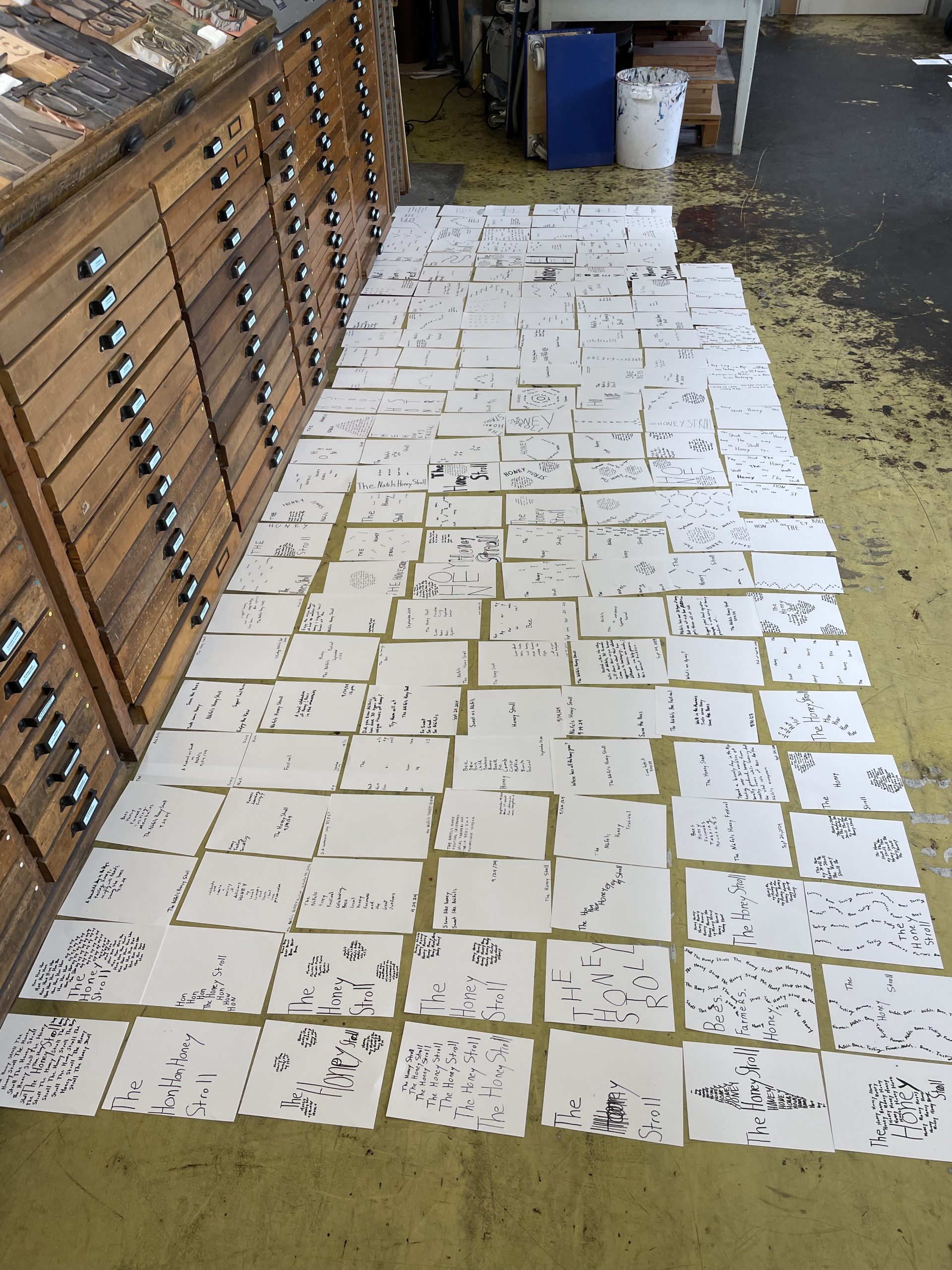
We then spent the next five days sketching. Do not think this was basic free-form sketching! As with everything in this program, Dafi provided us with systematic limitations that forced us to focus on one element of a composition’s structure at a time until we exhausted it and could move on to the next stage. Hundreds of iterations were produced dealing with issues of position, direction, line, weight, emphasis, scale, and perspective. Of any part of this workshop, this exercise might have been the most valuable in helping me understand the design process—which was not explicitly what I signed up for, but will absolutely help me be a better poster curator (it already figured in to how I wrote the upcoming Dawn Baillie exhibition).
During this time, we spent our evenings learning a bit more about type theory—a subject I was at least a bit more familiar with, having audited a class on type history with Paul Shaw a few years ago. But even then, the European and American approaches to this can be quite different, which really impacts how both cultures thought about and produced advertising.
A handful of my sketches
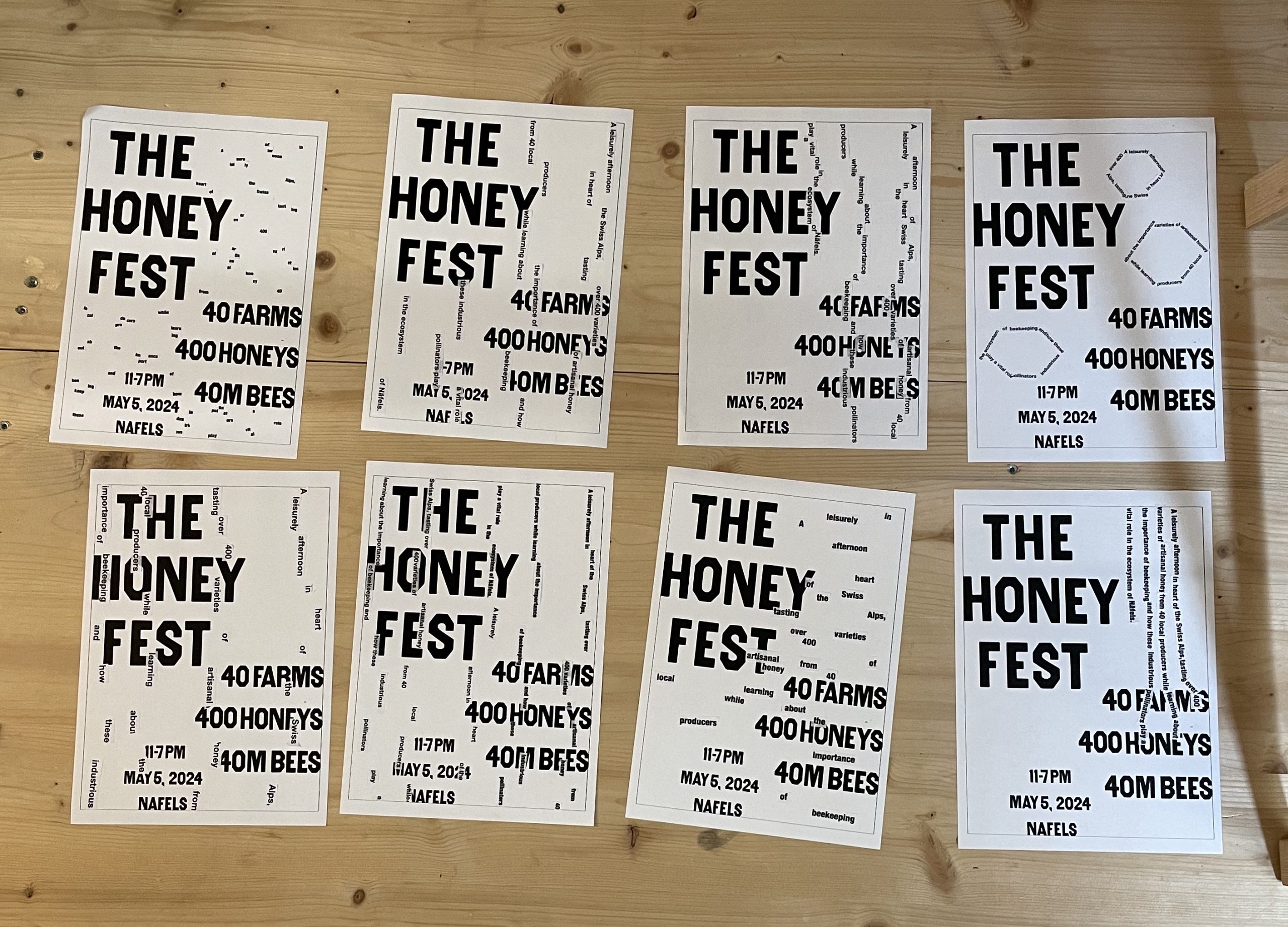
In the final week, we also had a great evening lecture with Julia Marti of Edition Moderne, a publishing house that focuses on graphic novels. A fantastic designer herself, she spent the next day helping us finalize our poster compositions, including choosing the right paper stock and color palette. She really helped me focus on separating out the layers in my design, making sure they worked independently as well as together, and didn’t rely on cheesiness or too literal an interpretation of the event. In other words, bye bye bumblebee-yellow paper and black ink, hello more natural, textured stock and earth tones.
At this point, I’m really starting to feel the difference between me and my fellow course attendees. Their designs are really fantastic and being worked on in InDesign and Illustrator while I’m trying to figure out how to scale up letters from Rob Roy Kelly’s American Wood Type on a Xerox machine. Cue impostor syndrome and my questioning all my life choices. Do I know anything about posters? Am I just here for a participation trophy? Is Dafi regretting accepting me into the program?
Some paste-ups leading to the final design
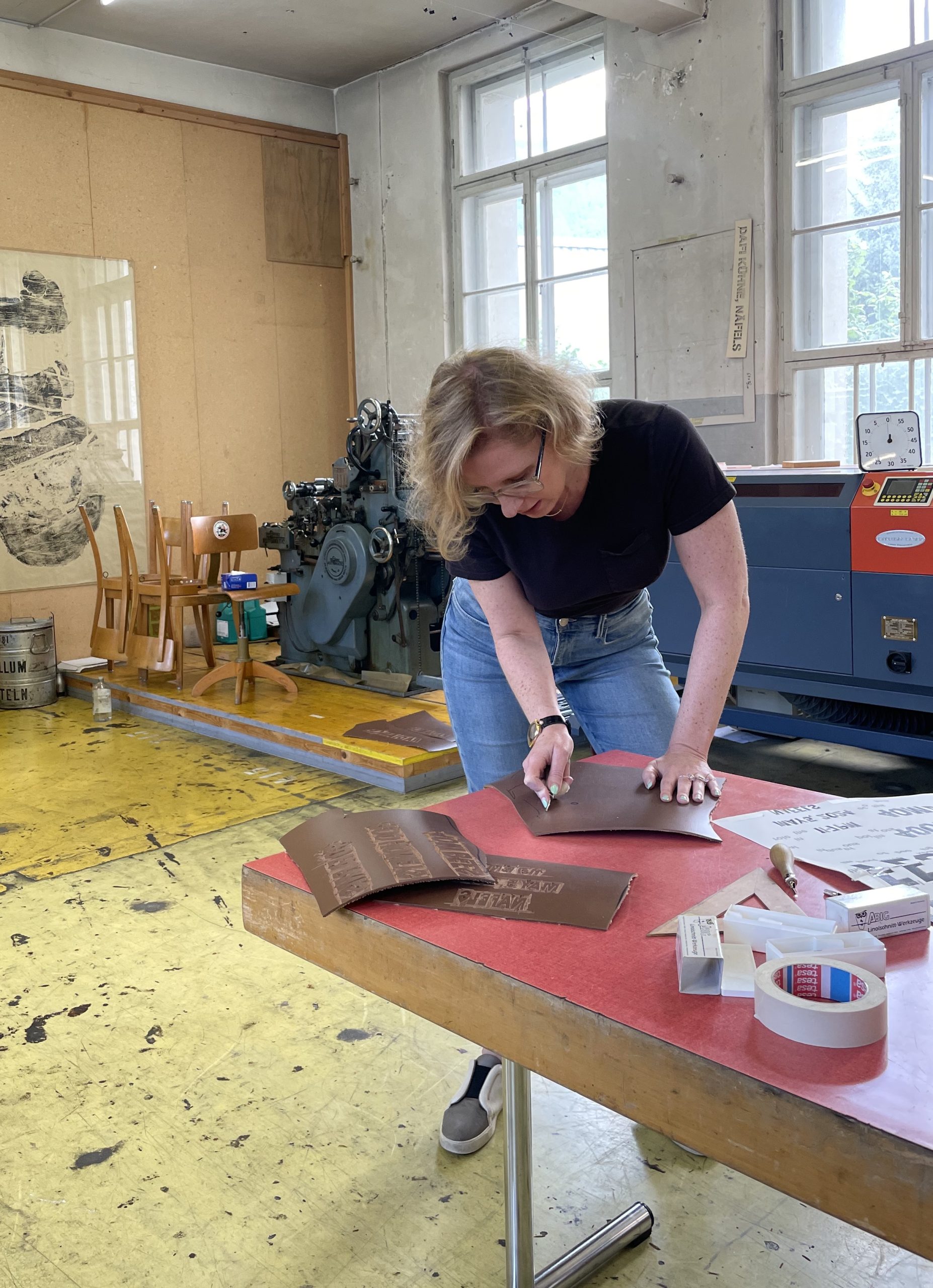
The rest of the week is an absolute blur. I lost the feeling in my left fingers making every rookie mistake possible while attempting to linocut my event title. I realized carving is not my skill and probably will never be. My manicure died a tragic death, but my linoleum may have looked even worse.
But there were also small victories! I’d spent half a week convinced my auxiliary compositional text would emulate honey dripping down the page, but Dafi pushed me to try a more horizontal layout and—voila—it was the bees all along! I got over my fear of InDesign (this is not to say I will be coming for our Design Director’s job, but I can certainly now move text around a bit), and I discovered a passion for working with molten lead that may ultimately result in my untimely death.
My attempting a linocut
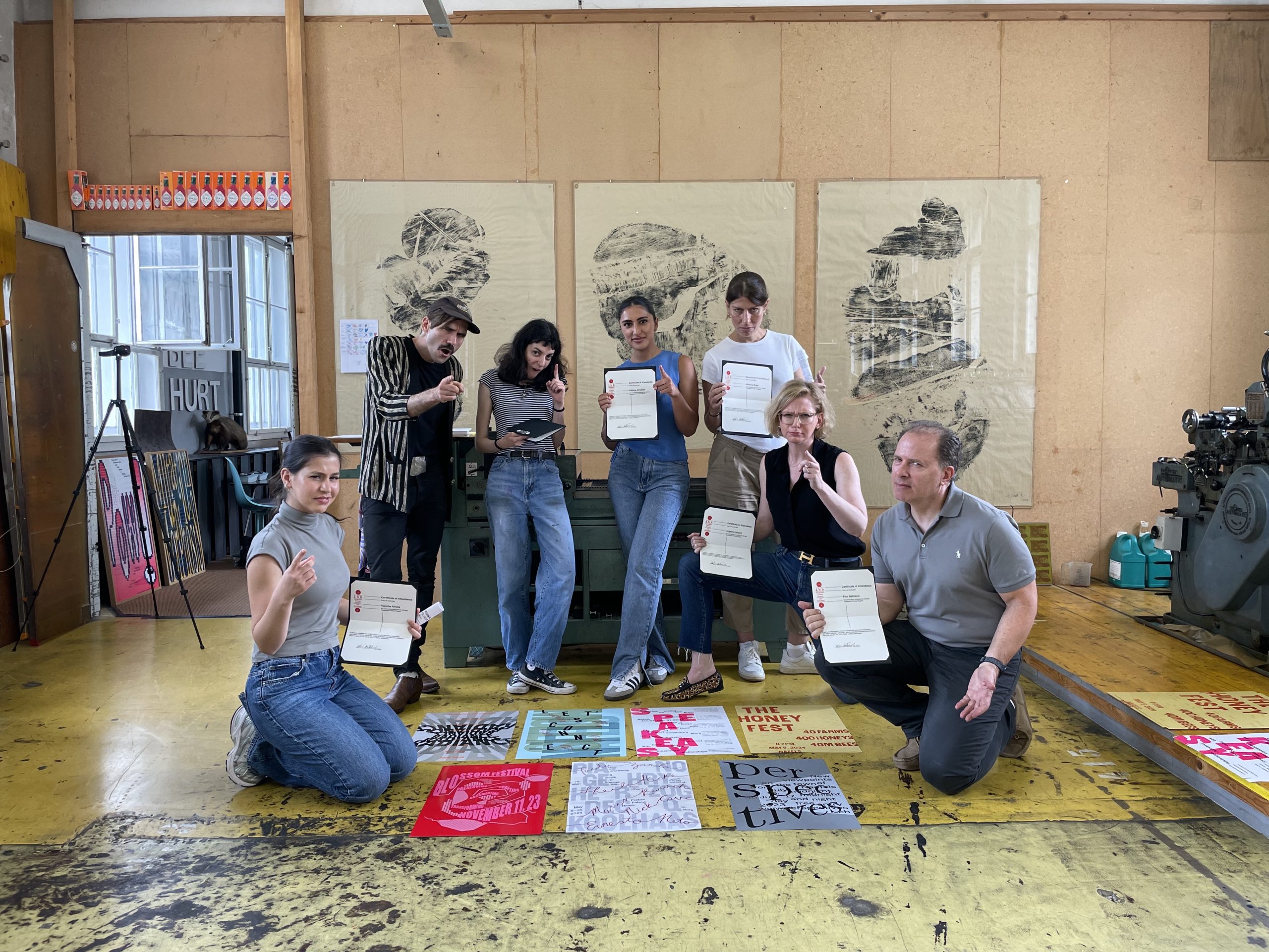
During the final 48 hours, we had the dreaded nightshift—a “printing party” lasting no fewer than 16 straight hours in which all of us had to have at least one layer of our posters completed. It was wild. I may have been delirious by the time I got back to my room. But the next morning, bright and early, we all finished our final designs with enough time for them to dry before Saturday. All that was left to do was trim them down, take many group pictures, and receive our final diplomas.
This was without a doubt one of the most rewarding poster experiences I could have hoped for—and I really want to encourage anyone out there who thinks they aren’t enough of a designer to participate in something like this to reconsider that reflex. No matter what your skill level, being in an environment that meets you where you are and raises you up along with a group of beautifully supportive people is so rare. And now I get to go back to New York and share all that knowledge with everyone at Poster House. And who knows—there may be a letterpress show in our future.
Our group on graduation day