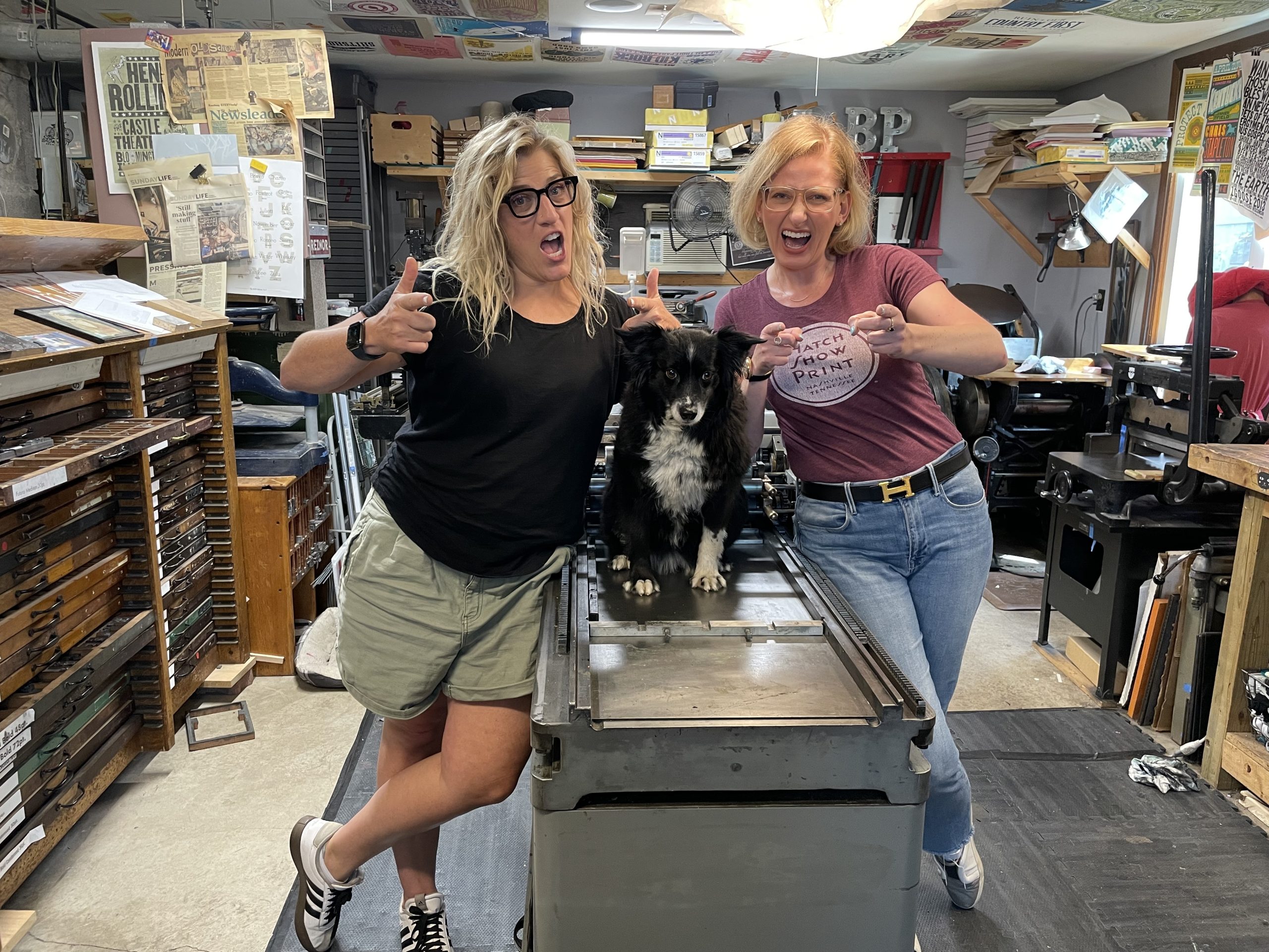

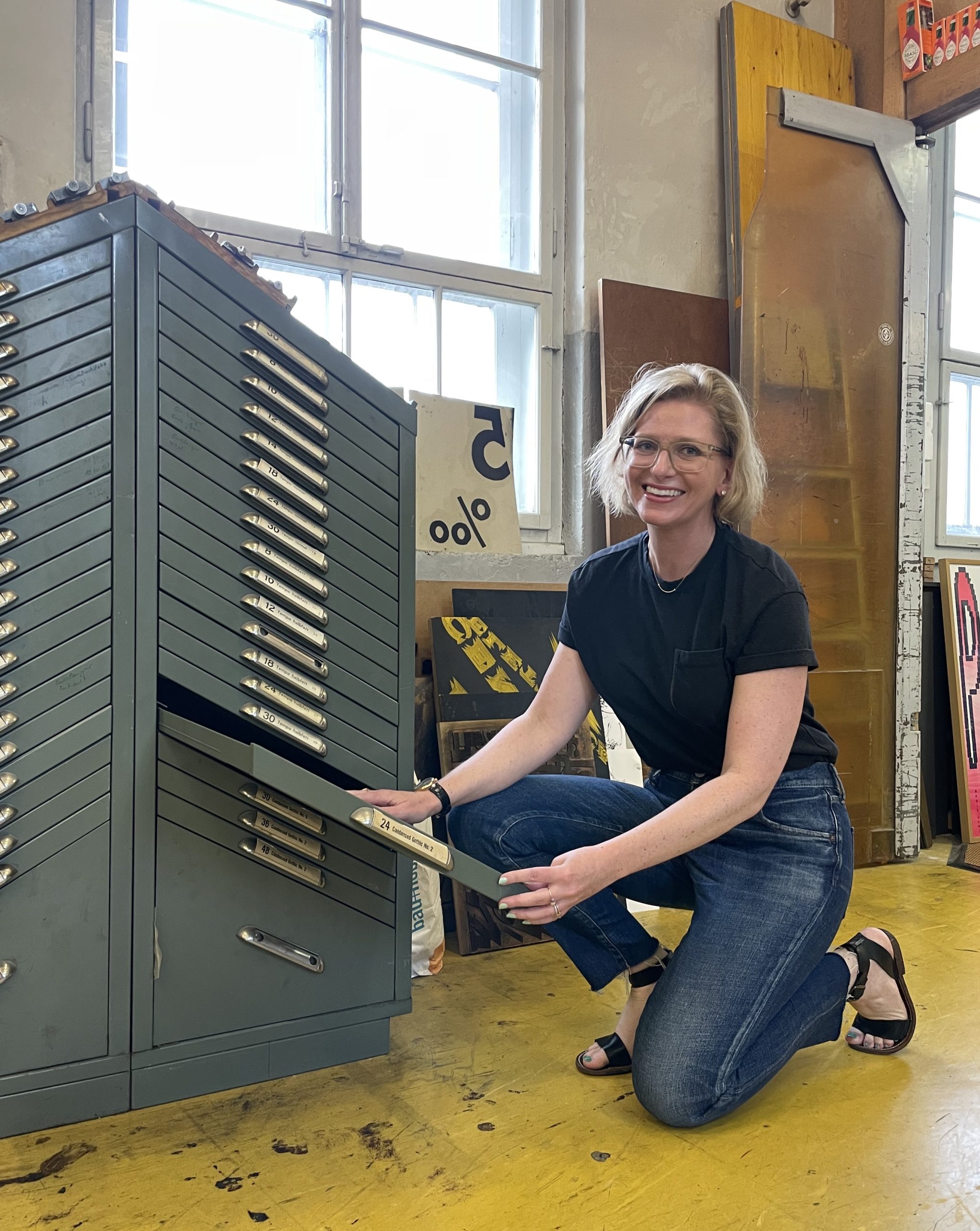
Last summer, Poster House’s Executive Director and Chief Curator, Angelina Lippert, spent a week at Bruno Press in St. Joseph, Minnesota where she studied reduction printing under press owner and second-generation printmaker, Mary Bruno.
During this visit, Angelina acquired two groups of work for Poster House made by Bruno Press: a batch of riotous political letterpress posters, concert advertisements, and reduction prints made by Mary Bruno, with her characteristic irreverent flair, and a surprise collection of silkscreen posters created by Mary’s father, the late Don Bruno.
Mary and Angelina having a good time at Bruno Press
Don Bruno founded a letterpress print studio in the mid-1980s, converting the family’s St. Joseph garage into a studio equipped with printing presses and type salvaged from local letterpress shops that were beginning to use newer printing technologies. Since his death in 2003, Mary has continued her father’s legacy, using the same equipment in her own work.
A renowned professor of art at St. Cloud State University, Don Bruno was commissioned in 1981 by Ron Perrier, then chairman of the St. Cloud State theater department, to design a set of posters for the department’s upcoming season. Bruno produced five silkscreen posters that are now part of the Poster House Archive alongside thirteen others by Bruno advertising subsequent shows by the department.
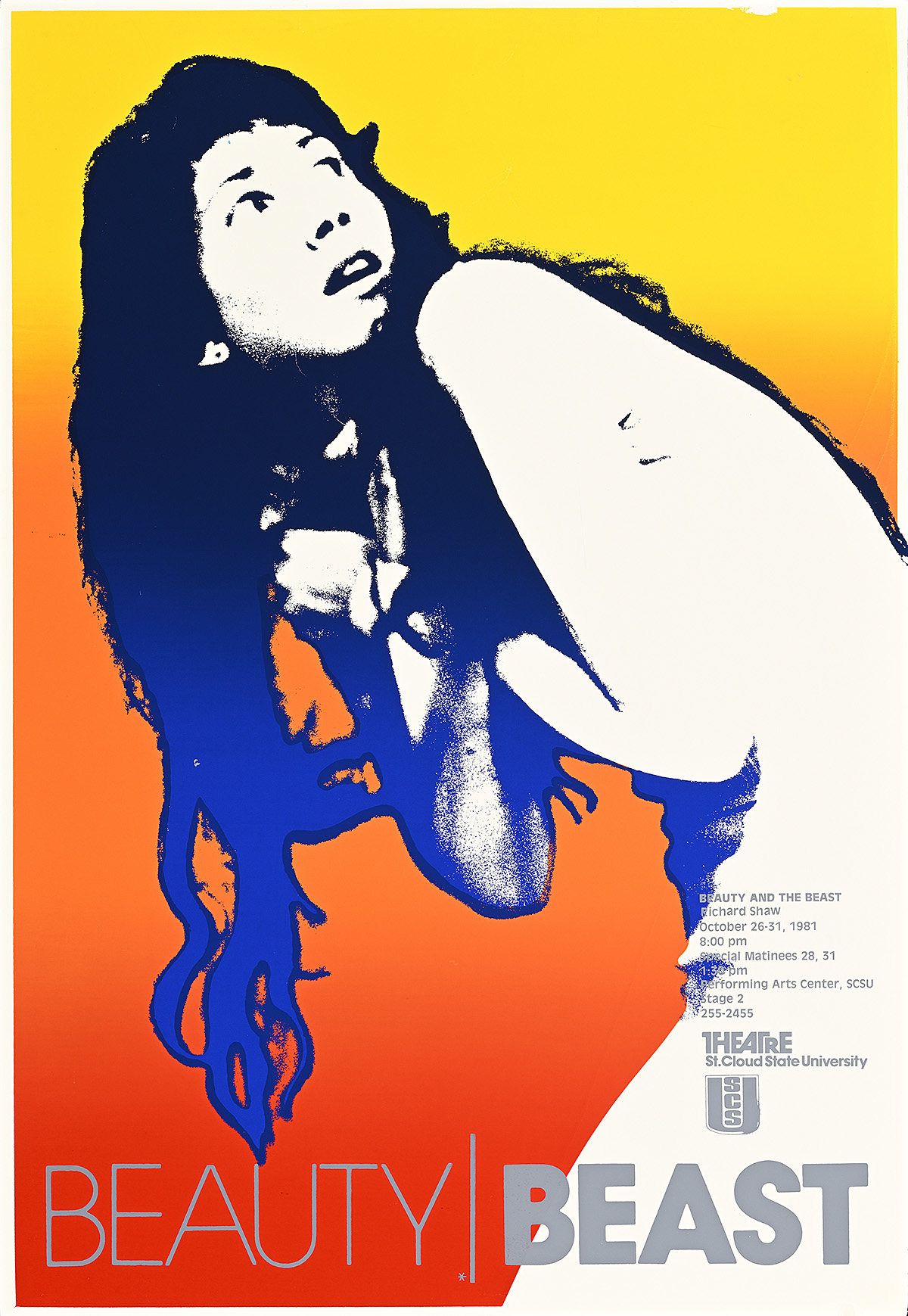
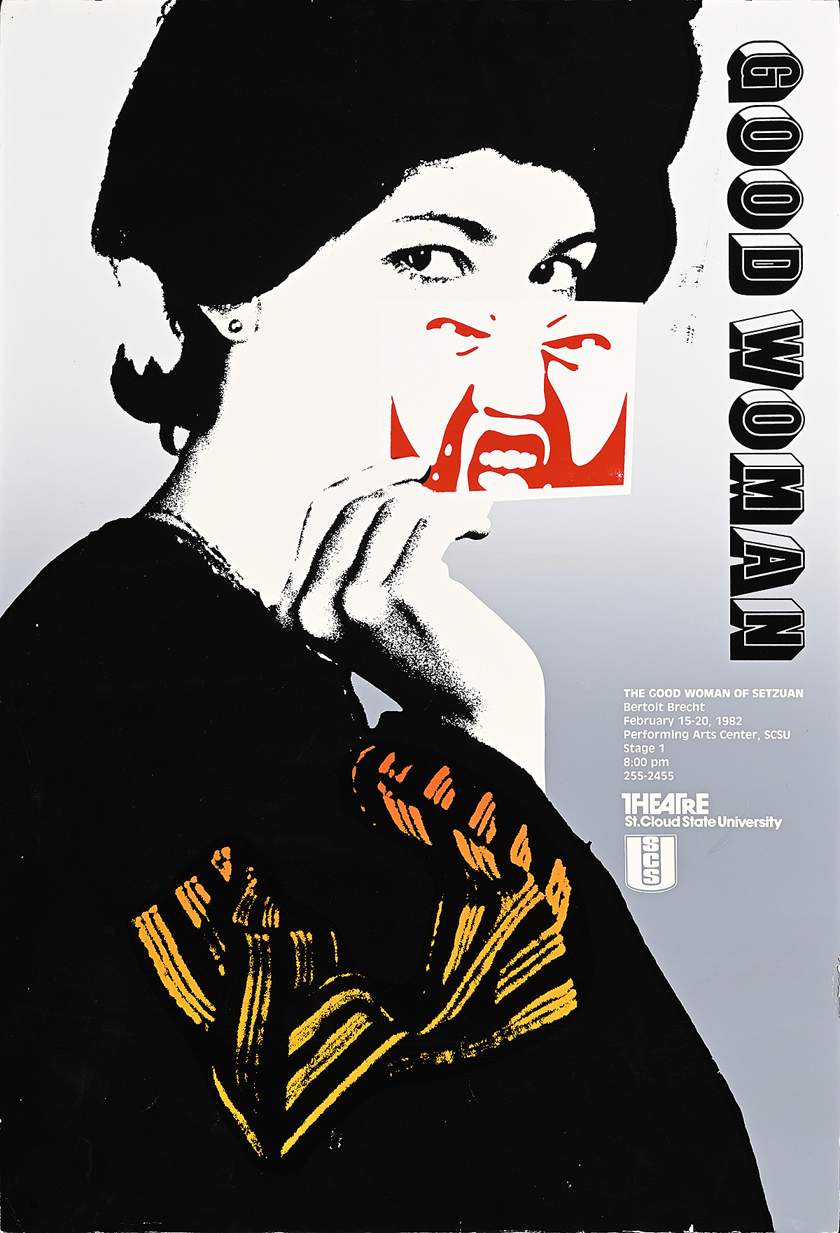
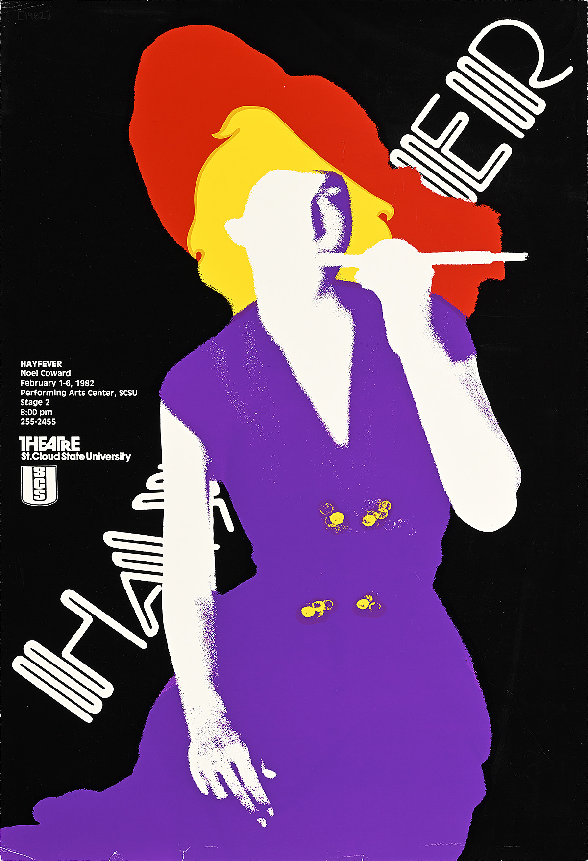
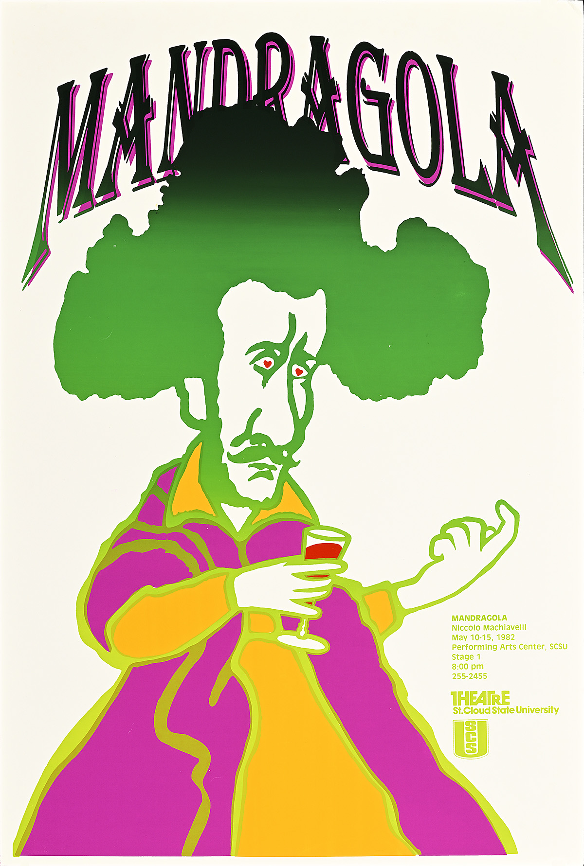
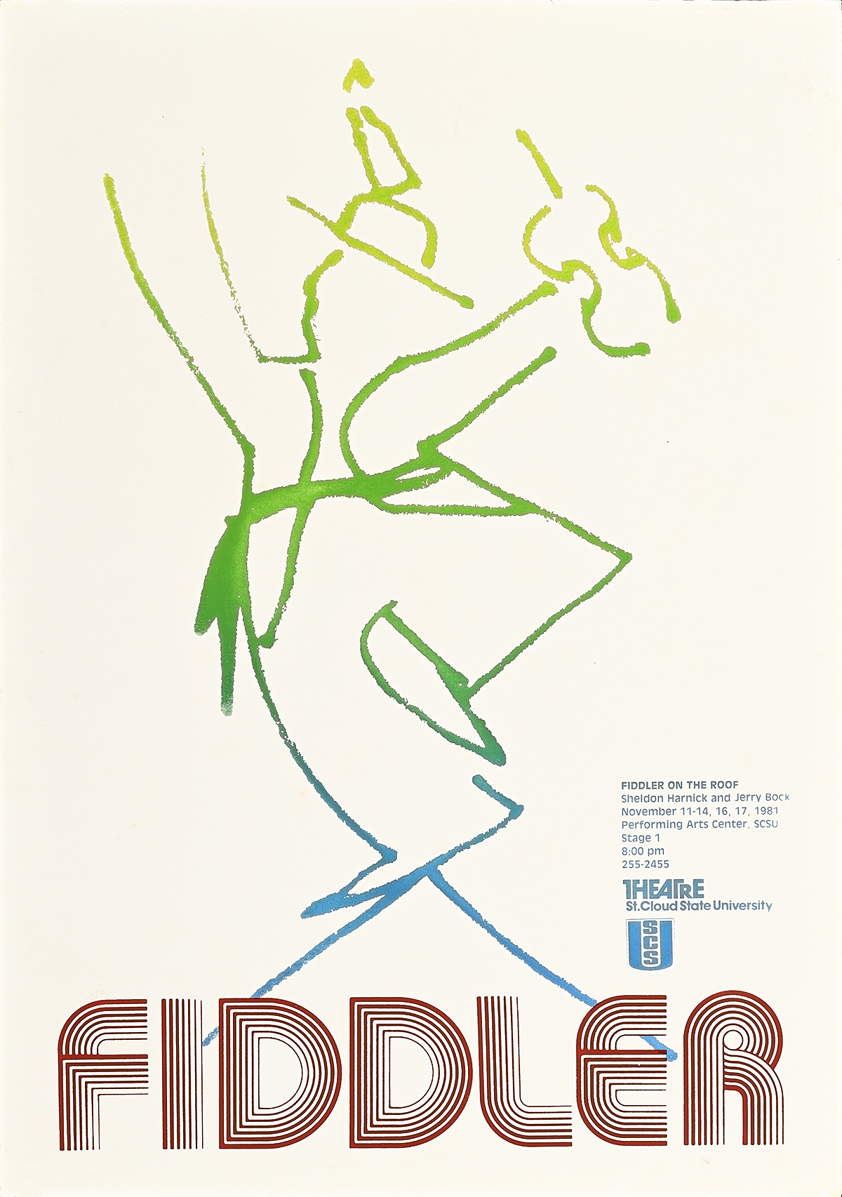
The five posters for the 1981–1982 season cover a dizzying array of typefaces and gradients–each poster incorporates at least three colors produced in separate layers with unique screens. The designs were so technologically complex that some, like those for Hay Fever and The Good Woman of Sentzuan, took as many as four hours each to print in full. Rather than simplify his compositions, Bruno increased the scale of each poster and produced a limited run of only 125 posters each.
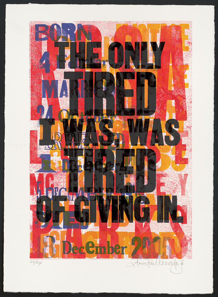
The Good Woman of Sentzuan (1982) by Don Bruno
Unlike many traditional advertisements for theatrical productions, Bruno’s posters do not depict scenes from the productions themselves. His designs are decentralized and distilled to their essence; figures and text float dreamlike on the backdrops of silkscreened gradients and solids, removed from their narrative context and revealing little about the content of the shows they advertise. In some of his posters, like that for Beauty and the Beast, the central figure, with her nondescript clothing, is not immediately identifiable; in others, like the poster for The Good Woman of Sentzuan, the character wears a costume that more clearly links her to the play’s narrative but her distorted face nonetheless evokes a sense of ambiguity. Even the performance titles are subjects for distortion and play at Bruno’s hand. In Fiddler on the Roof, for example, he reduces the musical’s title to just one word: “Fiddler.” And in Hay Fever, reportedly his favorite design from this set, he positions the central figure so that her body interrupts and obscures the text of the title.
Left: Beauty and the Beast(1981) by Don Bruno
Right: Hay Fever (1982) by Don Bruno
Though the works promote different productions, the consistency of the dreamy tone established by this kind of abstraction establishes a common visual language across the set, fulfilling one of Bruno’s priorities for the project. In a 1982 interview with the university’s student newspaper, Bruno stated,: “I tried to make the posters look like they came from one person.” As the student interviewer observed, there was another critical element that unified the series—the artist’s signature appears nowhere on any of the posters. Bruno believed it would only get in the way. “I tried to make it into a strong visual statement. I wanted the posters to communicate rather than make an artistic statement,” he said.
Left: Mandragola (1982) by Don Bruno
Right: Fiddler on the Roof (1981) by Don Bruno
Despite his modest intentions, the posters were met with rave reviews from faculty and students alike. Perrier, who had commissioned the designs in the first place, exclaimed, “I can’t say enough about this… It’s the first time theater has had such a strong signature from show to show.” The students clearly agreed. “I’m having a set of them framed and I plan to put them up in the green room—and have them screwed into the walls,” he added. “People have been stealing the posters.”
Poster House is thrilled to add these posters by both Don Bruno and Mary Bruno to the Permanent Collection as examples of innovative compositions produced by master printers working outside the traditional centers of artistic production. We hope they continue to build the legacy of the Bruno family of printmakers and to excite visitors and scholars to the Museum for years to come—although we sincerely hope we do not have to screw their frames into the walls.
Two posters by Mary Bruno